Just noticed dynamic font size is not allowed for Icon Text components.
Hi @trz-justin-dev, thanks for flagging this! This is one of the components that we still need to add the new component font size control feature to.
Feature:
I found an internal ticket were we are tracking this pending update, I added your feedback to it.
We'll be happy to update you here when it's done. ![]()
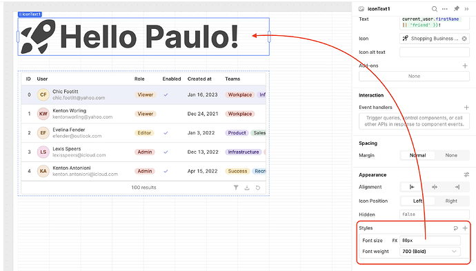
Custom font size has been added for this component! ![]()
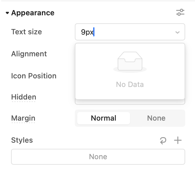
To set a custom value, add the "Font size" style under 'Appearance' and click "FX."
@Paulo woohoo! is this the first time we're able to set an icon's size? ![]()
First time we're able to set it to a custom size. We used to have limited options. ![]()
@Paulo awesome!
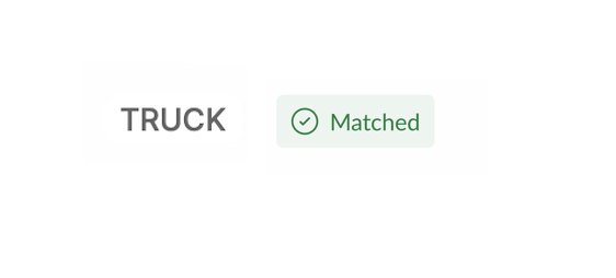
i'm working today on a page which needs a little tag alongside text, and we'd like it to hug the text. since each text (there are three) has a different character length, we found putting two components side-by-side doesn't leave a consistent gap. wondering if you have ideas/suggestions?
goal is to get something like this (from Figma):
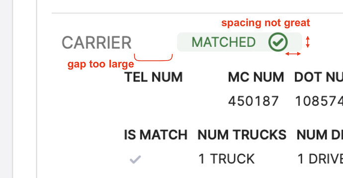
i first tried an icon text component with background and text coloring, but not quite good enough:
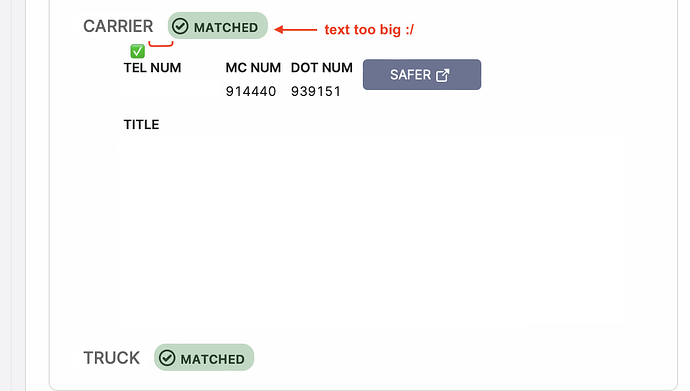
then i tried tags component to get the spacing, but lost control of font size between two tags:
thank you!
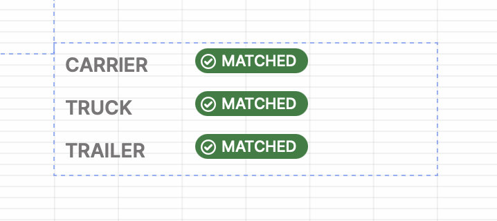
I helped someone build a similar structure using a Container and a Key-Value component:
However, if we use the Icon format for the value of 'CARRIER' we won't be able to put text next to the check mark symbol. The spacing issue would be fixed, but the value would just be a symbol. Is the tradeoff worth it for your use case?
hey @Paulo thanks for the help! the tag looks way better in key-value component, and the ability to have different fonts for label and value is perfect!
i can't find a way to hide the value but show the label (both disappear for a not-truthy value like ""), and would need a Left Justified option to keep consistent gap between label and value (tho it makes sense for key-value to not have this). also, when the fonts are different sizes, the tag is no longer aligned vertically with the label sadly. it's subtle but noticeable
i'll keep hacking around and see what i can make ![]()
The tag format does look great but I see what you mean by it no longer being vertically aligned. I tried custom css to add top padding but it has an impact on every key-value pair. Let us know if you find a better way!
hey @Paulo I think i stumbled on something useful related to this issue: the "stack" option for containers!
here's what i did:
- add a container component
a. set its type to stack instead of grid
b. remove its margin, background color, border, and header - bring into the container both a text label and a tag/tags component
- set the width to be Auto (this is a game changer)
i'm excited to see what other layout quirks i can fix with stack container plus auto width components!
This is exactly what you were looking for! ![]()
