also. Where can I go to understand how the addons for the columns work? I'm thinking i might have dynamic tooltips for some of these but how it's working does not seem to make sense to me.
Unfortunately there is no way of getting rid of the blank space under the grouped column.
Have you considered using expandable rows?? You could aggregate your data to show info about the group in the parent row, and have either another table in the expendable section, or other components. O made a video a while ago on this which you can watch here
Thanks guys. I did look at the expandable rows under my group. I think that will be useful for something we might do later on with equipment specific to each line item. But for my original request, it didn't help much. I've decided to just live with the limitation of the extra space in the grouping. It's more of an annoyance than anything. Because the group values are not that big it's not a big deal.
Sounds good! Thanks again for reaching out. I've filed a ticket internally documenting the behavior that you'd like to see for grouped rows and will provide an update here as soon as there is movement.

 Can you clarify or maybe provide a screenshot?
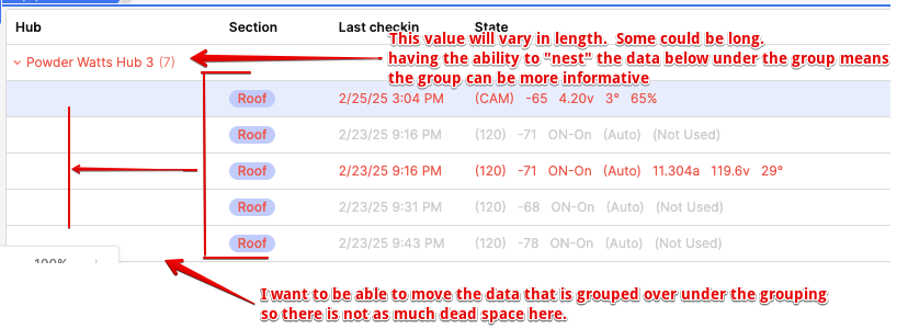
")