Third. I cannot get a tooltip to work on the group title. If it's possible, please advise. That would be a short term solution because I could make the title short and hard to understand and then explain it in a tooltip.
Fourth. If a table has any sort of complex filtering going on the option of opening groups which have rows selected by the filter and closing groups which have zero rows visible because of the filter would be a "nice to have" feature.
+1 the idea of having an API for managing groups. It would greatly enhance the flexibility and usability of the table component.
Here are some features that we would greatly appreciate:
User-Controlled Grouping: It would be fantastic if users could have the autonomy to group and ungroup data based on their specific needs. This would empower them to tailor the display to their preferences and tasks.
Custom Group Sorting: The ability to define custom sorting rules for grouped data would be incredibly valuable. This way, users can arrange groups in a way that makes the most sense to them.
Group Expandability: Offering options for group expandability is essential. Allowing some groups to be initially collapsed while others are expanded by default would provide a more intuitive and user-friendly experience. Additionally, giving users the ability to expand and collapse groups at will would further enhance the interactive aspect of the table, accommodating a wide range of use cases.
+1 for flexibility regarding management of groups
+1 for ways for controlling whether a group is open/closed (at the bare bare minimumm it should at least be persisting)
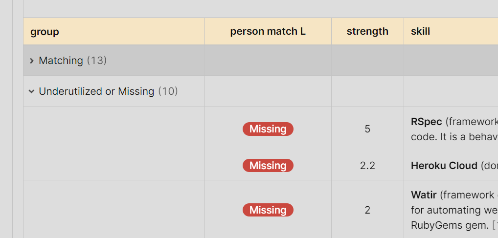
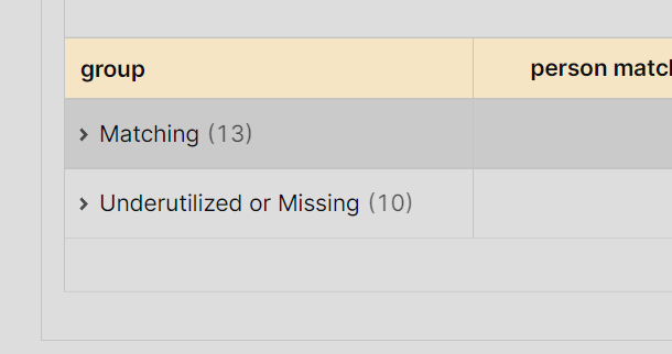
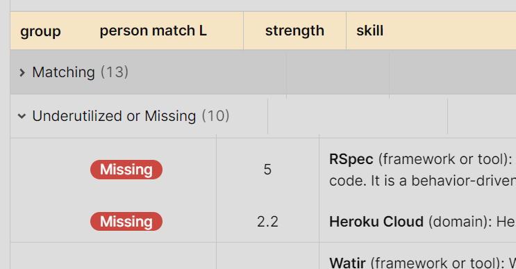
+1 the issue about space. >>> Second issue. The group column takes up a lot of space. It would be nice to support this style:
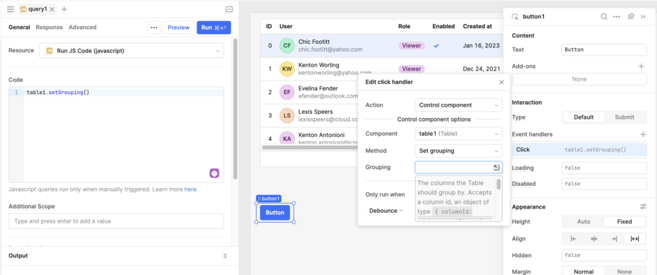
Most of this feedback is still in our queue to be worked on, but I wanted to share that we did add a setGrouping API for programmatically grouping table rows (as with our other component apis, you can access it via event handlers or JS queries):
Does the setGrouping functionality work on dynamic columns? I am unable to group on a dynamic column, either through the setGrouping function call or using the table toolbar feature. Just wondering if I am missing something or if this functionality is not supported yet.