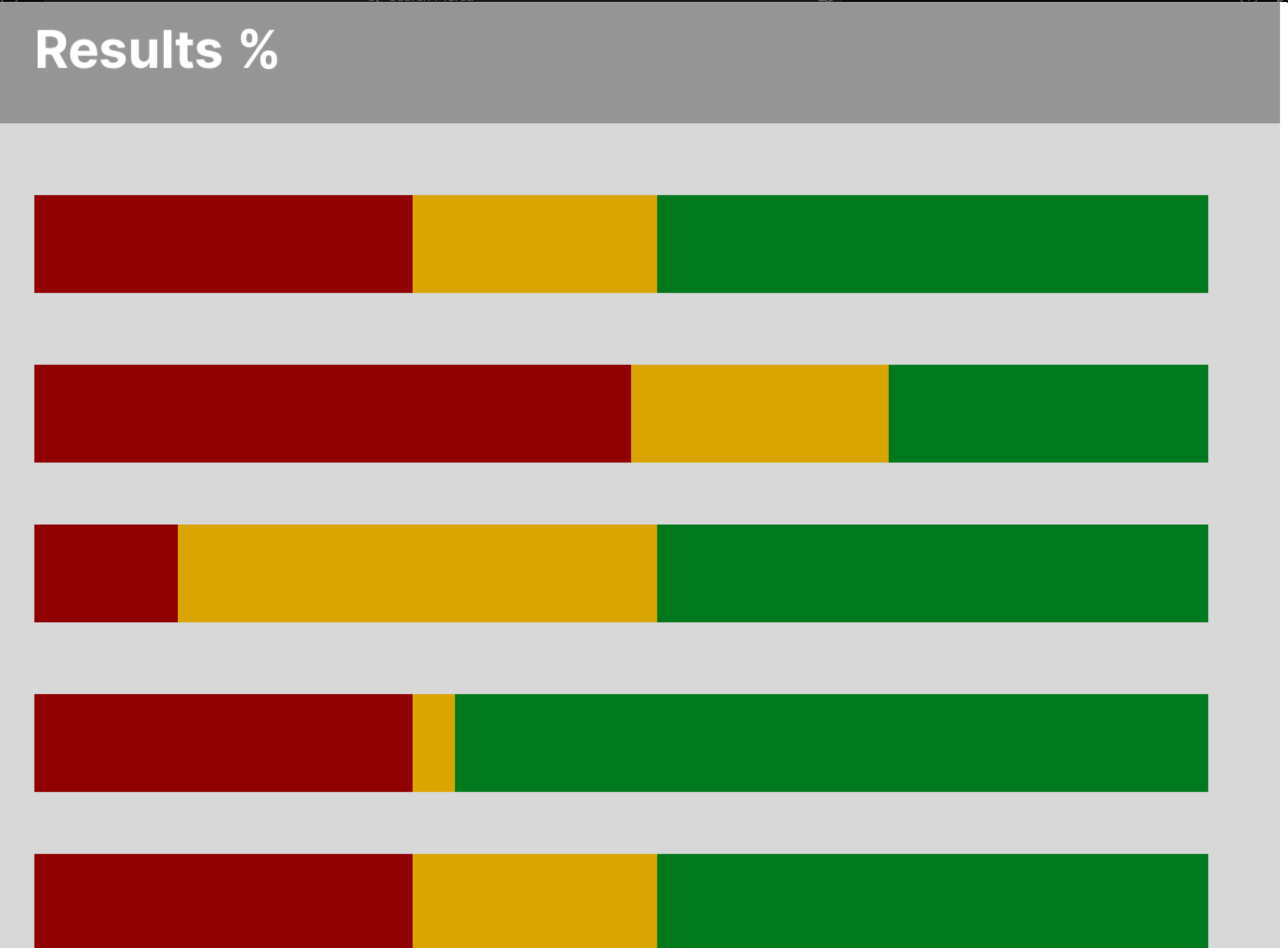
I'm trying to create horizontal bar charts in Retool to illustrate distributions (see screenshot). Any idea how I can do this? I've got the query ready - just not sure how to visualize it.
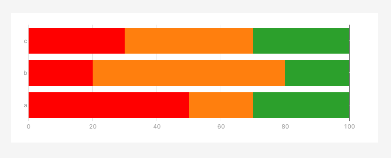
A chart with "barmode":"stack" is how I've achieved this look - there's a lot of info in the plotly docs. It's quite dense reading but has powerful features
forum (2).json (19.0 KB)
Thank you for that, @dcartlidge ![]()
There's also another community thread that has examples of a horizontal bar chart: http://community.retool.com/t/plotly-charts-cannot-do-horizontal-bar-charts-correctly/7350/6
Thanks @dcartlidge and @victoria - will give this a try!