For god sake turn off the new feature that opens the preview in a new tab

This change in behaviour made it extremely easy to enable editors creating N parallel universes out of sync, each time they press the "play" button.

We were all used to the "edit mode vs preview mode" behaving like a toggle.

Now that you changed it and opens the preview mode in a new tab, you broke many people's workflow and increased confusion and error rates by 10x.

Here is what happens now:

I open a retool project and I start making modification. Then I press the play/preview button to test it live

Screenshot 2024-06-05 at 11.34.28

It opens a new Tab, i test my changes, then I press the edit mode in this new tab.

Then I make some more changes iterating on what I just found in this new tab, and press play to test them live... again and again

And here you have it: three tabs in edit mode, branching out from one another.

I already lost 2 hours of work because apparently I was working in the "wrong" tab and changes were not saved when I closed the "most recent" tab.

PLEASE PLEASE PLEASE Turn this feature off, or turn off the button that takes from a preview page to the edit mode!!

EDIT : I just found out that the button I need is not Play, but this new toggle here
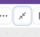
Screenshot 2024-06-05 at 15.28.02

This actually behaves as I need, like the old "play"... the icon is confusing. What's the point of the new "play" button then?

1 Like

I noticed this also, I had to start the habit of always hitting refresh or shift+f5 whenever I switch tabs, windows or computers and noticed the browser was already on an app/module and if its still on edit mode (to make it a bit simpler on myself I don't usually bother caring if it's edit or preview mode, if I change tabs or whatever and see retool isn't on the main org page I hit refresh anyway)

Hi there,

First, thanks so much for sharing this feedback!

A bit of context -- we added the Play button to make it easier to navigate to your app in "user mode" (how your users would see your app). We know that the quick preview is still very useful, and we thought the Full screen button was a more clear way to communicate the action.

That said, it's helpful to know that you (+ others) found the new iconography confusing, and will continue thinking about how to make these actions more clear!

Best,
Erin

3 Likes

honestly, :face_with_diagonal_mouth:I didn't even notice that thing next to the play button until I read this. just checked also(no offense) and indeed I can confirm... it really is there and I really am oblivious :upside_down_face:

1 Like

thanks. I warmly suggest you separate and move it somewhere else, far from the edit/preview toggle button, to highlight the difference