Thanks to everyone who attended today's community meetup on Designing Intuitive Apps in Retool! Here are some links/resources we referenced, along with answers to the questions we didn't get to.
Links:
- Community Meetup: Designing in Retool recording
- Designing in Retool slide deck
- Downloadable app template examples
- Advanced app examples
- Building Complex Full Screen Layouts in Retool webinar
Questions and Answers:
Will you be adding the ability to change tab index settings for on screen data entry? Currently you cannot use tab or enter to properly move to the next field.
By default, using “tab” will take you to the next component in the Explorer. If you’d like to change the default movement, we have the ability to add custom keyboard shortcuts. You can read more in our docs. If you wanted to make a custom order of fields to move through, I’d recommend setting up a temporary state that is an array of the correct order to move through. On “tab” you can call the component.focus() method to move to the next field.
I need to access a REST API that requires a Client certificate. I have the .PFX and Password of the certificate, but don't see where I can upload it. In Postman, we go into Settings > Certificates > then add the certificate there. Where do I do this in Retool?
We don’t natively support client certificates with REST APIs, but we can try to help you find a workaround. We’ll need additional information about the API capabilities, which you can share to the App Building section of this forum.
Why do you use a grayed out color for a section heading, eg, the smaller right block: Account Actions, Marketing, Create Code, Also in the right toolbar in Retool, the style does the same thing. It just looks disabled.
The use of lighter gray is typically related to the idea of hierarchy – similar to larger or smaller headings, you might use stronger or lighter colors. There has been a bit of a trend as well to not just use strong blacks for text.
Within the page (the smaller right block), the emphasis is being put upon the clickable links. There is a design decision here – some people find that having every clickable link as a “primary color” is the best way to let users discover the app's functionality. My personal preference (this is Jon) is that clickable links should use the Primary theme color; we do a lot of apps where the clickable link is black or a dark gray.
How do you make the text input without the borders so it looks like a display element rather than an editable element?
There’s a couple of options here.
First it’s worth asking whether you should be using a text component. These give you more formatting options, and their content can be dynamic e.g. {{ myTable.selectedRow.data.name }} could show a users name.
Second, to answer the question more directly, you can set the border color’s opacity to 0% and the border will disappear:

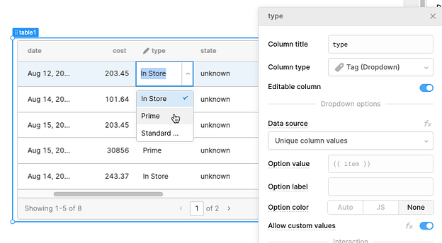
When editing, or adding a new record in a table, I do not see a way to edit a column in say combo/select component (so we can limit the inputs for user). Do you have some ideas on how we can do that?
For this you want to use a Tag (Dropdown) column type. When this is set as an editable column, you can limit the options available to the user. That could be based on the unique values already available in the table’s data, a separate query, or you can enter an array of values directly. You also have the option of allowing custom values, so that “preset answers” are available but not required. Note that Retool will by default apply tag colors to each unique value – setting the Option color to “None” will leave you with a plain dropdown like below.
