Hello,
I am just starting on retool, so Im sure have some basic questions. Checkboxes: How can I make it bigger and make the border around the box thicker. Thx!
Hello,
I am just starting on retool, so Im sure have some basic questions. Checkboxes: How can I make it bigger and make the border around the box thicker. Thx!
Hi there @Robert_Musseman, and welcome to the forum!
Unfortunately there is no out-of-the-box way to make it bigger and make the border thicker.
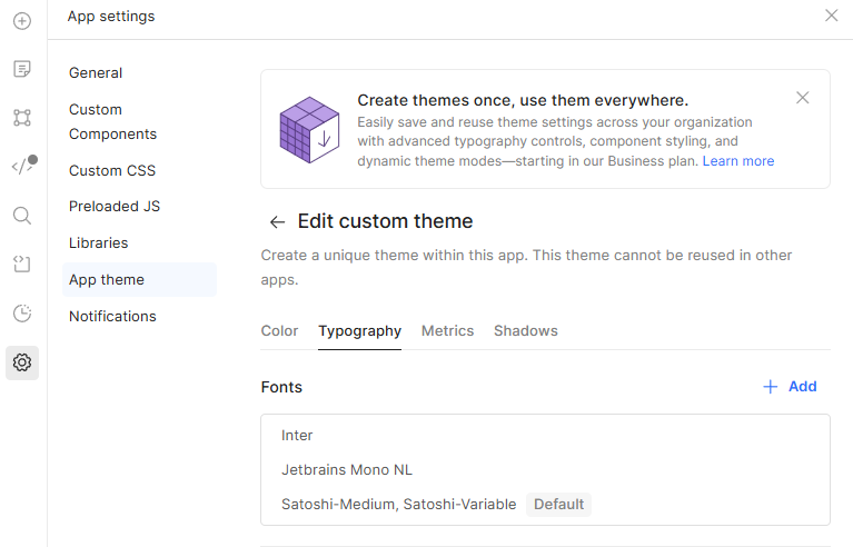
You could add CSS to your application (left bar > settings > custom CSS ) and add something like:
._checkbox_1aukd_10 {
  width: 24px !important;       /* Increase size */
  height: 24px !important;
  border: 3px solid #2e7d32 !important;  /* Make border thicker */
  border-radius: 6px !important;         /* Optional: more rounded corners */
}
}
This will apply to all of your checkboxes. If you want to apply it only to a specific checbox in your app, you could do:
._retool-checkbox1 ._checkbox_1aukd_10 {
  width: 24px !important;       /* Increase size */
  height: 24px !important;
  border: 3px solid #2e7d32 !important;  /* Make border thicker */
  border-radius: 6px !important;         /* Optional: more rounded corners */
}
and replace checkbox1 with whatever name your checkbox has.
However, this is brittle and will break silently if Retool renames _checkbox_1aukd_10 (which they absolutely could during a UI update or redesign).
There are some CSS Magicians here (Yes, I'm thinking about you @AJVancattenburch) that may know for sure a way of making it less brittle and persistent regardless of retool updates.
Thanks for this detailed answer! I cans see that avoiding custom css is optimal on these platforms. Would it be a reasonable potential product feature ask that those options be added to the standard checkbox css options? Also, at top of a form a wanted to put some fixed text in a simple text component. I wanted the the text component to have a certain backround color, a 2px black border, a certain text color, size, and font/font family. Some of these , like the border, were not doable out of the box and it didn't seem like there were many font options. I do normally try to just use the nice looking pre built stuff, but some basic tweaks sometimes desired.
Yeah, definitely a good think for a feature request.
I've been using Retool for 2.5 years now, and the styling options have gone a long way and hopefully more get added soon.
For the text with border, I know what you mean. The classic workaround is to put your text within a container, and then play around with the container's style, padding & margin etc.
For the fonts, you can add your own fonts:
Although I can't remember from which subscription level this is available.
Hey welcome to the forum @Robert_Musseman -- and I appreciate the shout out @MiguelOrtiz! 
I peaked behind the curtain a bit to see how you can increase the pixel width for checkbox borders and they are a bit tricky, as you have to override a style property that is set by retool as a variable called --retool-checkbox-border that lies within a specific div. The following custom CSS should drill into any checkbox with the word 'Checkbox' included somewhere in the name of your component. Just ensure any checkboxes that you want styled either have 'Checkbox' in their name, or change 'Checkbox' to whatever the name of your component is. If you want all checkboxes styled this way in your app, just be sure they all contain 'Checkbox' (or whatever you decide you want to name them -- so long as they all contain the same set of words somewhere in their name:
 Note: The way we target these styles should adhere through any Retool updates so that your styles aren't 'unapplied' during updates!
.retool-grid {
  [data-testid*="Checkbox"] > div > [data-scroll-target-id*="Checkbox"] div[class*="main"] > div > [data-checked] {
    --retool-checkbox-border: red !important;
    border-radius: 4px;
    outline: 2px solid red;
    outline-offset: -1px;
  }
}
What the above is doing in each bounding box? What are we targetting in each layer?
Why apply an outline with an offset instead of a border?
Since Retool already hard-sets border styles for checkboxes, applying styles can be tricky. The only way to do this and get the thickened border result you want is to:
--retool-checkbox-border value to the color you want (unless you want the same light gray shade, you can leave this alone).border-radius to a radius that looks good with your border/outline.outline.outline-offsetHopefully this helps get you where you need in your Retool app, and happy coding!
Thanks so much and sorry for delay. I have been trying out a few of these low code apps and one tricky area does seem to be limits on styles/css and how to more easily change display options for components. It seems like retool adds alot of special names to the components which is a learning curve. Thanks for this!
That it does and any time! Always happy to help in places where I also struggled when I was first discovering all the nuances and solutions to common problems using Retool.
One thing that has been really nice about it, though, is I'm yet to come across an issue that there wasn't some way to solve it. Even if, in some cases, that meant building out a custom component library 