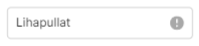
which is to be editable one language at a time. I want to display an indicator for when any supported language is missing text though. I've managed this via suffixIcon but the default color is not apparent enough. See image:
Is there any way to change this color? The only style on Text Input for adornment seems to be related the input outline.
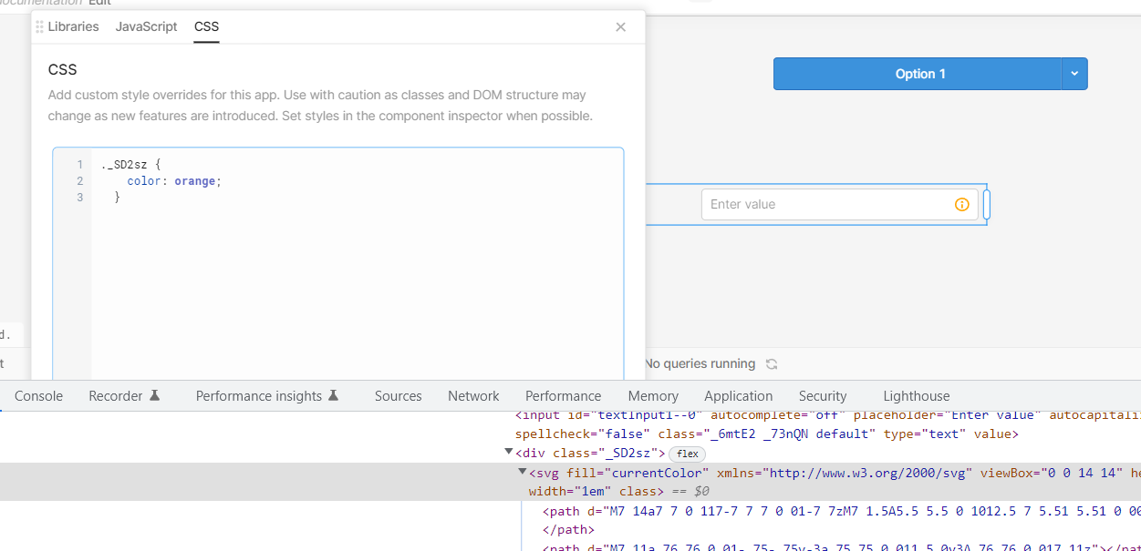
Thanks for the reply! Sadly this doesn't work since the input field is in a module and not an app. There seems to be no way of adding custom CSS to modules?
Hi @cworf Thanks for sending a screenshot! This looks like our Mobile apps editor, which doesn't have these options, unfortunately My apologies! I should've clarified
oh! My apologies I thought I had been searching the mobile category when I found this! haha. nevermind. so, no dynamic button color changing on mobile then?
 I'll post here if we're able to ship a fix for module css!
 My apologies! I should've clarified