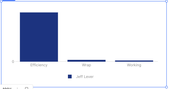
I don't actually know how to make this work using the chart GUI but this JSON seems to get you where you want:
[
  {
    "name": {{variable2.value.PinnacleName}},
    "x": {{ Object.keys((({ PinnacleID, PinnacleName, ...rest }) => rest)(variable2.value))}},
    "y": {{ Object.values((({ PinnacleID, PinnacleName, ...rest }) => rest)(variable2.value))}},
    "type": "bar",
    "hovertemplate": "<b>%{x}</b><br>%{fullData.name}: %{y}<extra></extra>",
    "transforms": [
      {
        "type": "sort",
        "target": {{ Object.keys(variable2.value )}},
        "order": "ascending"
      }
    ],
    "marker": {
      "color": "#1E3A8A"
    }
  }
]
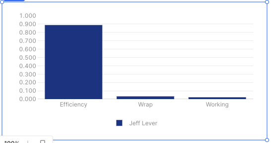
The good news is that the chart seems to parse the string floats into actual floats.
You can also change the layout a bit to fix the scale here.
"yaxis": {
    "title": {
      "text": "",
      "standoff": 6,
      "font": {
        "size": 12
      }
    },
    "type": "linear",
    "tickformat": ".3f",
    "automargin": true,
    "fixedrange": false,
    "zerolinecolor": "#DEDEDE",
    "range": [0, 1],
    "dtick": .1
  }