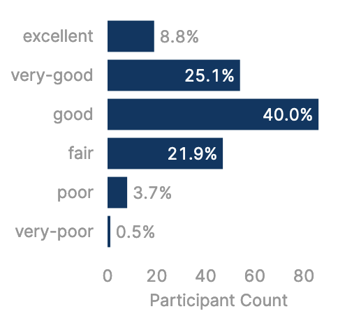
Hello! I have many bar charts displaying survey results as counts, and I would like to add data labels to each bar that show the values as percentages. I'm using horizontal bar charts, so the count is on x and the categories are y.
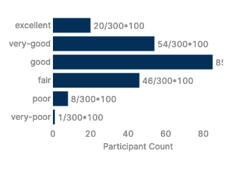
It seems ALMOST possible to calculate the percentage for each {x}. I can display "/*100", as seen in the attached image, but cannot get the mathematical function to actually run using any combination of parentheses and curly braces. I have also tried triggering a query to calculate the percentage using additionalScope to pass {x}, but this seemed less promising.
Is it even possible to calculate this percentage inline in this context? If not, any other suggestions for programmatically getting percentage labels on these charts?
Plotly.js JSON data:
[
  {
    "name": "Count of Participants",
    "x": {{formatDataAsObject(addNullsToEmptyResponses.value)}},
    "y": {{formatDataAsObject(addNullsToEmptyResponses.value).health_last4w_overall}},
    "type": "bar",
    "orientation": "h",
    "texttemplate": "%{x}/{{addNullsToEmptyResponses.value.length}}*100",
    "textposition": "outside",
    "transforms": [
      {
        "type": "sort",
        "target": {{formatDataAsObject(addNullsToEmptyResponses.value).health_last4w_overall}},
        "order": "ascending"
      },
      {
        "type": "aggregate",
        "groups": {{formatDataAsObject(addNullsToEmptyResponses.value).health_last4w_overall}},
        "aggregations": [
          {
            "target": "x",
            "func": "count",
            "enabled": true
          }
        ]
      }
    ],
    "marker": {
      "color": "#033663"
    }
  }
]
Plotly.js JSON format:
{
  "title": {
    "text": "",
    "font": {
      "color": "#3D3D3D",
      "size": 16
    }
  },
  "font": {
    "family": "Inter",
    "color": "#979797"
  },
  "showlegend": false,
  "legend": {
    "xanchor": "center",
    "x": 0.5,
    "y": 1.1,
    "orientation": "h"
  },
  "margin": {
    "l": 72,
    "r": 24,
    "t": 24,
    "b": 72,
    "pad": 2
  },
  "hovermode": "closest",
  "hoverlabel": {
    "bgcolor": "#000",
    "bordercolor": "#000",
    "font": {
      "color": "#fff",
      "family": "Inter",
      "size": 12
    }
  },
  "clickmode": "select+event",
  "dragmode": "select",
  "xaxis": {
    "title": {
      "text": "Participant Count",
      "standoff": 6,
      "font": {
        "size": 12
      }
    },
    "type": "-",
    "tickformat": "",
    "automargin": true,
    "fixedrange": true,
    "gridcolor": "#fff",
    "zerolinecolor": "#fff"
  },
  "yaxis": {
    //"type": "linear",
    "tickformat": "",
    "automargin": true,
    "fixedrange": true,
    "zerolinecolor": "#DEDEDE",
    "categoryarray": ["very-poor", "poor", "fair", "good", "very-good", "excellent"],
    "categoryorder": "array",
  },
  "barmode": "stack"
}