Button Tootip does not display when Disabled set to true

I would like the tooltip to work even when the button is disabled. My use case is to tell the user why a button is disabled like: "You cannot delete this Client as there are orders associated with them."

I would use it like so:

{{(lbClients.selectedItem.project_count > 0 || 
lbClients.selectedItem.contact_count > 0) ? 
"There are Contacts or Projects associated with this Client, therefore it cannot be deleted" : 
'Delete Client'}}

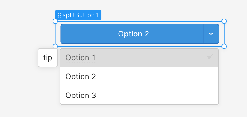
While you are are at it, make this change for all components (I only tested Select and it does the same thing.)

1 Like

Hiya @bradlymathews, totally agree that a way display the tooltip with custom text for the disabled state would be great.

Submitted an internal request for this -- will keep you posted here :+1: Thanks as always!

This has been fixed in the Dec 16th Update!

1 Like

This works for buttons, but not for modal buttons and actions on a split button. It would be logical if it applied to those as well, I believe?

Hi @PaulvG, good call-outs!

I can confirm the tooltip does not show up on a modal button when disabled. But I can't repro the split button case:

Can you clarify what you're seeing?

Option 2 is set to disabled, and has a specific tooltip for when it is:
image

While it shows Option 2 as disabled, it doesn't show the tooltip. Seems to have trouble with ternaries.

Ah, thanks @PaulvG -- I can reproduce that! Will bring to the team to fix for these cases as well.

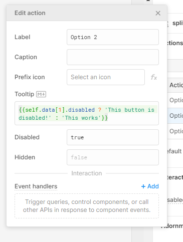
@PaulvG a quick update about actions in Switch buttons: the correct way to target an action's disabled state by index is using disabledByIndex[i]. So for example:

{{ self.disabledByIndex[1] ? 'this is disabled' : 'this is not disabled'}}

@PaulvG this fix for modal buttons should be out in the latest cloud release! (2.111.1)

That's great news, Shawn, thanks!

1 Like