We often implement Tooltips, love 'em. However, when a component is disabled (yet still visible), its Tooltip typically doesn't work. Sometimes, it would be really helpful for the Tooltip to continue working, so the user can be shown an explanation why the component is disabled and/or what they need to do to enable it.
We encounter this issue mostly within forms, but it applies outside of forms, too. There are some clunky workarounds possible (see below), but it would be much simpler for the tooltip to simply continue working in disabled state, and use a ternary in the Tooltip field keying off the component's enabled/disabled state to show different messages.
It's worth mentioning that this isn't consistent across all components. If you disable a "regular" button, its Tooltip stops working. If you disable a modal's button, however, its Tooltip continues working whether the modal is enabled or disabled. Hm!
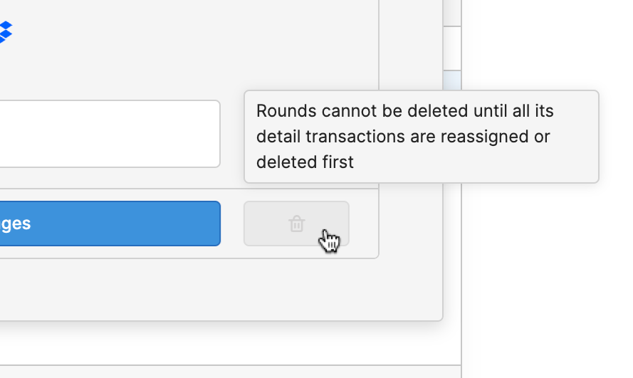
Here's an example of a workaround tooltip on a "disabled" button – we want users to see this when they hover over this disabled trashcan button, so they can see why it's disabled. Instead of disabling the trashcan button where we normally would (and thus lose the tooltip), we conditionally change the color of it and also prevent the query from triggering at the event handler level. It works, but, ugh. It would be so much easier to simply use the usual disable attribute yet still have a Tooltip display.
Long story short, would love to have tooltips be able to still work on disabled components (not just buttons, all of 'em)!