Hey @Babs1 ,
I ran into a similar issue with colors being reassigned dynamically when filtering categories in a Plotly JSON Chart. The fix is to use a transformer where you explicitly define categories, assign fixed colors, and then filter based on the selected checkboxes.
Here’s how I approached it:
1. Mock Data (sample dataset)
I mocked up data similar to what you shared:
return [
  {
    "label": "A. Critical self-reflection (correct)",
    "On-campus HCP": 3,
    "HCP in non-college community setting": 11,
    "HCP in college community setting": 4
  },
  {
    "label": "B. Concrete, finite facts",
    "On-campus HCP": 0,
    "HCP in non-college community setting": 5,
    "HCP in college community setting": 0
  },
  {
    "label": "C. Working collaboratively",
    "On-campus HCP": 0,
    "HCP in non-college community setting": 4,
    "HCP in college community setting": 4
  },
  {
    "label": "D. Knowing everything about different cultures",
    "On-campus HCP": 0,
    "HCP in non-college community setting": 2,
    "HCP in college community setting": 2
  }
]
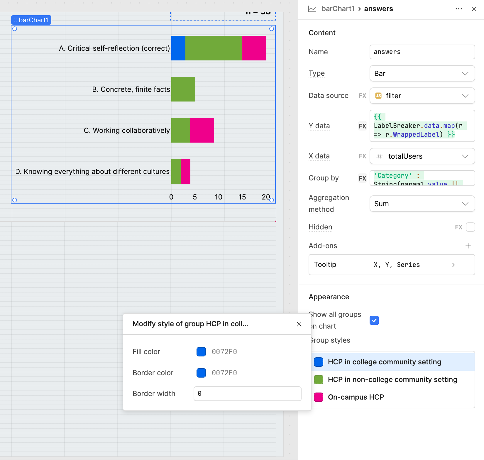
2. Plotly JSON Transformer Code
const raw = {{ transformer14.value }};   // mockData array
const selected = {{ checkboxGroup1.value }};  // array of selected series

// Define categories & fixed colors
const categories = [
  { name: "On-campus HCP", color: "#1f77b4" },
  { name: "HCP in non-college community setting", color: "#2ca02c" },
  { name: "HCP in college community setting", color: "#d62728" }
];

// Wrap long labels (optional for readability)
const wrapLabel = (text, width = 30) =>
  text.length > width ? text.match(new RegExp('.{1,' + width + '}', 'g')).join('<br>') : text;

const yLabels = raw.map(d => wrapLabel(d.label));

// Build traces but only include selected categories
const traces = categories
  .filter(cat => selected.includes(cat.name))   // keep only selected
  .map(cat => ({
    name: cat.name,
    type: "bar",
    orientation: "h",
    y: yLabels,
    x: raw.map(d => d[cat.name] || 0),
    marker: { color: cat.color }
  }));

// Dynamic margin for labels
const longestLabel = Math.max(...raw.map(d => d.label.length));
const leftMargin = Math.min(350, Math.max(120, longestLabel * 7));

return {
  data: traces,
  layout: {
    barmode: "stack",
    title: "Survey Results",
    plot_bgcolor: "#ffffff",
    paper_bgcolor: "#ffffff",
    font: { color: "#333" },
    margin: {
      l: leftMargin,
      r: 40,
      t: 60,
      b: 60
    },
    legend: {
      orientation: "h",
      y: -0.3
    }
  },
  config: { responsive: true }
};
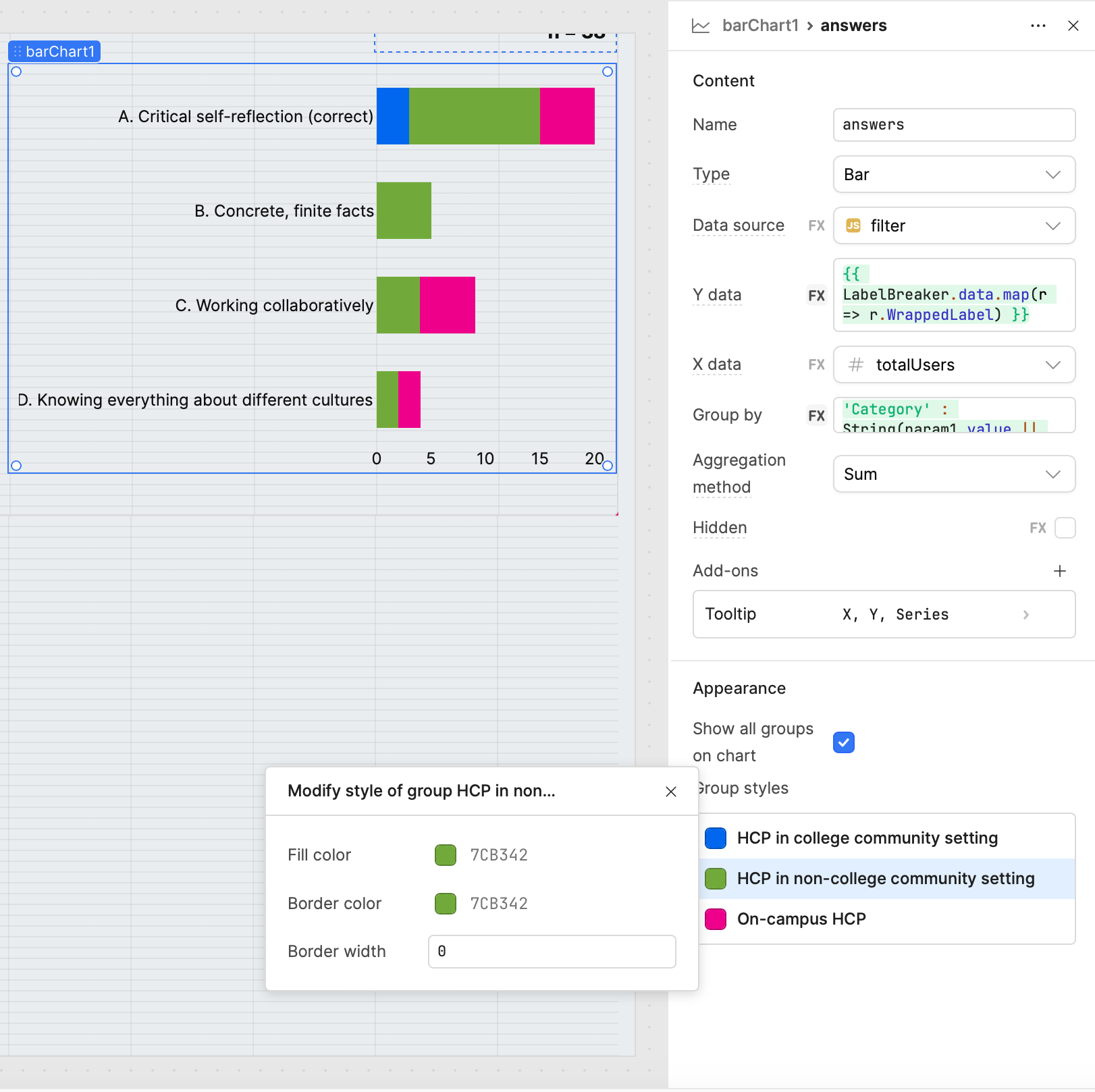
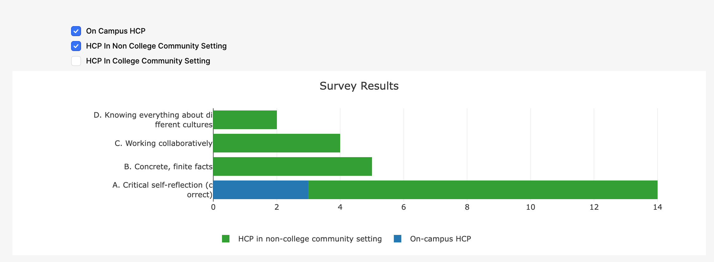
3. Why this works
- Fixed colors per category → no more auto-reassignment when filtering.
- Checkbox filtering → chart only shows selected series (
checkboxGroup1.value).
- Dynamic margins → chart automatically adjusts left margin based on longest label, so text doesn’t overlap or get cut off.
- Wrapped labels → improves readability for very long labels.
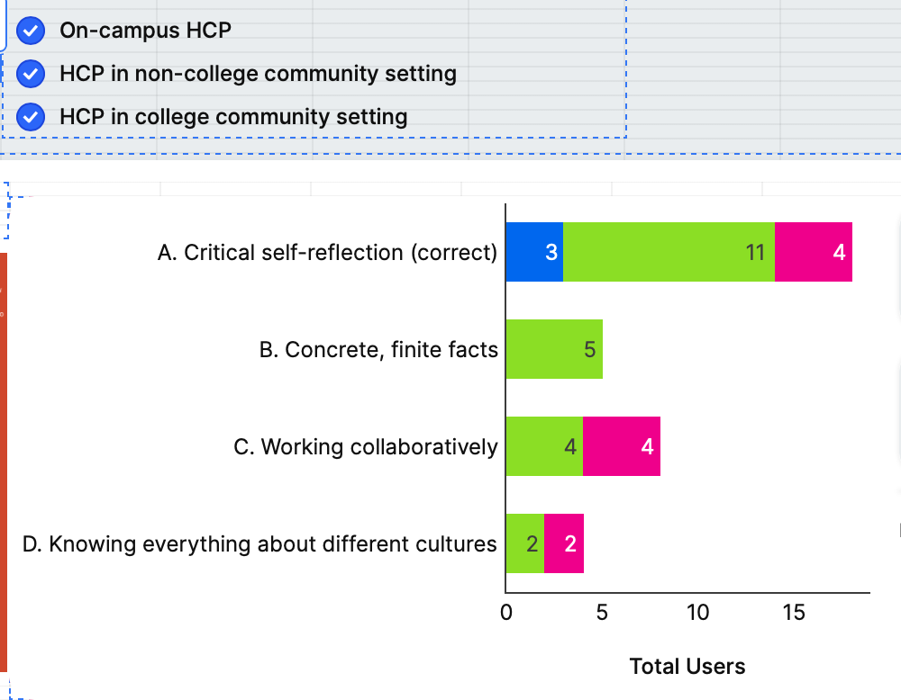
4. Example Result
When some categories are selected:
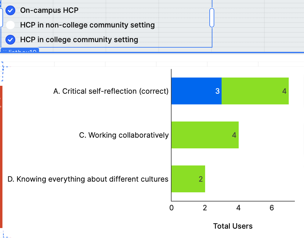
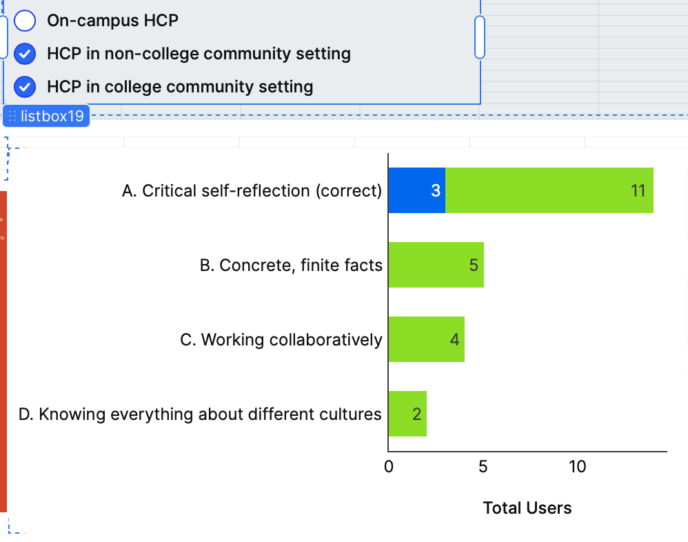
When one or two are deselected, only the chosen traces appear but colors stay consistent.