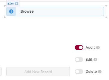
The ‘Alert’ component is nice but, slightly annoying, it cannot be smaller than 3 spaces wide as the component leaves room for e.g. a button even if you don’t want one.
I’d quite like to be able to get it down to 1 space by only having a title, for example.
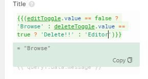
Got it, thanks for the example. Are you toggling the alert type here, as well? (e.g. deleteToggle being true changes the alert type to ‘warning’ or ‘error’?)
Thanks for the extra detail. We’ll take a look and how we might be able to gracefully degrade the component at smaller sizes, without obfuscating the optional message and action button (if set).