-
Goal:
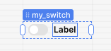
I want to be able to toggle a switch component while in editing mode, but the switch label covers the switch so I can't change it. -
Steps:
Clicking the switch and label
Resetting state etc -
Details:
Add a switch in edit mode, and now try to toggle it -
Screenshots:

2 Likes
Hi Alan,
That is an interesting bug! I was not able to reproduce it on my end. I haven't seen my component labels overlap their corresponding component before.
If you add another switch did it have the same label behavior? Were the labels for any of your other components overlapping their component?
Thanks!
Hmm, I've hit this on three different apps but rarely use switches. Perhaps it's where I'm placing my switches. Ive only used them in the footer of a form next to a button
Ok, I see it now when putting it in the footer. The label blocks initially as you said, but I am able to move my mouse around to get the label to hide long enough to click the toggle. I agree it is not ideal for being able to use the toggle, but this is just in testing from edit mode.
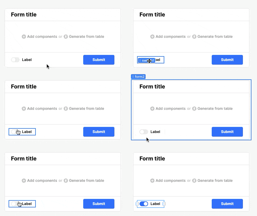
Let me know if mousing around the label is possible on your end.
1 Like
Hi @alan, I just wanted to check in and see if mousing around the label worked or if it is still an issue for you. Thanks!
I experience this very often. It is most bothersome when a small component like this is in a list view and you need to click on the component that is not at the top of the list. The little tag "click to edit first instance" completely covers up the clickable part of the component and will not go away. I pretty annoying.
Hi @Shawn_Crocker,
Apologies for the inconvenience.
I just reproduced the behavior and the "click to edit first instance" pop up definitely gets in the way.
I imagine that when building the list view component, the UI team was hoping that the pop up would be a sort of guard rail so that users would only edit the first instance and its child components, as they intended for the edits to be made at the top and 'cascade' down to the child iterations.
I can check with that team and see if they can make a toggle to turn off that "click to edit first instance" pop up.
I am guessing they want to hear more about your use case for what types of edits you are making to the component that are need to be done at a level below the first instance 
I'm not trying to make component edits on child instances. I'm just trying to use the component input. In this case, it was a check box. Because the checkbox is small, I am unable to click and toggle it because that message blocks it. If hovering over the message for a second would cause it to disappear, that would be great and would follow the current pattern. Currently if there are multiple components nested, hovering over one will expose its name tag which sometimes blocks clicking on the component behind it. But resting the mouse for a second will cause the tag to disappear and no longer be blocking. I think the click to edit first instance tag should also disappear when hovering to get out of the user's way. That's all I trying to point out here. The edit first instance label is not disappearing to get out of the way like all the other similar popup tags do.
1 Like
Thank you so much for that explanation @Shawn_Crocker that helped things click for me I definitely agree, having any popups disappear after hovering over would make sense and definitely be helpful when working with nested and tightly packed small components.
I will create a feature request ticket to our UI to work on this and will pass along your examples and feedback! Will update this post with any news I hear.