Hi,
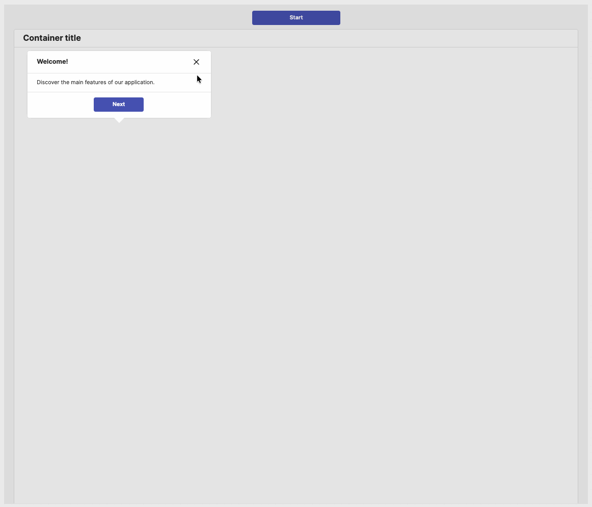
I updated my hack to create a Walkthrough component, using modals. This way, it’s more robust on different screen sizes and solves other issues.
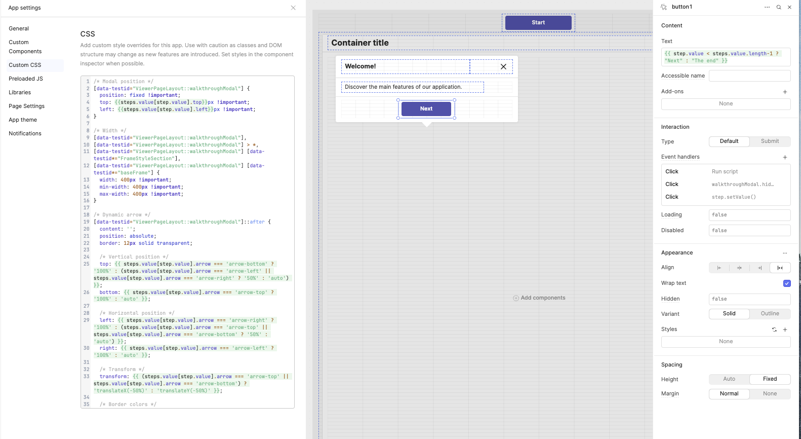
Here’s the CSS code
/* Modal position */
[data-testid="ViewerPageLayout::walkthroughModal"] {
  position: fixed !important;
  top: {{steps.value[step.value].top}}px !important;
  left: {{steps.value[step.value].left}}px !important;
}

/* Width */
[data-testid="ViewerPageLayout::walkthroughModal"],
[data-testid="ViewerPageLayout::walkthroughModal"] > *,
[data-testid="ViewerPageLayout::walkthroughModal"] [data-testid*="FrameStyleSection"],
[data-testid="ViewerPageLayout::walkthroughModal"] [data-testid*="baseFrame"] {
  width: 400px !important;
  min-width: 400px !important;
  max-width: 400px !important;
}

/* Dynamic arrow */
[data-testid="ViewerPageLayout::walkthroughModal"]::after {
  content: '';
  position: absolute;
  border: 12px solid transparent;

  /* Vertical position */
  top: {{ steps.value[step.value].arrow === 'arrow-bottom' ? '100%' : (steps.value[step.value].arrow === 'arrow-left' || steps.value[step.value].arrow === 'arrow-right' ? '50%' : 'auto') }};
  bottom: {{ steps.value[step.value].arrow === 'arrow-top' ? '100%' : 'auto' }};

  /* Horizontal position */
  left: {{ steps.value[step.value].arrow === 'arrow-right' ? '100%' : (steps.value[step.value].arrow === 'arrow-top' || steps.value[step.value].arrow === 'arrow-bottom' ? '50%' : 'auto') }};
  right: {{ steps.value[step.value].arrow === 'arrow-left' ? '100%' : 'auto' }};

  /* Transform */
  transform: {{ (steps.value[step.value].arrow === 'arrow-top' || steps.value[step.value].arrow === 'arrow-bottom') ? 'translateX(-50%)' : 'translateY(-50%)' }};

  /* Border colors */
  border-top-color: {{ steps.value[step.value].arrow === 'arrow-bottom' ? '#fff' : 'transparent' }};
  border-bottom-color: {{ steps.value[step.value].arrow === 'arrow-top' ? '#fff' : 'transparent' }};
  border-left-color: {{ steps.value[step.value].arrow === 'arrow-right' ? '#fff' : 'transparent' }};
  border-right-color: {{ steps.value[step.value].arrow === 'arrow-left' ? '#fff' : 'transparent' }};
}

/* Overlay background */
[data-testid="ViewerPageLayout::ModalOverlay"] {
  background-color: rgba(0, 0, 0, 0.2) !important;
}
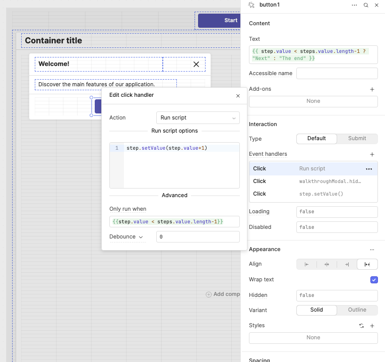
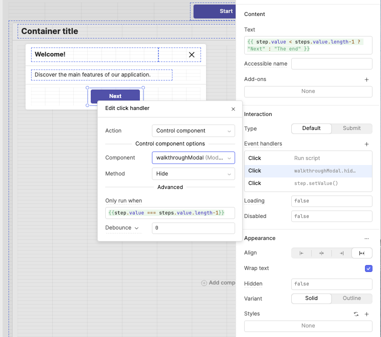
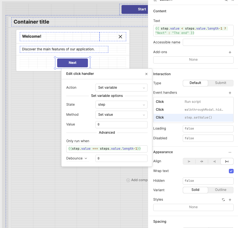
Name the modal ‘walkthroughModal’
Create the steps
[
  {
    id: 1,
    title: "Welcome!",
    content: "Discover the main features of our application.",
    top: 100,
    left: 50,
    arrow: "arrow-bottom"
  },
  {
    id: 2,
    title: "Navigation",
    content: "Use the sidebar to access different sections.",
    top: 150,
    left: 250,
    arrow: "arrow-right"
  },
  {
    id: 3,
    title: "Settings",
    content: "Customize the interface to your needs.",
    top: 250,
    left: 250,
    arrow: "arrow-top"
  },
  {
    id: 4,
    title: "Review",
    content: "Check your configuration one last time.",
    top: 250,
    left: 450,
    arrow: "arrow-left"
  },
  {
    id: 5,
    title: "All Done!",
    content: "You're ready to go. Click 'Finish' to start.",
    top: 350,
    left: 250,
    arrow: "arrow-left"
  }
]
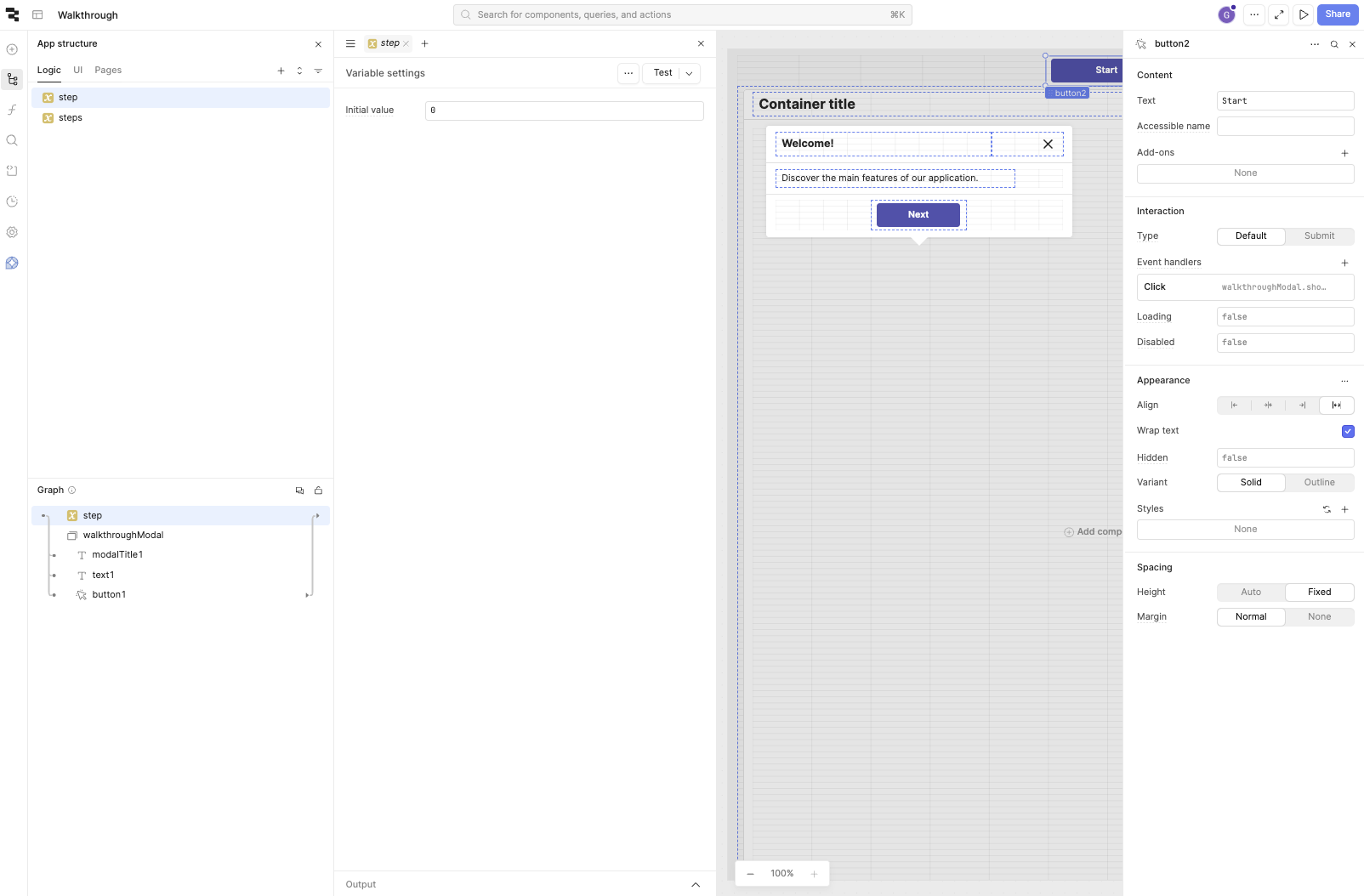
and the step value @ 0
Here are the screenshots