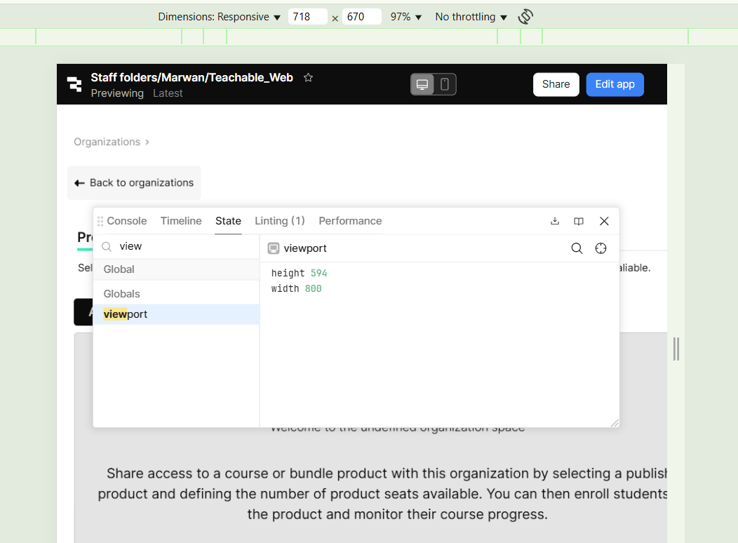
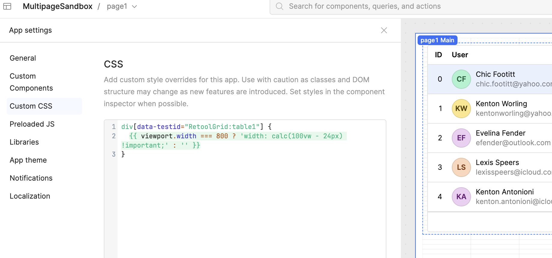
We are building a responsive web app using retool utilizing the web/mobile views and their canvas.
There is an issue where the viewport.width value is not appropriately changing in the screen width range between 600-800 px..causing the containers not to adapt to the fill actions since the width is not changing and that breaks the responsiveness in this width range.
Screenshot using the responsive screen width option showing the actual width to be 718px but the viewport width is stuck at 800px.