How to use buttons as tabs for a slicker UI, from our UI sessions Buttons post, which you can read in full here.
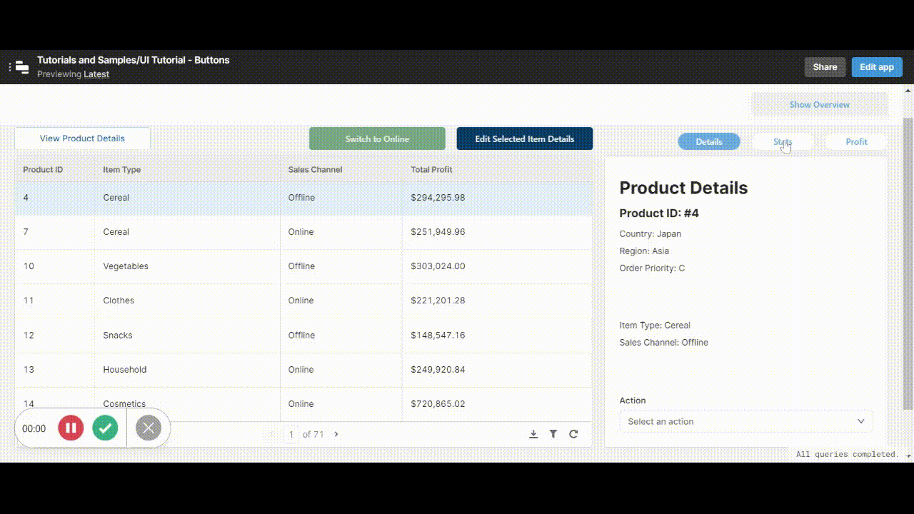
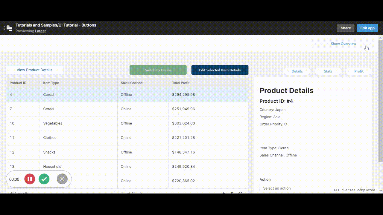
The tabbed container component - while useful - is not exactly the prettiest. In fact, we don’t really like the appearance of the standard tabs at all. This is why we’ve created a snazzy (albeit more complicated) way of switching tabs using buttons instead of ordinary tabs! This is how it looks:
Here’s how to use this trick yourself:
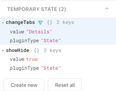
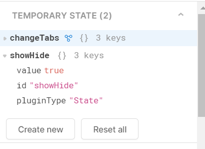
First create a temp state (by clicking ‘Create New’ under Temporary State in the left panel) and label it for clarity:
Then insert your tab buttons and name them accordingly.
Note: we don’t use a button group here simply because the component itself is not very responsive for different screen sizes, and we want our buttons to always remain in line to make their function clear. If using a button group - you simply need to follow the event handlers step and skip the temp states)
Now you want each button to change the value of the temp state on click - to do this you’ll use the event handlers within the button component. First create an event handler that selects the relevant tab when the button is clicked, like below:
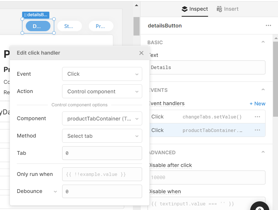
So now, when the button is clicked, it will control the tabbed container and switch the tab to ‘0’ (the details tab).
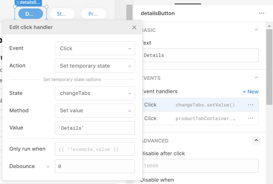
Then, add another event handler that sets the temp state value:
You’ll use this event handler to change the color of the button according to which is selected, using the code below:
Background:
{{changeTabs.value == 'Details' ? "#67AAE4" : "#FFFFFF"}}
Label:
{{changeTabs.value == 'Details' ? "#FFFFFF" : "#67AAE4"}}
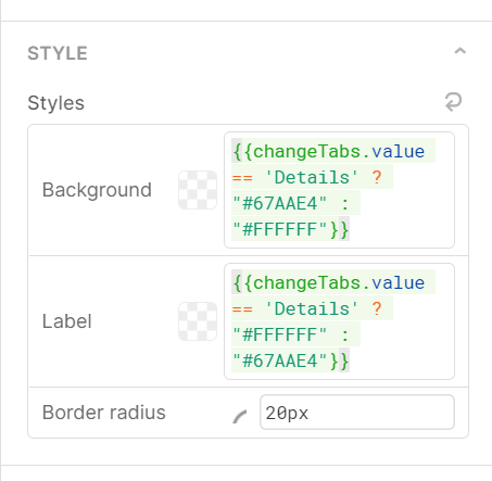
This ternary will set the color to blue text on white when the button/tab is not selected, and white text on blue when that button and tab is selected.
Do this exact process to each of your buttons and tabs, only changing the temp state to an appropriate, unique value each time.
Once that is complete, make sure to set the default value of your temp state (in the left-hand column, click the ‘Temporary State’ you created and change this value in the right-hand column) to the tab you would like the app to open on.

And with that you are done creating more beautiful, and more customizable, buttons for your tabbed container!
Buttons in Place of Switches
Switches (or toggles) are handy for true/false values, but they don’t always make the most sense when it comes to certain UI functions, where the switch doesn’t naturally indicate whether something is on or off. An example is a show/hide container function, where the button changes dynamically to change the action. Here’s how it looks in practice:
Like the buttons in place of tabs, this works using temp states to indicate whether the action is true/false or on/off (or even multiple options).
First, like above, create a temp state (by clicking ‘Create New’ under Temporary State in the left panel) and label it for clarity:
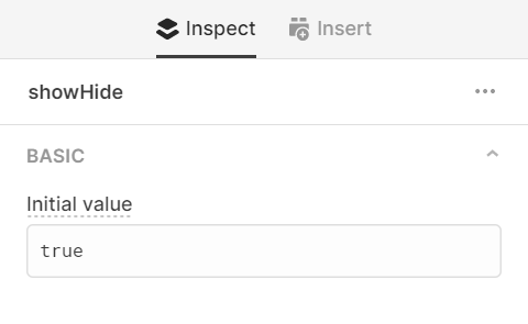
Set the state’s default value by selecting it in the left-hand panel and editing it in the right-hand panel, in our case we wanted it set to ‘true’.
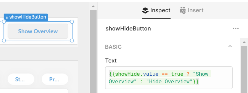
Next to whatever components you wish to show or hide, add a button. In the button text section add a ternary that changes the button text dynamically according to the value of the temp state:
Then add two Event Handlers which sets the value of the temporary state to true and false, back and forth, by basically completing the opposite action, as below:
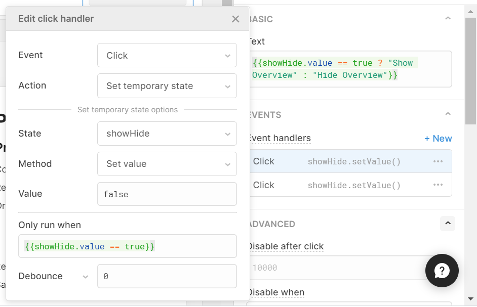
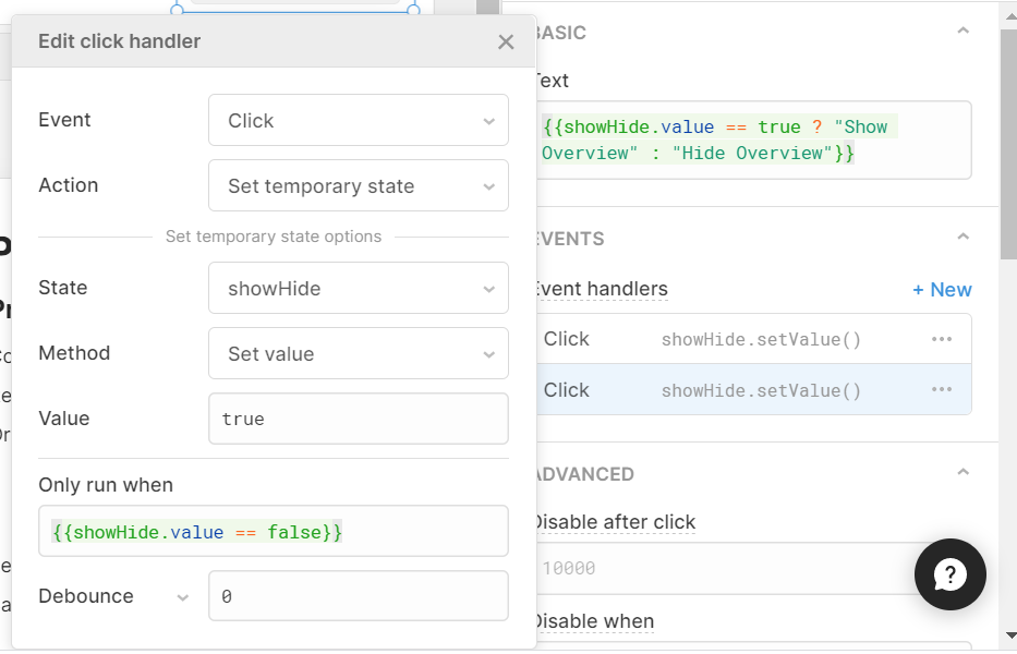
Essentially, the first event handler sets the value to false (the default is true) on click, but will only do so if the temp state is currently set to true, and the second event handler sets it back to true on a second click (again only if the temp state is currently false - to create a cycle).
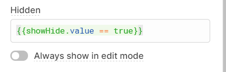
Once this is done, you just need to set the relevant components to hide, by adding this to your ‘Hidden’ value box (where showHide.value is the temp state):
This true/false button in place of a switch creates an intuitive action with a slicker UI than a toggle.
Read more tips in the full post here.