Tip #3 from our UI session focusing on buttons, which gives some tips, tricks and best practises for using the button component in Retool - read more on our site.
3. Use colour and shape effectively.
It’s a well-known tactic in marketing UI to use color to draw attention to the key action buttons which convert to sales - but this concept is not reserved for marketing alone, it can be really useful in internal apps too! By using color intentionally, developers can aid productivity by guiding users to the correct or important actions.
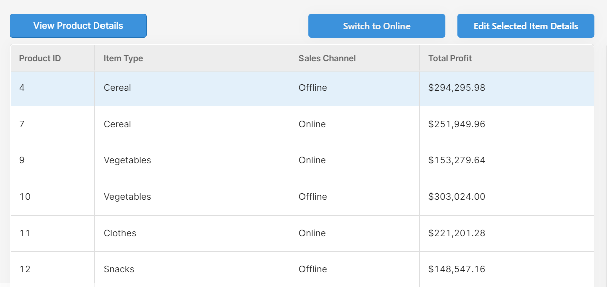
We’ve seen many Retool apps defaulting religiously to the blue button that Retool provides as standard - and not only is this (sorry) really quite boring for the user, it also means that you are relying too heavily on the text of each action button. This means that your user needs to read (or remember the position of) each button before clicking, which can slow productivity, and once again, lead to silly mistakes. Color here helps to give the user some clues as to what each button does to speed up the processes within the app.
To illustrate, compare the two UIs here:
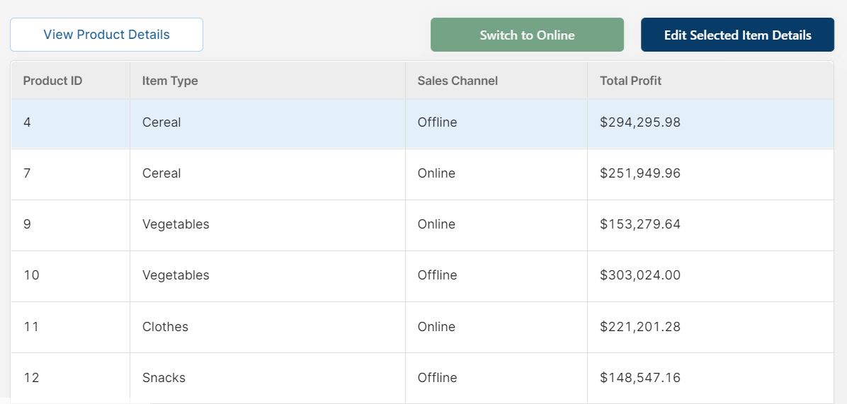
The simple changes to button color have made the actions much clearer and easier to discern: the associated green/red of online/offline for our dynamic button helps indicate the kind of action that takes place. Then, the action of ‘Edit Selected Item Details’ (which is a key process for this app) is in a darker color to indicate its dominance and importance as an action, and the ‘View Product Details’ (which is a lesser-used, secondary action) uses an inverted white/blue color scheme to make it more subtle and allow the user to focus on the key action buttons instead.
Here is another example of using dominant and then inverted colors to indicate key action versus secondary actions with our save/submit buttons:
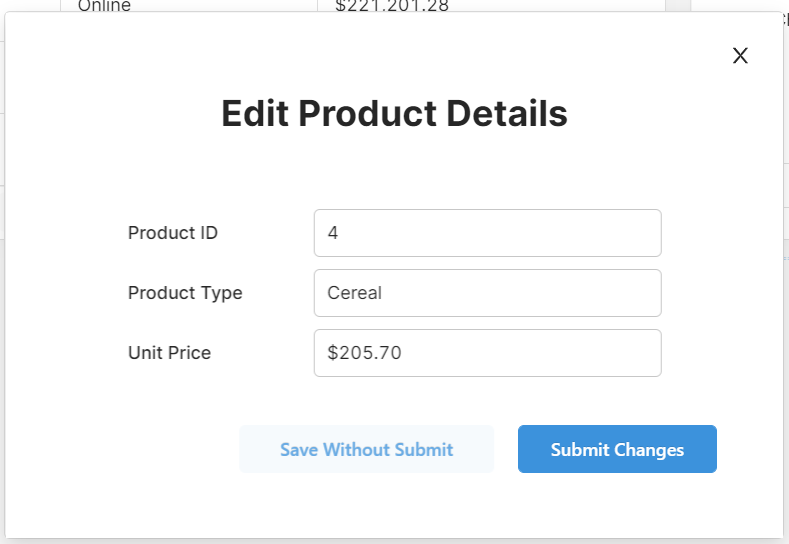
This simple change guides the user towards the most commonly used or important button.
On a similar note, you can also use the button shapes to differentiate between button types. In our app, we use buttons to switch between tabs in a container, but these buttons are less important than the action buttons for the data. So we changed the shape of each to reflect that difference:
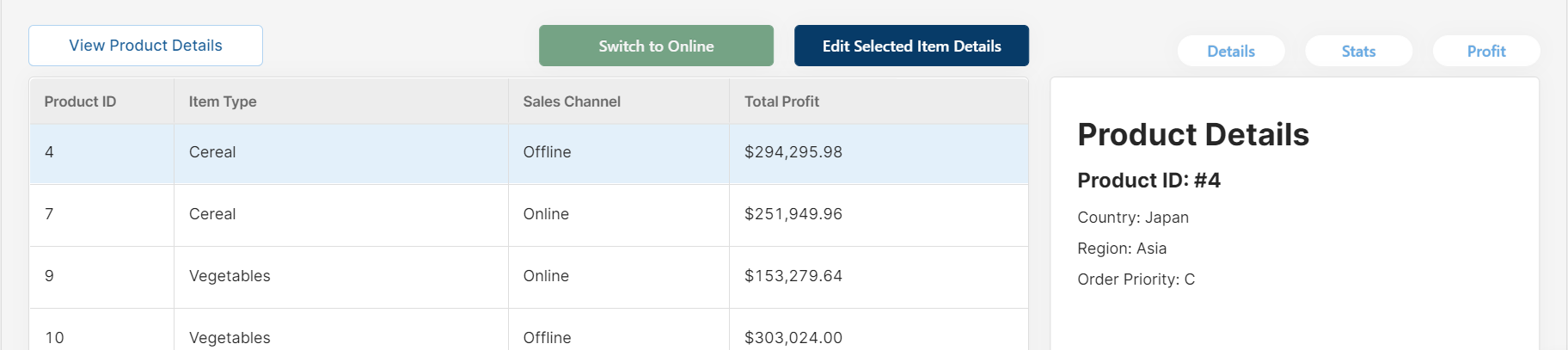
Although it may seem subtle and perhaps inconsequential, small details such as these can guide the user to the correct action buttons quicker and avoid confusion.
To summarize this section (and give you some extra ideas), here are some of our top tips for tactical button design:
- Use darker colours for the most used or most important actions to guide your user’s attention towards it
- Use more toned down or inverted colours (e.g. blue text on white background) for less important or secondary action buttons to maintain focus on key actions
- If relevant, use colors such as green for actions such as ‘Go’, ‘Validate’, ‘Submit’, ‘On’ etc and red for actions such as ‘Delete’, ‘Stop’, ‘Reject’, to give the user a clue before reading the button (people react to color quicker than they can read text!)
- You can also use Emojis to enhance the meaning of the text on the button, such as alert sirens (
 ) for delete buttons or risky actions
 - Use button shape to differentiate between action buttons and buttons that interact with the UI, such as tabs
Read the full post here.