I am looking to take a list of activities and users from a calendar and pivot the data like a gantt chart. I'd like each scheduled meeting type to have a distinct color. Has anyone done this/does anyone have any advice on how this can be achieved?
Unfortunately there's not an easy answer here yet that I've found.
You can sorta hack the native chart component (which is Plotly.js with some neat helpers) to display a scatter plot that mimics a gantt. The setup is easy in the sense that it's already in Retool but creating the chart data from your raw data would require some creativity and JS knowledge. Here's an example: https://codepen.io/nite/pen/arwozr
The other option is a library like DHTMLX (https://docs.dhtmlx.com/). They offer a free version that can be imported/used in Retool as a custom component. There's some setup work involved (and I'm happy to share a sample app if you'd like) but once you have your script added you can pretty easily add new gantt tasks as objects from the DB with a little bit of transformation.
1 Like
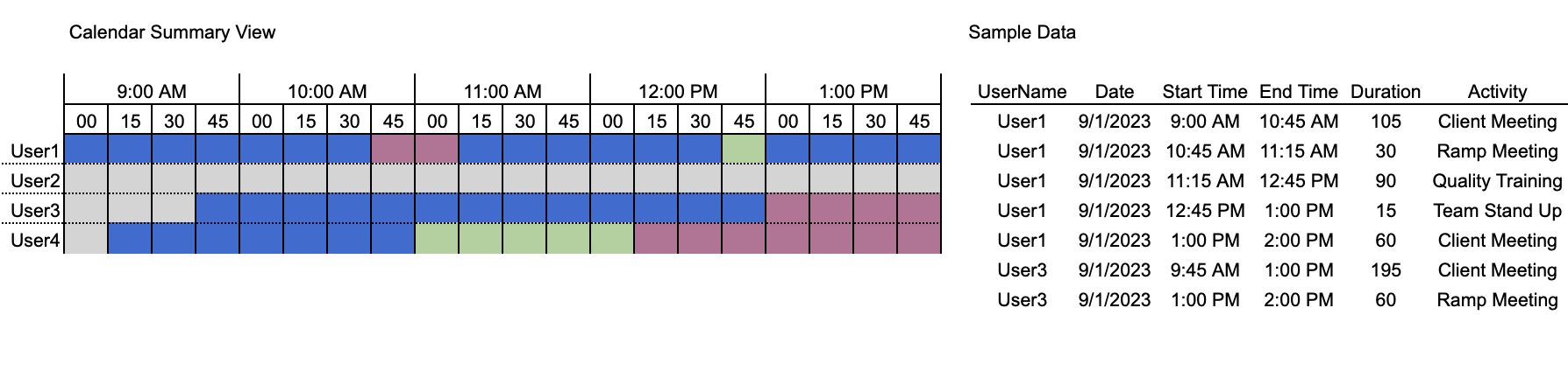
@MTR we have a new Timeline component that might be a good fit here: Introducing the new Timeline component
Read the docs here: Getting started with the Timeline component | Retool Docs
1 Like