Hi,
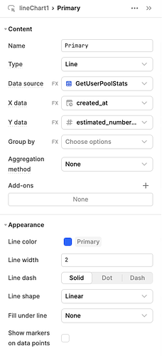
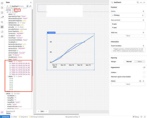
I am trying to create a simple line graph with dates on the x-axis and number of users on the y-axis.
The main bit of the line graph shows up correctly, however, there looks to be a sort of line of best fit showing as well. Is there a way to turn this off? It is very annoying.


