-
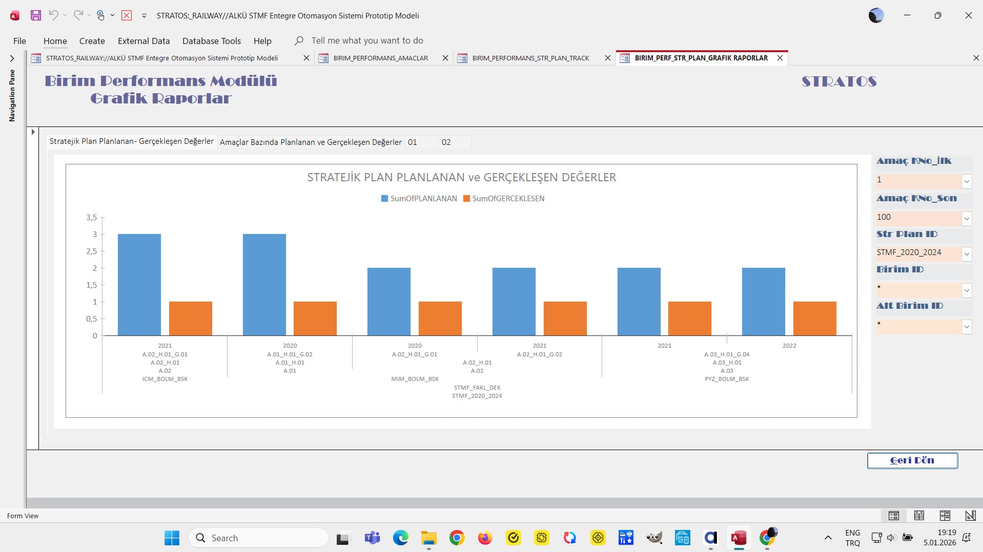
My goal: to have a plotly JSON chart that is similar to the ms access chart I uploaded
-
Issue: AI tried to help, but no solution, I have 7 levels on X axis
-
Steps I've taken to troubleshoot: data is retrieved from supabase postgre, no problem
-
Additional info: (Cloud or Self-hosted, Screenshots)
1 Like
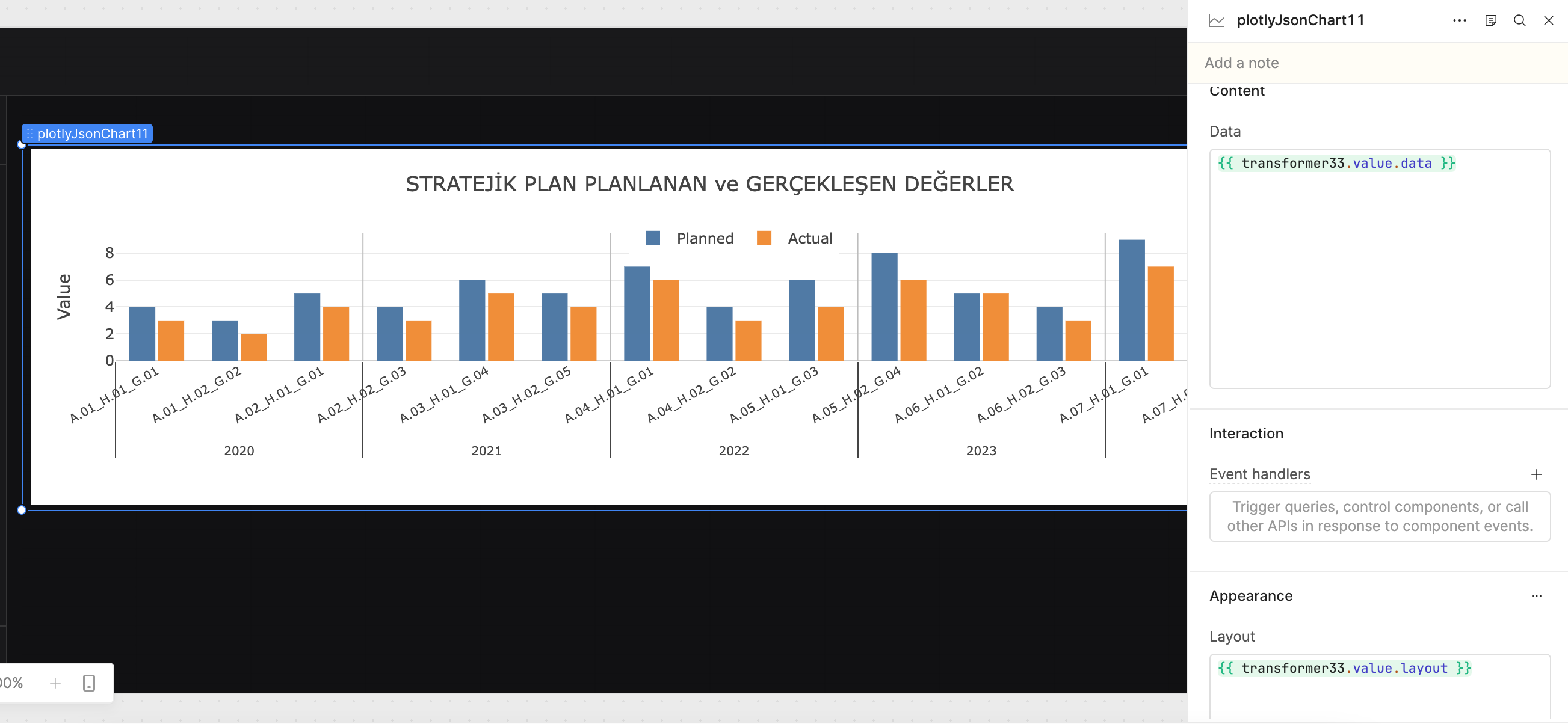
Hey @alaattinkanoglu , Welcome to the Retool Community!
I understand you're trying to replicate a multi-level MS Access chart inside Retool using the Plotly JSON chart component. I tried to reproduce a similar structure using mock data and a transformer, and I was able to get very close to the Access-style layout (including grouped years and multi-category X-axis).
Below is the approach I used.
Step 1: Mock Data (for testing)
I used structured mock data that mimics your hierarchy:
- Year
- Objective
- Sub Objective
- Unit
- Sub Unit
- Plan
- Strategy Plan
- Planned vs Actual values
return [
  // ================= 2020 =================
  {
    year: "2020",
    objective: "A.01_H.01_G.01",
    sub_objective: "A.01_H.01",
    unit: "A.01",
    sub_unit: "ICM_BOLM_BSK",
    plan: "STR_PLAN_ALPHA",
    strategy_plan: "STMF_2020_2024",
    planned: 4,
    actual: 3,
  },
  {
    year: "2020",
    objective: "A.01_H.02_G.02",
    sub_objective: "A.01_H.02",
    unit: "A.01",
    sub_unit: "ICM_BOLM_BSK",
    plan: "STR_PLAN_ALPHA",
    strategy_plan: "STMF_2020_2024",
    planned: 3,
    actual: 2,
  },
  {
    year: "2020",
    objective: "A.02_H.01_G.01",
    sub_objective: "A.02_H.01",
    unit: "A.02",
    sub_unit: "MIM_BOLM_BSK",
    plan: "STR_PLAN_BETA",
    strategy_plan: "STMF_2020_2024",
    planned: 5,
    actual: 4,
  },

  // ================= 2021 =================
  {
    year: "2021",
    objective: "A.02_H.02_G.03",
    sub_objective: "A.02_H.02",
    unit: "A.02",
    sub_unit: "MIM_BOLM_BSK",
    plan: "STR_PLAN_BETA",
    strategy_plan: "STMF_2020_2024",
    planned: 4,
    actual: 3,
  },
  {
    year: "2021",
    objective: "A.03_H.01_G.04",
    sub_objective: "A.03_H.01",
    unit: "A.03",
    sub_unit: "PYZ_BOLM_BSK",
    plan: "STR_PLAN_GAMMA",
    strategy_plan: "STMF_2020_2024",
    planned: 6,
    actual: 5,
  },
  {
    year: "2021",
    objective: "A.03_H.02_G.05",
    sub_objective: "A.03_H.02",
    unit: "A.03",
    sub_unit: "PYZ_BOLM_BSK",
    plan: "STR_PLAN_GAMMA",
    strategy_plan: "STMF_2020_2024",
    planned: 5,
    actual: 4,
  },

  // ================= 2022 =================
  {
    year: "2022",
    objective: "A.04_H.01_G.01",
    sub_objective: "A.04_H.01",
    unit: "A.04",
    sub_unit: "INS_BOLM_BSK",
    plan: "STR_PLAN_DELTA",
    strategy_plan: "STMF_2020_2024",
    planned: 7,
    actual: 6,
  },
  {
    year: "2022",
    objective: "A.04_H.02_G.02",
    sub_objective: "A.04_H.02",
    unit: "A.04",
    sub_unit: "INS_BOLM_BSK",
    plan: "STR_PLAN_DELTA",
    strategy_plan: "STMF_2020_2024",
    planned: 4,
    actual: 3,
  },
  {
    year: "2022",
    objective: "A.05_H.01_G.03",
    sub_objective: "A.05_H.01",
    unit: "A.05",
    sub_unit: "FIN_BOLM_BSK",
    plan: "STR_PLAN_EPSILON",
    strategy_plan: "STMF_2022_2026",
    planned: 6,
    actual: 4,
  },

  // ================= 2023 =================
  {
    year: "2023",
    objective: "A.05_H.02_G.04",
    sub_objective: "A.05_H.02",
    unit: "A.05",
    sub_unit: "FIN_BOLM_BSK",
    plan: "STR_PLAN_EPSILON",
    strategy_plan: "STMF_2022_2026",
    planned: 8,
    actual: 6,
  },
  {
    year: "2023",
    objective: "A.06_H.01_G.02",
    sub_objective: "A.06_H.01",
    unit: "A.06",
    sub_unit: "HR_BOLM_BSK",
    plan: "STR_PLAN_ZETA",
    strategy_plan: "STMF_2022_2026",
    planned: 5,
    actual: 5,
  },
  {
    year: "2023",
    objective: "A.06_H.02_G.03",
    sub_objective: "A.06_H.02",
    unit: "A.06",
    sub_unit: "HR_BOLM_BSK",
    plan: "STR_PLAN_ZETA",
    strategy_plan: "STMF_2022_2026",
    planned: 4,
    actual: 3,
  },

  // ================= 2024 =================
  {
    year: "2024",
    objective: "A.07_H.01_G.01",
    sub_objective: "A.07_H.01",
    unit: "A.07",
    sub_unit: "IT_BOLM_BSK",
    plan: "STR_PLAN_THETA",
    strategy_plan: "STMF_2022_2026",
    planned: 9,
    actual: 7,
  },
  {
    year: "2024",
    objective: "A.07_H.02_G.02",
    sub_objective: "A.07_H.02",
    unit: "A.07",
    sub_unit: "IT_BOLM_BSK",
    plan: "STR_PLAN_THETA",
    strategy_plan: "STMF_2022_2026",
    planned: 6,
    actual: 5,
  },
  {
    year: "2024",
    objective: "A.08_H.01_G.03",
    sub_objective: "A.08_H.01",
    unit: "A.08",
    sub_unit: "LOJ_BOLM_BSK",
    plan: "STR_PLAN_OMEGA",
    strategy_plan: "STMF_2022_2026",
    planned: 7,
    actual: 6,
  },
];
(You can replace this with your Supabase/Postgres data once validated.)
Step 2: Transformer for Plotly Structure
Then I created a transformer to:
- Map each hierarchy level
- Build a
multicategoryX-axis - Generate vertical separators between year groups
- Return a fully formatted Plotly config object
const dataSource = {{ transformer32.value}} || [];

if (!Array.isArray(dataSource) || dataSource.length === 0) {
  return {
    data: [],
    layout: { title: { text: "No data available" } },
  };
}

const year = dataSource.map((d) => d.year);
const objective = dataSource.map((d) => d.objective);
const subObjective = dataSource.map((d) => d.sub_objective);
const unit = dataSource.map((d) => d.unit);
const subUnit = dataSource.map((d) => d.sub_unit);
const plan = dataSource.map((d) => d.plan);
const strategyPlan = dataSource.map((d) => d.strategy_plan);
const planned = dataSource.map((d) => d.planned);
const actual = dataSource.map((d) => d.actual);
const shapes = [];
for (let i = 1; i < year.length; i++) {
  if (year[i] !== year[i - 1]) {
    shapes.push({
      type: "line",
      xref: "x",
      yref: "paper",
      x0: i - 0.5,
      x1: i - 0.5,
      y0: 0,
      y1: 1,
      line: {
        color: "#BDBDBD",
        width: 1,
      },
    });
  }
}

return {
  data: [
    {
      type: "bar",
      name: "Planned",
      x: [year, objective, subObjective, unit, subUnit, plan, strategyPlan],
      y: planned,
      marker: { color: "#4E79A7" },
    },
    {
      type: "bar",
      name: "Actual",
      x: [year, objective, subObjective, unit, subUnit, plan, strategyPlan],
      y: actual,
      marker: { color: "#F28E2B" },
    },
  ],

  layout: {
    barmode: "group",
    bargap: 0.3,
    bargroupgap: 0.1,
    autosize: true,

    height: 500,

    margin: {
      l: 70,
      r: 30,
      t: 70,
      b: 120,
    },

    title: {
      text: "STRATEJİK PLAN PLANLANAN ve GERÇEKLEŞEN DEĞERLER",
      x: 0.5,
      xanchor: "center",
    },

    xaxis: {
      type: "multicategory",
      tickangle: -30,
      tickfont: { size: 10 },
      showgrid: false,
      automargin: true,
    },

    yaxis: {
      title: "Value",
      gridcolor: "#EAEAEA",
      zerolinecolor: "#CFCFCF",
      rangemode: "tozero",
    },

    legend: {
      orientation: "h",
      y: 1.1,
      x: 0.5,
      xanchor: "center",
    },

    hovermode: "x unified",
    shapes: shapes,
  },

  config: {
    responsive: true,
    displaylogo: false,
  },
};
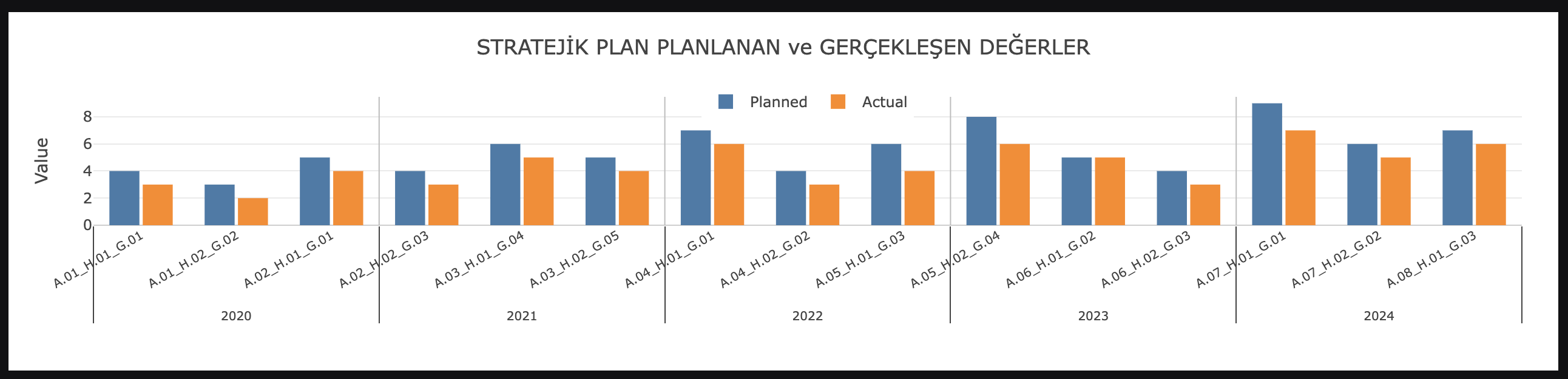
Screenshots of My Implementation
If you’re still facing a specific visual issue (alignment, spacing, grouping, performance), feel free to share:
- A screenshot of your current chart
- A sample of your real query output
Happy to help refine it further.
Thanks for the solution, I appreciate the effort. However, as shown in the chart, the result currently supports only two levels, not the seven levels I need.
Also, this approach requires additional custom code. One of the main reasons I chose Retool was its positioning as a low-code platform for building UIs, so needing this much extra logic feels a bit counter to that expectation.
In addition, the built-in AI assistant has not been very helpful in my experience for more complex cases.
Finally, while the charting features look powerful, some simple behaviors are hard to reason about. For example, choosing or not choosing “sum” as the aggregation method changes label behavior in ways that are not very intuitive.
1 Like
@alaattinkanoglu Thank you for sharing your thoughts — I completely understand where you're coming from.
You're right that the standard Retool chart component works best for simpler groupings, and once we move into deeper hierarchies like a 7-level structure, its limitations start to show. That’s why I suggested the Plotly JSON approach — it gives us more flexibility and control, even though it does require a bit of additional configuration.
I also appreciate your point about choosing Retool as a low-code platform. For most UI and dashboard use cases, it works very smoothly. However, more advanced visualizations sometimes require stepping slightly outside the purely “drag-and-drop” experience to achieve the exact structure needed.
Regarding the aggregation behavior you mentioned, I agree — some of the built-in chart settings (like “sum”) can affect labels and grouping in ways that aren’t always intuitive.
I’m happy to adjust the approach or explore alternatives if that would feel more aligned with what you’re looking for. Let me know how you’d like to proceed.