-
Goal: I'm trying to render data with a heatmap
-
Steps: I've tried changing around my heat axes and data to no avail
-
Details:
I have a table with raw data. I then have a query, that simply selects all the data. It's a cohort analysis table. There are 3 columns I care about: cohort_month, months_since_cohort (ie: how long it's been since the cohort), and some financial metric like revenue retention
The maximum value for months_since_cohort is 26 but the heatmap is rendering a value of 300+

If I inspect the state I see the following
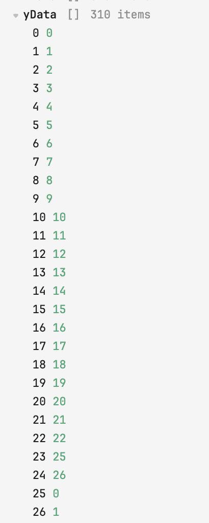
It seems that the size/length of the y data is being used for rendering rather than the unique values in there.
I'm confident the data in my dataset is complete and not malformed.
