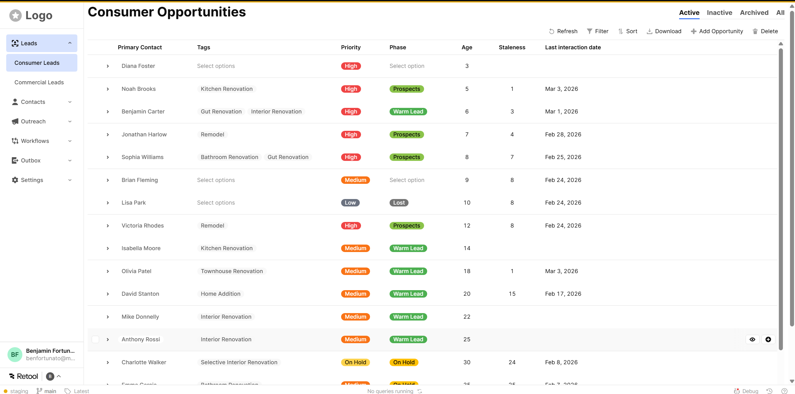
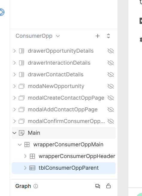
I have a pretty typical design pattern, sidebar nav with a table and some tools bar items at the top. I'm having trouble getting a clean layout with server-side pagination where the tools stay at the top and the pagination stays at the bottom.
Are there any examples of this pattern I can take a look at?
- My goal: I would like to get a table with the pagination on the bottom and the toolbar at the top without any scrolling, this would involve setting the table to the viewport height and then dynamically adjusting the number of rows. Second best is getting the table component to scroll and fill the screen without any scroll bar on main I either get a table that is shorter than the viewport, sometimes I’m getting two scroll bars, or the table toolbar scrolls away as I scroll down.
- Issue: Retool does not seem to expose a viewport height prop. The grid layout is buggy and doesn’t snap to the bottom, screen sizes also change from computer to computer.
- Steps I've taken to troubleshoot: Tried creating a stack, but the Main component can only be grid based. Tried a bunch of different patterns, like making the table larger then the screen but then I get this wierd double scroll bar.
Hey @benjaminfortunato ,
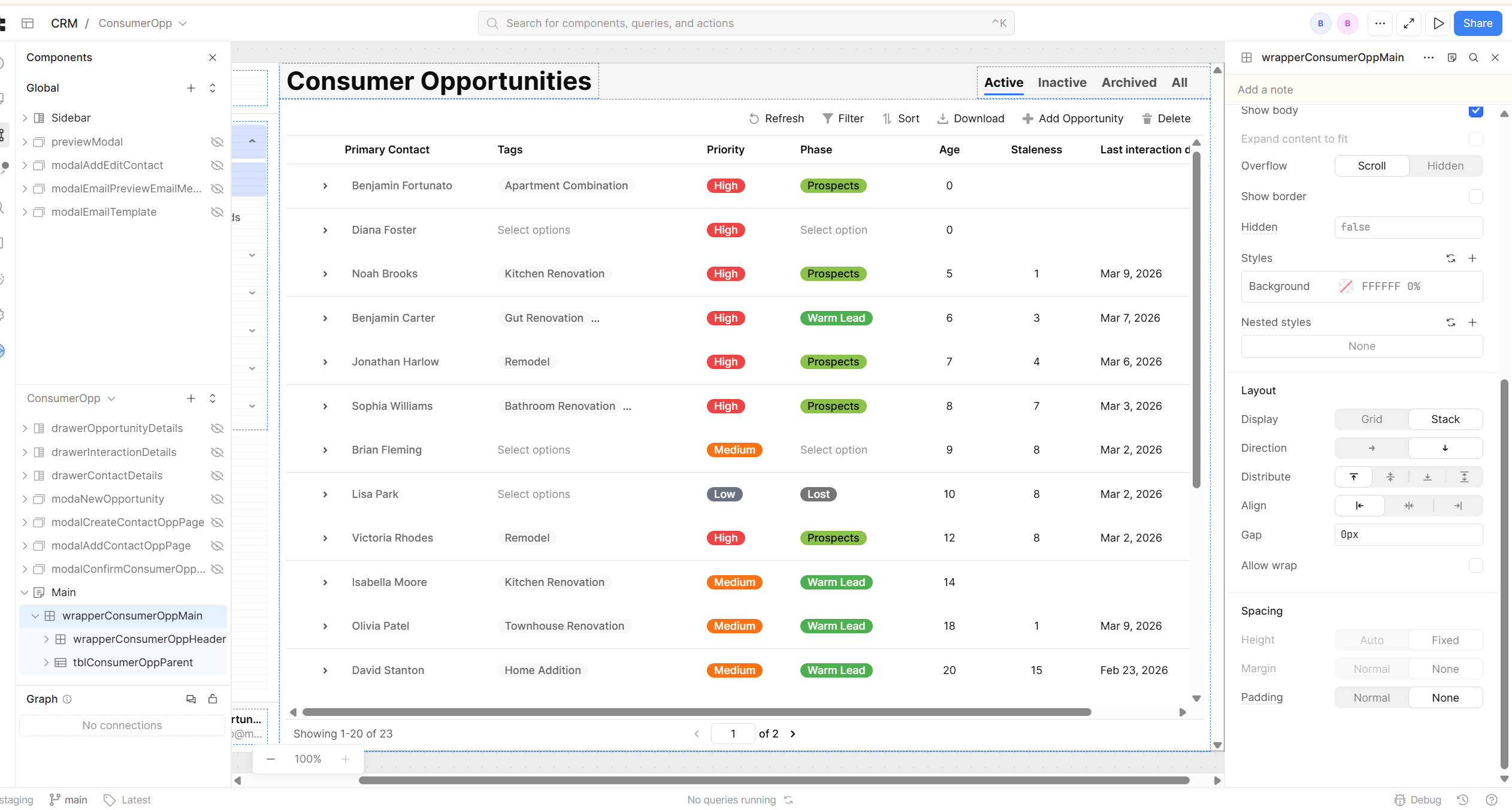
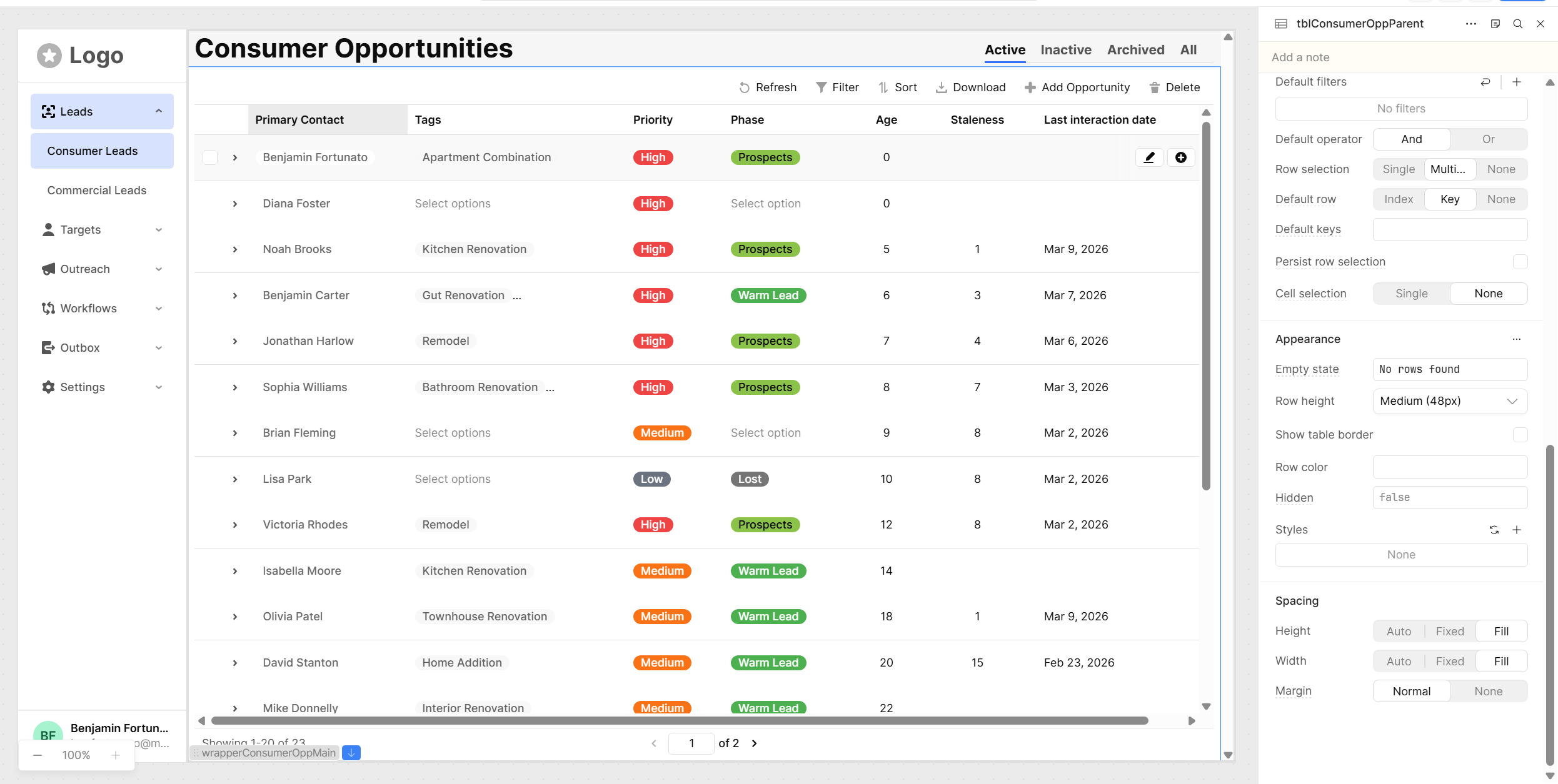
One solution I like to use for displaying tables in full screen is combining Expand to Fit on the main component with a stack. The stack's 'fill' option gives you the ability to adjust the table component to the full page height and width dynamically and you can use headers and footers to pin additional components (like your filters and action buttons) above or below the table.
I've made a simple example here (81.7 KB) to show you what I mean. Hope this helps!
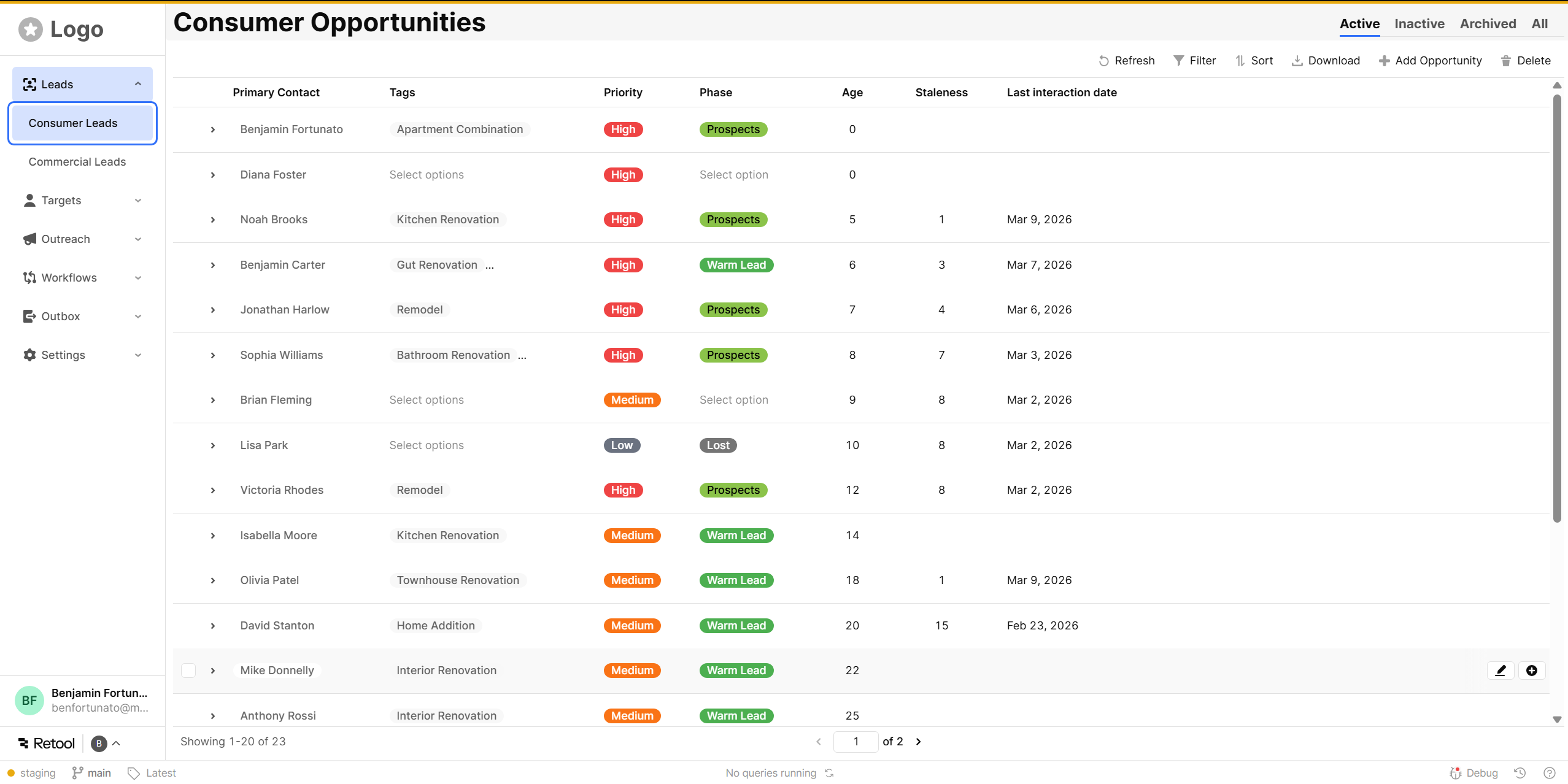
Thanks for getting back to me. I’m not sure what to do with the json, is that a retool file? I did get this to work just by using the ai assistant. I don’t know exactly what values it changed. I feel like it has access to some parts of the code that is not available to me on the front end. The way I would do this with code is to set a flexbox with vh 100% and then calculate the main height of the table by subtracting the height of any header from the 100vh - 80px for example.
After running the ai that main wrapper that is filling the screen has the height and width greyed out so I feel like it did something behind the scene to get this to work .
Glad you got something closer to what you were aiming for!
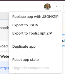
The json I attached is an export of my sample app. You can import it into a test app by replacing app with JSON/ZIP (click the ... button in the top right to see that option). You'd mentioned wanting to see an example of this pattern, so it's just a really simple example of how I achieve this functionality.
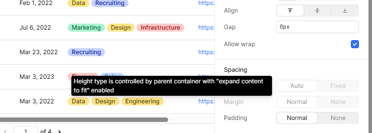
I expect the height option is grayed out because it's set the main container to expand to fit, I did the same in my setup and see this.
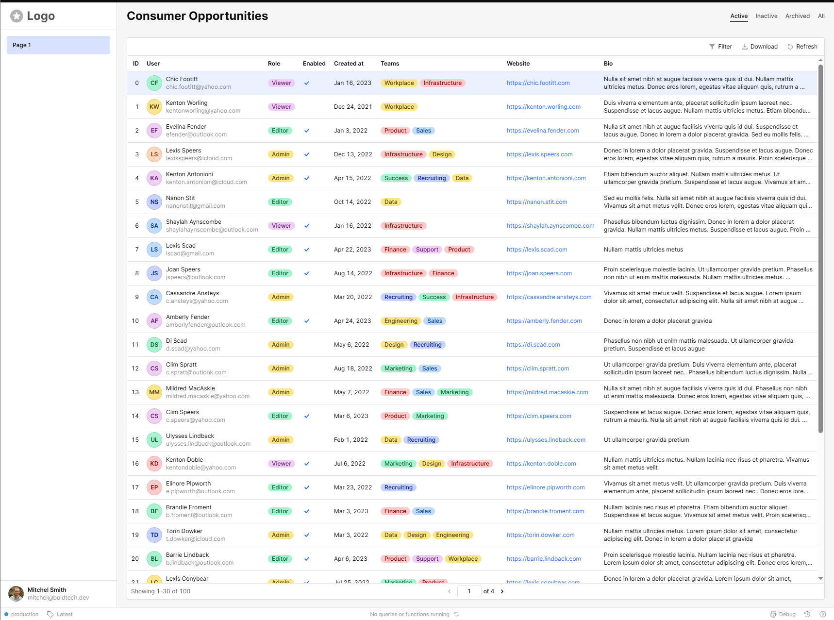
Just for reference, here's what mine looks like. I prefer the little bit of whitespace that nesting the stack gives me, but it's overall very close to what the AI assistant seems to have kicked out for you.