I think I have a solution for this that I have been using in my apps...
So I have an ultrawide monitor with over 2000 pixels in width. This leads to a weird layout when I set the max-width to a pixel value, and not a percentage.
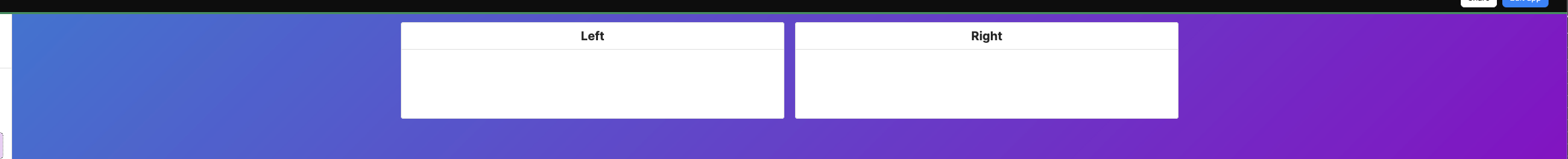
So here is the page at 100% width
That is as expected
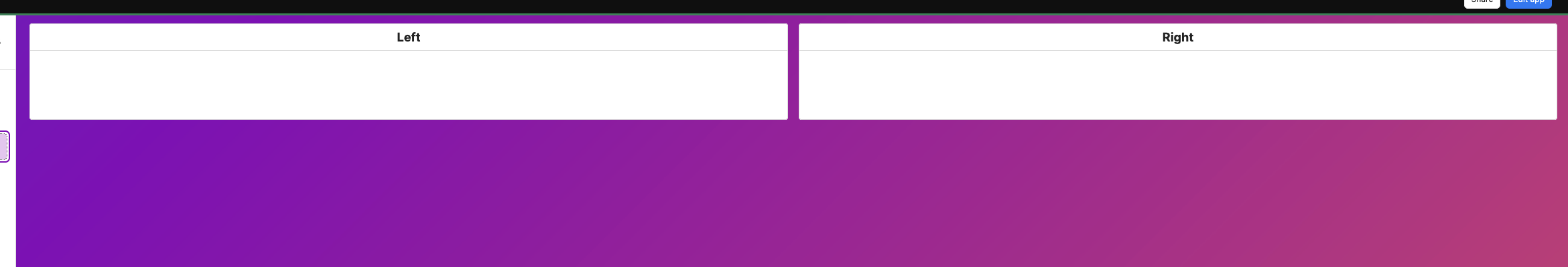
Then I set my max-width to 1440px which I like, but that makes the layout awkward...
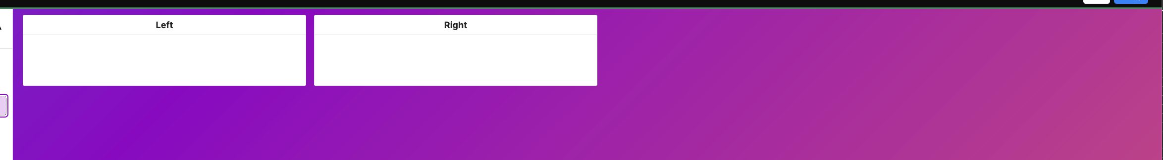
My solution is to use this CSS to override the gutters, calculated from the width I set in the app. 
main div[data-testid="ViewerPageLayout::ScrollContainer"] {
  --total-gutter: calc(var(--retool-canvas-container-width) - var(--retoolCanvasAppTemplateMaxWidth));
  --gutter-width: calc(var(--total-gutter) / 2);
  padding-left: var(--gutter-width) !important;
  padding-right: var(--gutter-width) !important;
}
Tada!