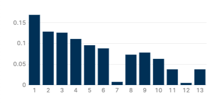
This seems like a simple feature, but I can't for the life of me figure out how to change the maximum range for the y-axis on a chart. I'm charting percentages and the default y-axis range is making it look at a glance like these are all high percentages.
I assume this is updated by adding a JSON attribute, but those that I've tried after researching online didn't work. Please help!
Hey @bryan I think @KLP wrote about something similar in the filtering section here: Charting using PlotlyJS in Retool: Second Y-axis, Changing Date Formats, Filtering Chart Data by Date
It's not exact, but you could probably apply a similar concept to your data set - by limiting the collection given to the data attribute of your plotly chart
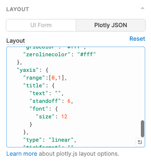
Figured out the solution basically immediately after I posted, of course....
I didn't realize there's a separate JSON for layout. Just have to add in range to the yaxis like so:
1 Like