Hi,
I'm not sure if this is a feature request, or there's something available that I'm missing.
Coming from a React/Bootstrap background I'm used to being able to adjust column allocation based on the width of the screen, so components can take advantage of larger screen realestate, but also collapse elegantly to a laptop.
For example have a container set up to take 8 columns on a laptop, but only 6 columns on a monitor.
As it stands I'm finding I have to make a choice between one or the other - ie take advantage or monitor width, or have the app usable on a laptop. But I want to have my cake and eat it 
Otherwise retool has been brilliant for my projects.
Thanks,
Ben
1 Like
Hey @BenCook  ,
,
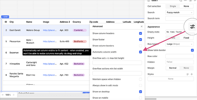
Happy to hear you're enjoying Retool! Can you share how you're currently setting the width? Do you have Automatic column width enabled?
Hi Abbey,
Thanks for the reply, and sorry for the confusion.
I'm talking general screen layout, not table columns.
Retool has the layout divided into 12 columns, and components must be set to take a specific number these columns to define their width.
Thank you so much for clarifying! Unfortunately, we do not support that feature at this time. It is a highly requested feature so stay tuned with new releases! 
Thanks Abbey, that would be amazing.
Probably the most significant limitation that I've come across compared to coding in React
(and I don't mean that as a criticism - I get that it won't be trivial to implement  )
)
1 Like
![]()
