Hi @kyleteal,
I tried with the Retool bar chart and only got as far as you. There doesn't seem to be a way to customize it showing all ticks. However, you can use a Plotly JSON Chart to get what you need.
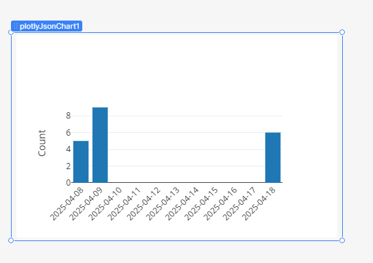
I set my data to:
[
  {
    "type": "bar",
    "x": {{ qcDates.data.x }},
    "y": {{ qcDates.data.y }}
  }
]
Then my appearance to :
{
  "xaxis": {
    "type": "category",
    "tickangle": -45
  },
  "yaxis": {
    "title": {
      "text": "Count"
    }
  },
  "margin": {
    "b": 80
  }
}