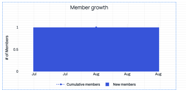
I only want the x-axis tick to appear where I have data. Here's a bad example:

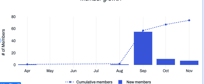
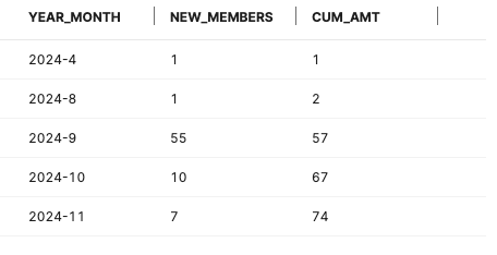
Here's a good example, with the same exact chart, just different data:
Here's the x-axis controls
I only want the x-axis tick to appear where I have data. Here's a bad example:


Here's a good example, with the same exact chart, just different data:


Here's the x-axis controls
Hmm it looks like we may need more settings here ![]() Does it work for you to set the
Does it work for you to set the Scale on the x-axis to "Category":

Yep that does fix it. However, I lose the label formatting and don't see a way to control it, so was hoping to find another fix.
True ![]() I'll keep you posted if we ship a new setting for this.
I'll keep you posted if we ship a new setting for this.
Technically, you can add a mapper to the x axis to set the preferred label with JS but it would also change the chart properties if you're referencing those anywhere
