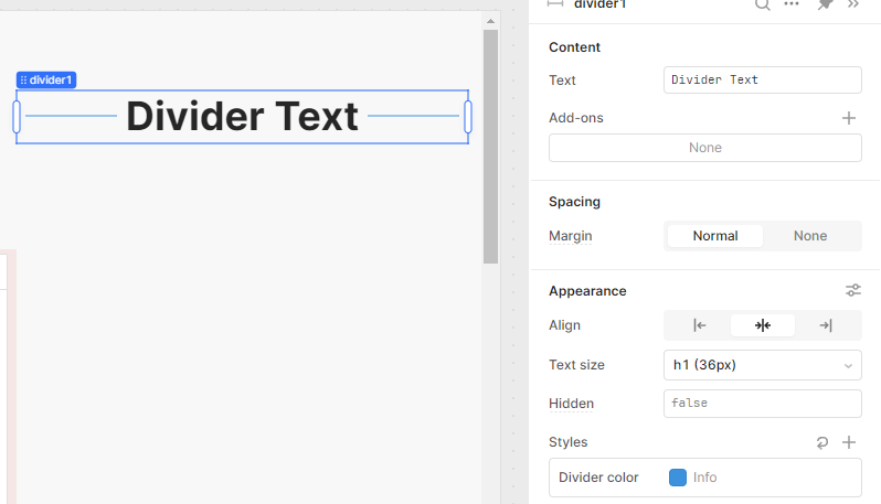
I had no clue you could add text to these things!! To be fair though, I mostly use dividers w hidden=true and place them at the top and bottom of containers. This lets me set height to auto even when they have no visible components.
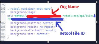
I needed a simple way to display child components on top of images and found setting the background-image for a container to a url (or base64 uri string) the easiest way.
this lets me do layouts like below where 'Launch' is a button and 'meet_cora' is a container.
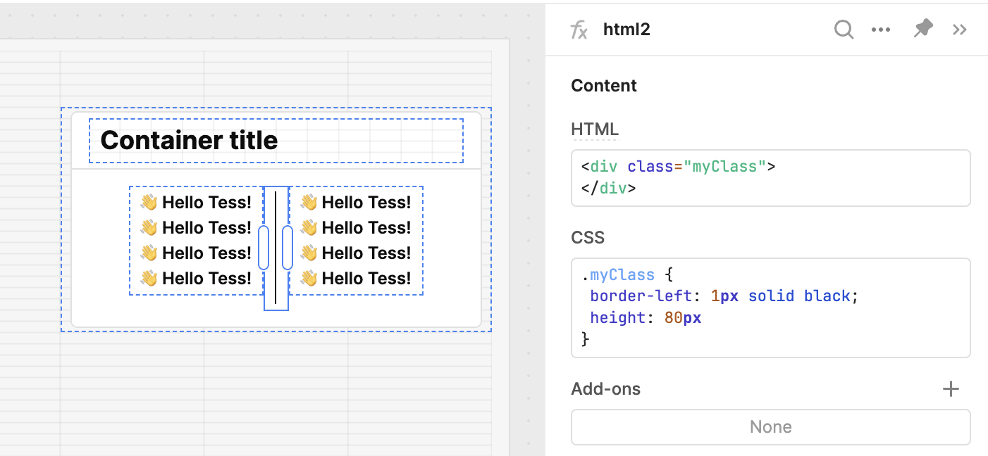
For separating vertical lists, I might work around this for now using a html component with a border (the stack container could also help with alignment)