I’m building a module that is a segmented form within a stepped container component that has a dynamic array of steps — with each step being an object that contains the contents for the current view.
In the current inspector options for the steps component, we have the following options for the alignment/spacing between each step in our steps component (highlighted w/ pink border):
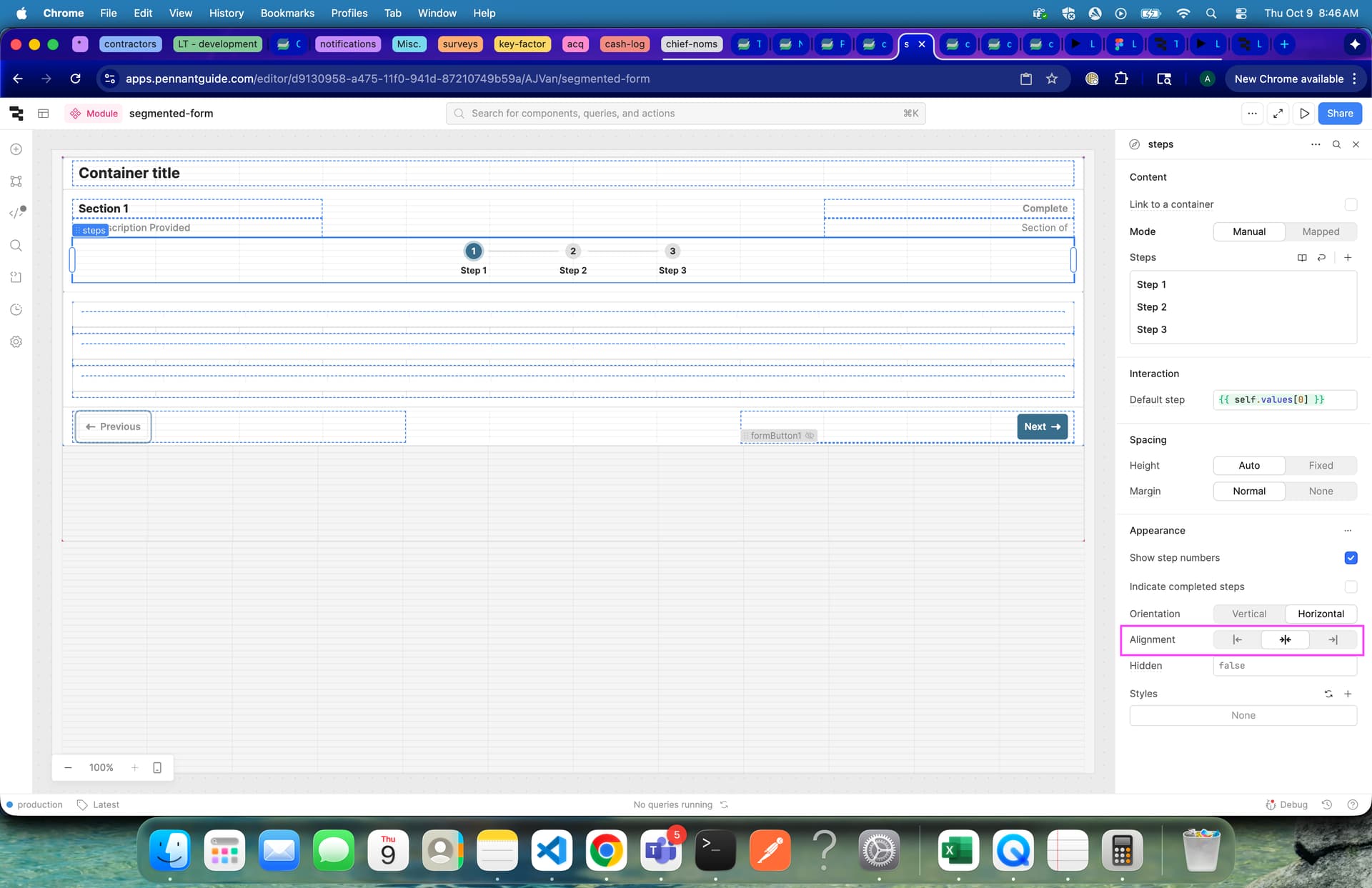
…can we simply add the option to set the alignment as ‘space-between’ instead of just being confined to selecting ‘center’, ‘start’, and ‘end’ as options? I’ve used custom CSS for this in the past which is very simple to target, but I don’t like using it unless necessary whereas it feels like spreading them across the span of the containers width feels like it should be a option within the inspector.
As well, this would mean I would have to add custom CSS to each app that this module would get scoped to, where that could be easily fixed with a native option that allows up to evenly space steps across their container.
Thank you for all you guys do! This is just one that has been a minor annoyance for quite some time now that shouldn’t have to be. 