Utils.shownotification styling was updated. Notification shows at bottom of screen instead of top

Hello,

Something changed with the utils.shownotification component (since yesterday I believe). It suddenly shows at the right bottom of the screen instead of top of the screen.

I want it back at the top.. Should I fix this with css or will this be restored?
CSS code suggestions?

Thanks :slight_smile:

1 Like

Agree....

Me too. I like how it looks but want choice to have it on top or on the bottom.

Hi @Shawn_Crocker @Hsiao_Min_Shyh and @ellenhelena ,

This has to do with a refresh we just did with our notifications (read more here: New: Notifications Settings and UI). Along with giving it a visual refresh, we moved the placement of these notifications to the bottom right corner.

In the long term, we see notifications as components similar to Table, List View, Key Value, Text, etc. that Retool builders can use to build UIs. We want builders to be able to customize these notifications (visually, placement, etc.) similar to how Modals are. This is on our roadmap, but we don't have a timeline right now of when we'd support this!

1 Like

Hi Jennifer,

Thank you for the reply. In our use case, the app is already live with several end-users. They use the notification as a conformation message when a table update was successfull.
The app is used on an Ipad, so now the Ipad keyboard is above the notification message, thus the end-user cannot see the message.

Could you please provide me the css code to have the message at the top of the screen again?

I get it but, seems like a bit of screw up to make system changes that affect releases in such a drastic visual way right? Seems obvious people might have been counting on and have designed other areas of an app to take into account the notifications being on top. I guess what I'm getting at is, why not hold off on changing the notifications in this way until you have the functionality ready that people are obviously going to want? How could it have been such a desperate need to change them now so far ahead of them actually being ready?

2 Likes

+1 on wanting the CSS or ability to change this back to top ASAP.

Thanks!

1 Like

Hi @Shawn_Crocker ,

I understand your concern here, and our intention is not to break people's apps but rather to improve the visual experience of notifications by default. We'll take your feedback into consideration. Right now we have no plans on adding customization of where the notifications can be positioned.

@ellenhelena – this feels like a bug apart from the fact that the notifications are now on the bottom right. In other words, the notifications should still be appearing above the iPad keyboard. I can check with our team on reproducing the bug on our side and see if we can make a fix.

In the meantime, we've rolled back the feature flag due to a different issue: Custom Notification Content Not Displaying Correctly

Hi Jennifer,

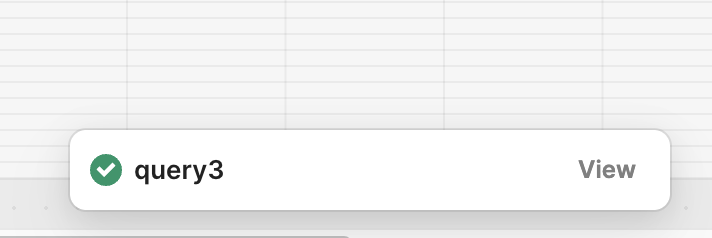
It's not a bug. The message is still above the keyboard; however, it is not user-friendly to have it on top of the keyboard.

To provide some background information:

The app is live and will eventually be used by 140 users every day during a timeframe of about 2 hours. During this time, employees need to confirm arrived guests. Imagine a scenario where a guest arrives every second, and users search on reservation number. Each time, the keyboard has to pop up and down for the notification message. :sweat_smile:

Also these end-users are not always tech savvy, for them a small change is a huge change in their user experience. They contact our support team that the guests are not confirmed even when clicking 'confirmed', that the app broke and they stopped using it, because they don't understand/see (in such speed) that the confirmation message changed position.

So basically what happened; I wake up to end-users calling the support team, claiming the app broke. The support team contacts me, and I can't fix it because I can't access the styling of the notification message. The ground managers then need to explain and instruct all employees about the app's change right after its launch and immediately after they introduced the app to the employees. They look at us (developers) annoyed, questioning why we made such a change right after they instructed all their employees on how to use the old version of the app.

And this is just for one app. Now, imagine if I build 10 apps with Retool Cloud. Every morning, I'd have to check if nothing changed. If something does change, we need to inform all employees. It's impossible.

Therefore, our conclusion is that we cannot use Retool Cloud. We need to explore other solutions, whether self-hosted or another product. :smiling_face_with_tear:

(Don't get me wrong, it's great that Retool continues to improve, however, unfortunately over the months, this happened several times, small Retool updates that broke or changed a live app. For me and our development team it is a disaster to have these sudden updates. Perhaps Retool could maintain a two-week timeframe for Retool Cloud users during which developers are informed before the update is implemented, so we have time to inform users or to fix it).

1 Like

Update;
The notification update was rolled back. Thanks Retool for taking our concerns into account.

Very much agree with that. I am all for continuous improvement and retool certainly has lots of it with great outcomes. It does worry me though that retool seems to sometimes not consider the impacts of making a pretty significant visual change like this that propagates through released apps with no control on the developers part and no obvious update that it is about to happen. I am glad to see the notification back to its old state however, I did like the look of the new notification. Not sure why we can't just get control over where it appears?

1 Like

Hey just want to give a quick update on this! We definitely hear your concerns and feedback and iterated on this new notification feature after we rolled back two weeks ago. This week we are going to start rolling the new notifications back up but in addition to that we allow the position of the notification to be customizable:

By default end-user app notifications will show up on the bottom right, but you'd be able to customize it to any of the positions above.

4 Likes

This feels right now. I like the new look. It really stands out now and I find it easy to read

4 Likes

Hi, where do I specify the setting you pictured in your post about where the notification will show up?

Hi @arle :wave:

App settings -> Notifications