1) My goal:
To make the tablet app look exactly like it appears in the Retool editor — same layout, spacing, and alignment. This is a simple app for logging metal scrap by department and weight, meant for warehouse use on tablets.
This is extremely time-sensitive. We’re actively trying to roll this out in a live warehouse environment, and layout issues are blocking us from going live. Any help would be greatly appreciated ASAP.
2) Issue:
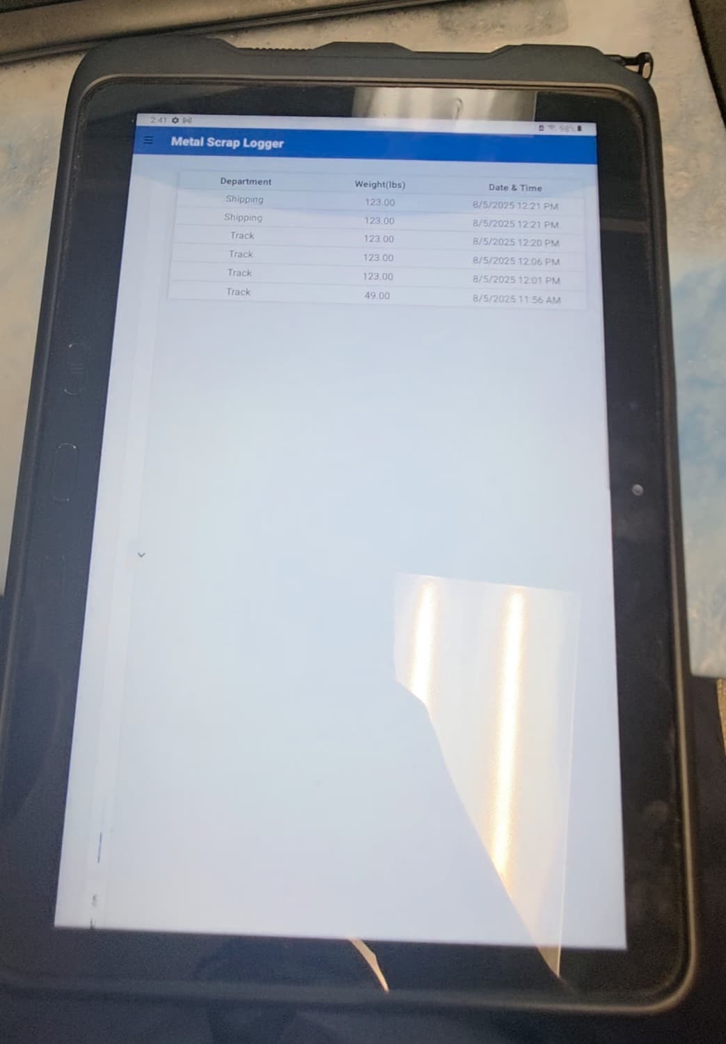
In the editor and desktop viewer, the layout looks exactly how I want it. But when I open it on an actual Android tablet using the Retool native app, the layout shifts — spacing between components gets thrown off, alignment breaks, and the design no longer matches what I built.
3) Steps I've taken to troubleshoot:
- Tested in both portrait and landscape orientations on the tablet
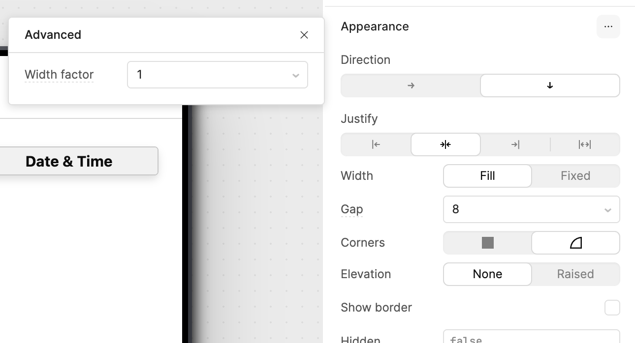
- Checked container widths, padding, and alignment settings
- Verified display scaling is default on the device
- Confirmed this issue happens in the Retool native mobile app
4) Additional info:
- Hosting: Retool Cloud
- Device: Android tablet (Samsung)
- Expected behavior: App should match layout seen in editor
- Actual behavior: Spacing and alignment are inconsistent
- Screenshots:
-
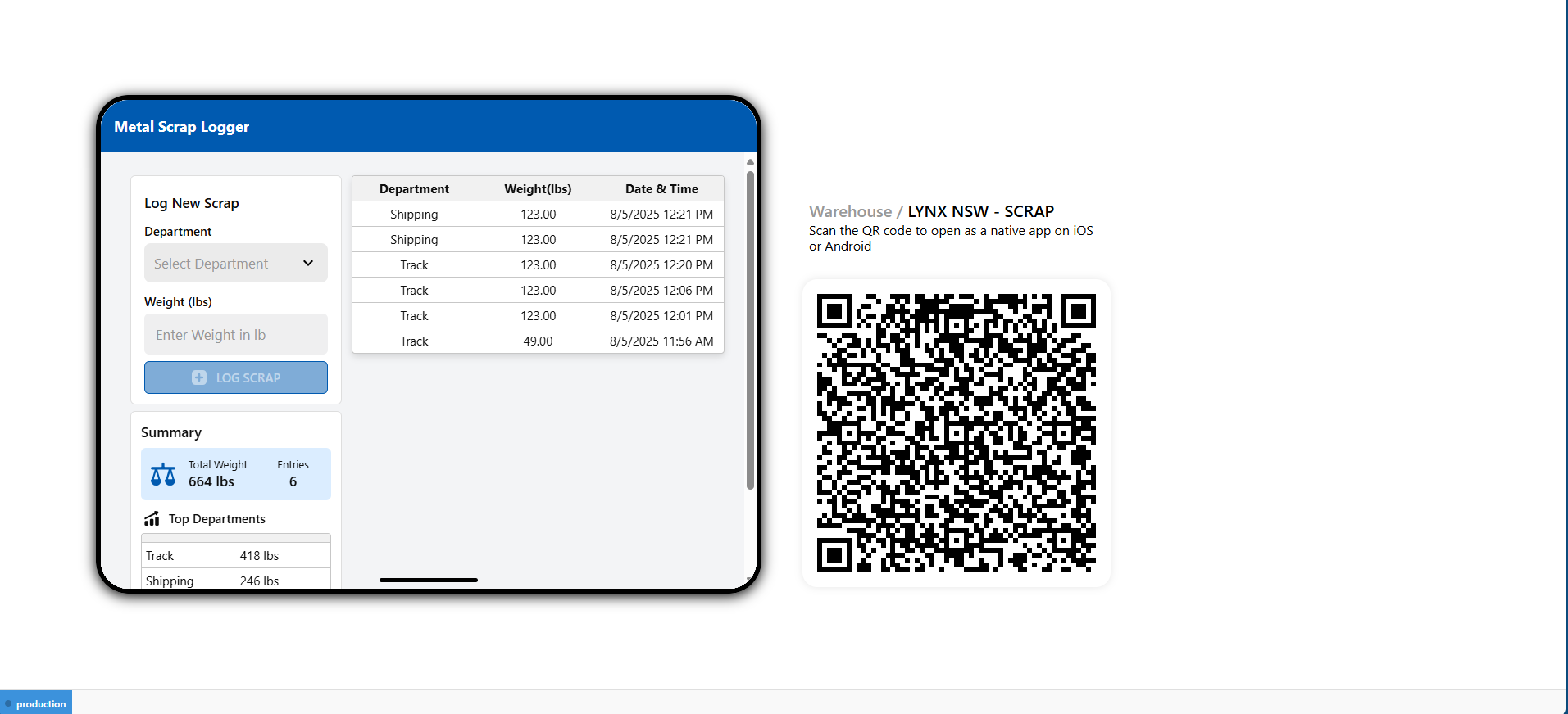
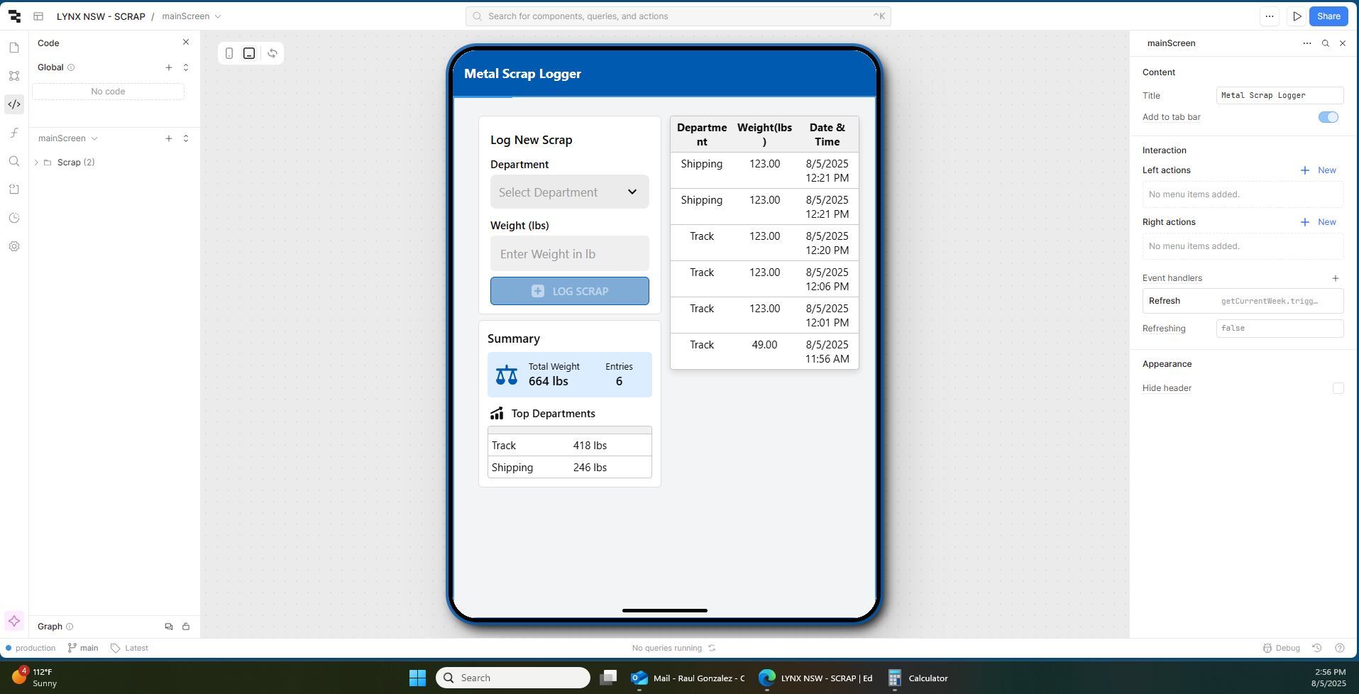
Editor/Desktop View:
-
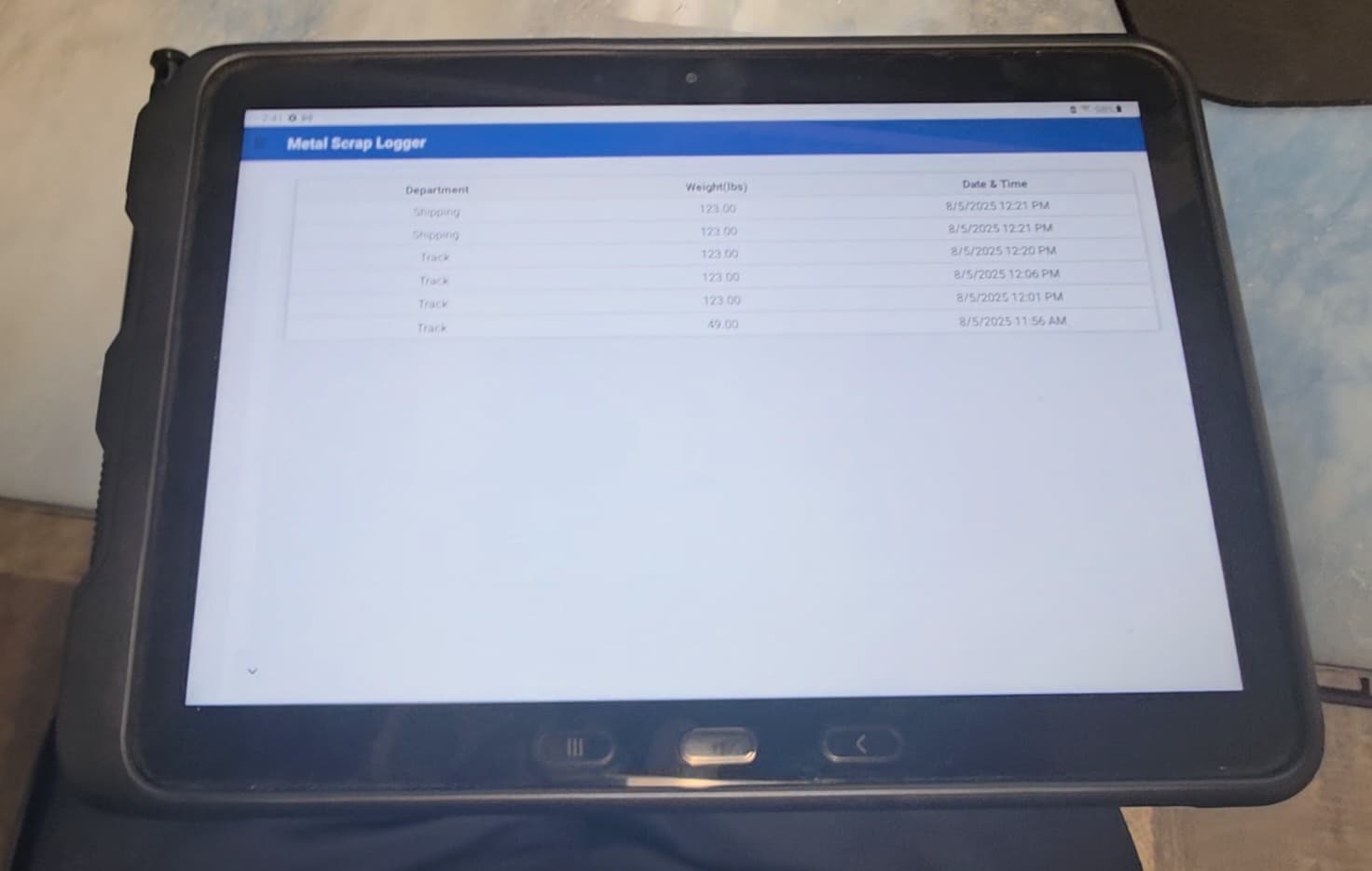
On Tablet (Real Device):
-
5) App File for Review:
If it helps with troubleshooting, I’ve attached the following export from the app:
 LYNX NSW - SCRAP.json (43.5 KB)
Let me know if I should DM or email this file instead.
 URGENT QUESTION:
Is there a reliable way to get exact layout parity between what I see in the editor and what appears on the tablet via the Retool app? Any known layout quirks, configuration tips, or limitations that I should be aware of?
We’re really under pressure to deploy this live and need a solution urgently.
Thanks in advance — any help is appreciated!