In the Timeline component (timeline1), I’ve noticed an inconsistent and visually disruptive behavior:
When I collapse a group (e.g., company name) without expanding the sub-group (e.g., machines):
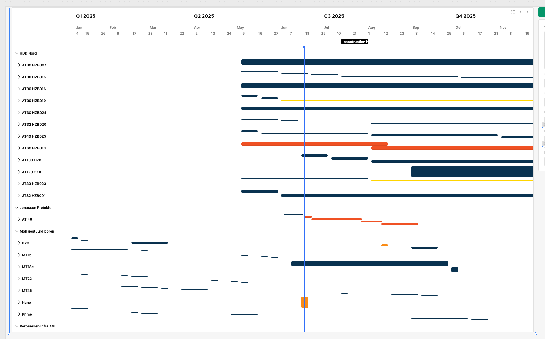
If a machine has only one project, the timeline bar appears very thick.
If a machine has multiple projects, the bars shrink in height and become thinner.
This results in uneven line heights for collapsed rows, which looks very unprofessional and clunky — see attached screenshots.
Expected Behavior:
All rows in the collapsed state should display timeline bars with consistent height, regardless of how many child items they contain. The visual structure should remain predictable and clean when collapsed.
Steps to Reproduce:
Use a Timeline component with grouped data (e.g., company → machines → projects).
Collapse all groups at the second level.
Observe how bar thickness changes based on the number of underlying items.
Undermines the professional look of the application
Request:
Please provide instructions on how to to ensure uniform bar height in collapsed view — ideally via a style override, fixed height, or rendering fix. I have tried custom css, but to no avail.
Additonal question: I would like to bring my milestones to the back, behind the bars. Instead of being in front of them and crossing over the bars, making it look messy
Sorry for the issue. I was able to reproduce the behavior using the component's demo data.
It appears to be a design choice, and I can definitely make a feature request to allow for greater control of row height. So that all rows can have the same height regardless of grouping.
As currently it appears that the first and second level grouping will evenly divide out from the total space of their parent. With each line within the second level grouping sharing space with siblings in the second level group. Causing many bars in the same second level grouping to shrink to fit together.
The tradeoff would be that is a number of tasks are all under the same second grouping, they would push any other groupings at the second or first level much farther down the page.
Leading to some weird chunks of empty space along the left most column. But I understand that we should allow for users to make that trade off if they want to.
I will create this feature request and keep you updates on any updates I hear. In terms of Custom CSS workarounds, this may be tricky as their is a cascade of sharing space evenly at each level. Someone would need to override all those rules and even then the left column might break or have so odd behavior if it stretches to fit.
Thanks for getting back to me. Please make the feature request. I'm looking into using a combination of event handlers, and a transformer to load data at the level of granularity that's needed but this seems a way too complicated workaround to solve such a simple issue.
Could you please also come back to my second question regarding the milestone lines?
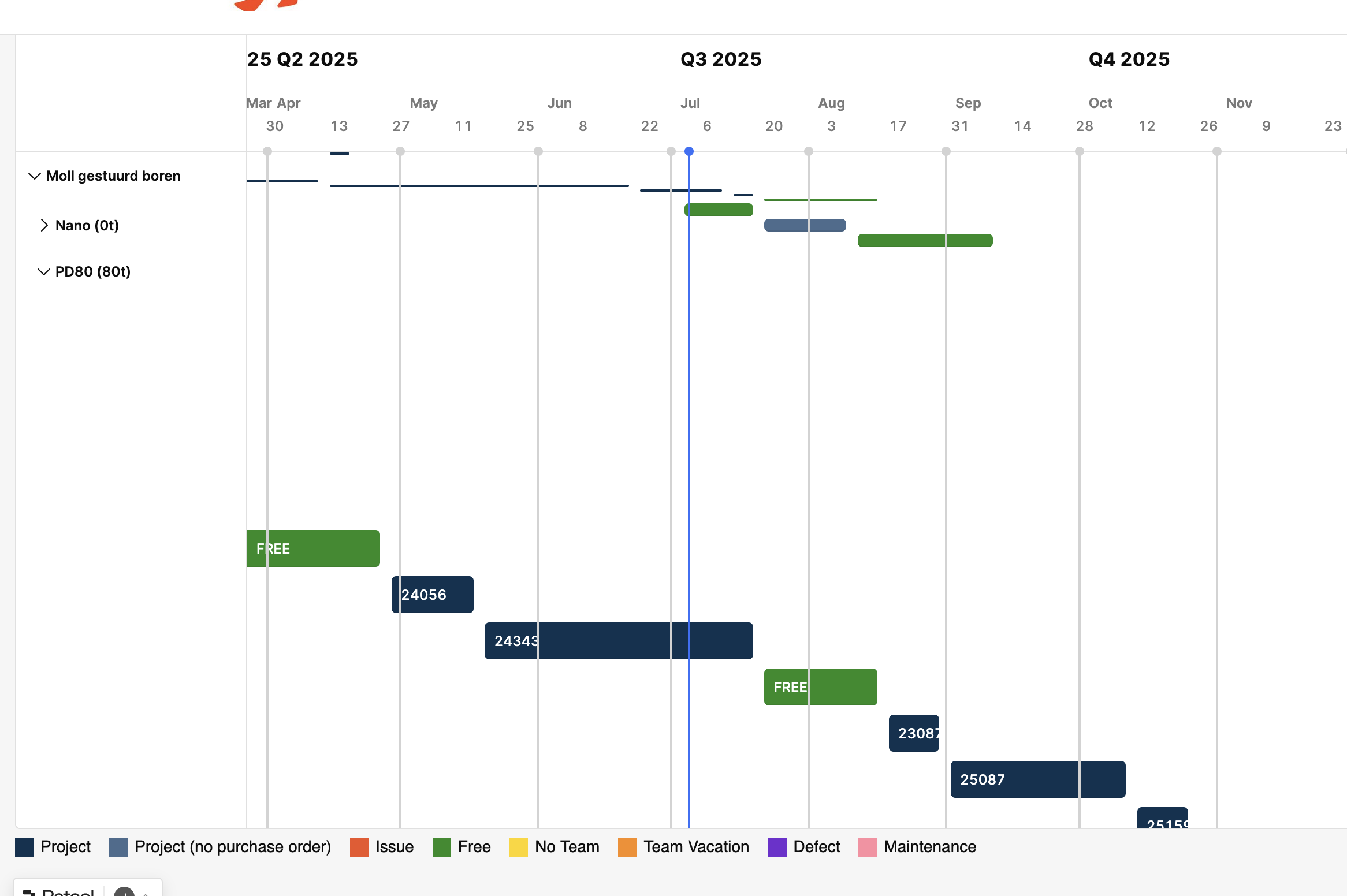
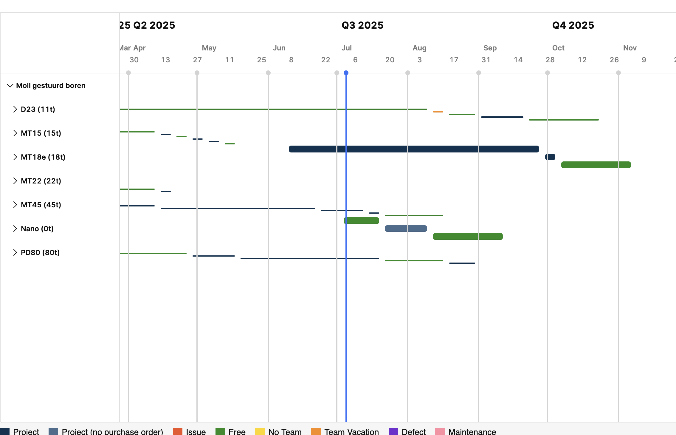
Finally: another issue I ran into : when more than 10 events are created within a group the aggregated data just dissappears from the collapsed/aggregated view. So for example: I can see events when I uncollapse a view, but they just disappear when I close that detailed group view making it seem as in that period for that group there's no event scheduled. See screenshots: we have events scheduled for Oktober on the group 'PD80' but they just dissapear when I collapse that group view. This is a pretty critical error for a timeline component.
Yes I made the feature request for adding greater controls for row width to allow for all rows to be made the same size
For your second comment about having milestone lines 'behind' the rows, I can make a request for that as well.
On the last issue you ran into, you are using the term 'events' for rows/horizontal bars, correct?
I do see that in the second screenshot the two bars that are in October are missing(25087 and 25159), I can look to reproduce that on my end and file a bug report if I see this occurring when I have more than 10 bars in a group.
It seems like the current component is currently lacking the functionality you are looking for. My suggestion for the short term would be looking into building custom React Components which can be used in Retool apps and allow for much more granular controls.
The requests are been but into our v2 feature requests group, but this is currently on backlog while our engineers are heads down on our major AI launch coming out in the next few weeks.
Once that is out they will have a lot more bandwidth for improving components and address requests for added styling and tickets like these.