Hi folks - any suggestion how to set the width according to content rather than flowing the table across the full screen? Probably some CSS magic i don’t know…
Hey @zimmerst85 , you when you set the column widths in editor mode, it should persist in end user mode. Or are you talking about the width of the table component itself?
2 Likes
I think it’s about the width of each column, which it would be nice if it could auto-size itself according to the content of the cells in that column.
Precisely. Right now the “table” element will just auto-adjust the width of the columns to be basically the same for all of them. However, what if have a case like this:
Date | Unit | Value | Description
Here date, value and unit are really narrow columns whereas Description would benefit from being wider…
Any answers on this?
Hi @rkaplan! We have a feature request on file for this, but currently, we don't have a native way to auto adjust column widths 
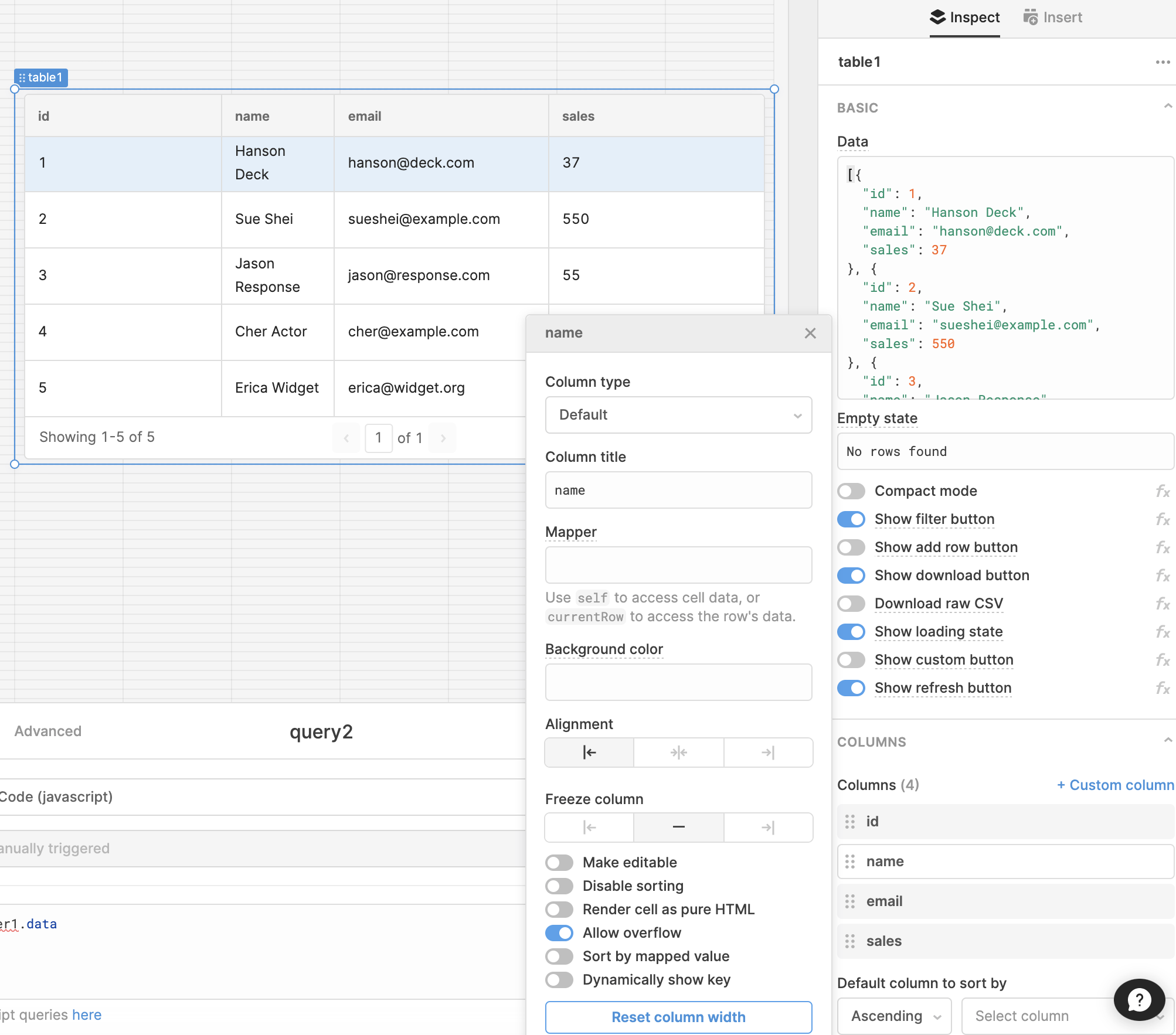
In the meantime, if you have columns with longer text blocks, you might want to toggle on "Allow overflow," which formats the column as multiple rows as needed:
1 Like
@Tess is there a way to either dynamically set column widths or manually set them on tables?
@Tess - Also interested if column widths can be set now. ie: is the feature request done?
Hi @rcanpolat Thanks for checking in! We don't have a fix yet, but I'll post here when we do 
We launched a new version of our table component, and it now has a feature for auto column widths 
You can go to Appearance->Advanced to enable it on any new table components:

We're still working on a feature for user defined, persistent table column widths in the new table
2 Likes