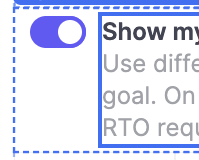
At some point between self-hosted 3.14 and 3.33, the switch widget vertical alignment style changed when the label caption has multiple lines of text. Previously the switch was vertically aligned to the top, which meant it stayed aligned with the label, and the caption sat beneath it. Like this:
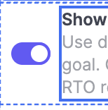
But somewhere along the line it changed to be vertically aligned to the middle, which makes it look misaligned with the label. Like this:
Wondering if this is intentional or an accidental change? If possible, would love to be able to choose how to vertically align it with an option in the inspector. For now I've resolved it with custom CSS, but that's not optimal.
._retool-SwitchWidget2 div {
  align-items: flex-start !important;
}
