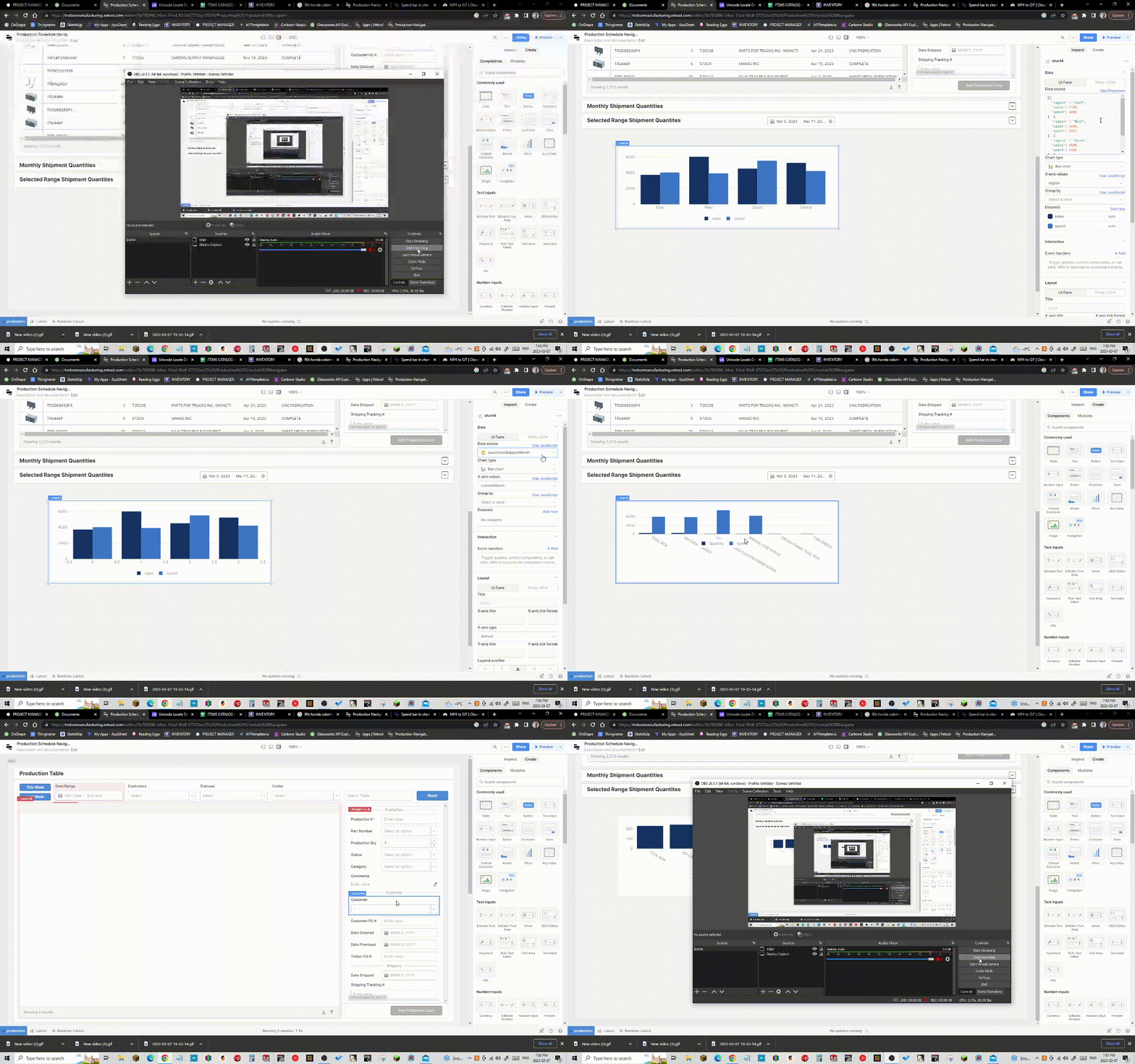
I am willing to accept that I might be having a strange, dense lack of brain power right now, but every time I try to setup a chart using the bar type, I have a bar called "spend". I do not know how to get rid of this "spend" bar or how is seems to be getting unique data for each category. Does anyone know where this "spend" bar is coming from. I does not exist in my source data and nowhere in the charts settings do I see anything relating to "spend".
I figured it out. Looks like for some reason, changing certain things in the chart requires a refresh of the browser. I can replicate this strangeness. Every time I drop in a chart and select a data source, the spend bar remains in the chart. As soon as I refresh the browser, the chart loads in without the spend bar.
Hey @shawncrocker! Ack, that doesn't sound good. Would you mind sharing a screen recording of this happening? I can't seem to repro on my end, but I assume I'm just missing something. And out of curiosity, if you start over with a brand new chart, do you see the same behavior?
Screen Recording 2023-03-07 at 1.54.37 PM.mov
Hi @victoria Yes I can repeat the behavior. See the screen recording. Now that I know a refresh of the browser will sort of jolt it into behaving, it is not much of a workflow issue rather an oddity. It looks like the original JSON data somehow remains in the background until reloading the page.

Yikes! Thank you for sending that. Would you mind if I stepped into your app to take a look at this?
No problem