Have some more wishlist items:
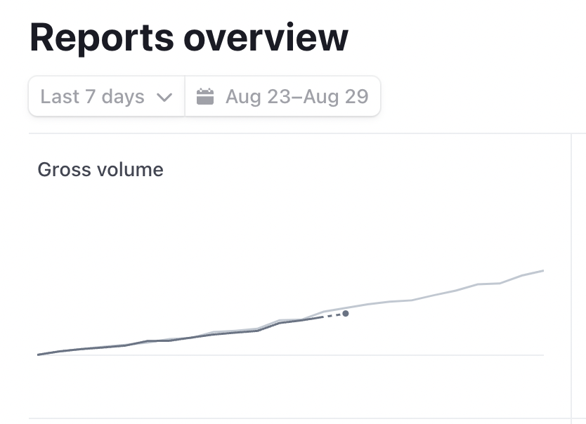
native timeseries plotly chart filter
we often filter charts based off of time ranges. I think that this is a common enough workflow that it'd be nice if this was a native feature for charts in retool that existed directly in the component ui: something like Stripe's charting functionality:
A better Key Value map
Something that you can be sure of is that most apps have some type of data displayed for a single record. Currently there is the free-text component, the statistic component, and the key value map which we use to display data for single objects. The Key Value map has quite a bit of white space and isn't pretty enough to justify using that often. This leads us to writing out most of the attributes in text form. Would love if there was a prettier version of the key value map to use.
Native Filters and download button for the list view
The list view is something that could use quite a bit of development. I think its a component a lot of people want to use, but end up resorting back to the table due to the additional padding and component limitations. We wrote about the listview here: The ListView Component: Uploading & Organizing PDFs to an S3 Bucket. In a lot of ways the list view could benefit from the same aggregate actions that a table does. I would love a native functionality that could be toggled on to filter the list view, export the data as a csv, or create a new row.L
S3 Query Crud Improvements and file upload button improvements
currently there is a s3uploader component and a s3 upload data query section. I think that these can both be improved substantially. For example: you can't natively change the color of the S3uploader button or specify when you'd like to upload the document. (it happens immediately). The query section doesn't specify choosing a folder and has different functionality than the s3uploader. I think uploading to S3 is a pretty common use case for Retool so streamlining the set up I think would be useful to a lot of people.
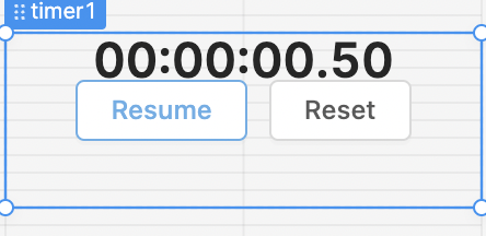
Timer Improvements
Currently the timer is super limited (in style and in function) I would love to toggle these buttons to be not shown and change the collor of the timer.
Vertical steps
Currently the step component can only be horizontal would love vertical functionality as well.
Better Navigation Component
The navigation component is relatively limited compared to the rest of Retool. I often want to use a navigation component for a section but it makes more sense as tabs or buttons because I have more customizability.
General thought
I think in general I would love if there was more focus on improving existing components and adding functionalities at the component level as opposed to creating slightly different components. I think that this would improve the developer experience. Currently I might get excited about a new component like the navigation component, but find that its more limited than another component that could serve the same purpose.
Think that is it for now ![]() With all these in mind - my largest request is still the same as @vangelov: less padding:
With all these in mind - my largest request is still the same as @vangelov: less padding: