-
My goal:
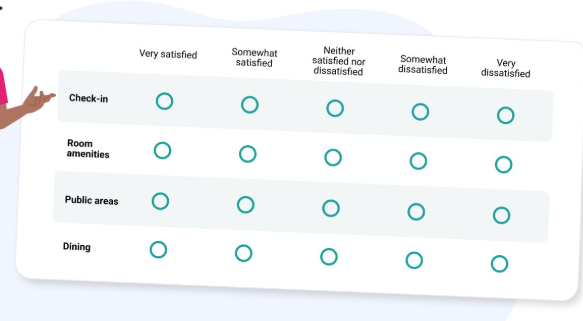
I am making a module to be used in apps. I want to make a survey style repeatable that I can input some params like a list of questions, the number of options to select and the option labels and get something like
I want a bulk style 'rating' for surveys.
-
Issue:
I can't get the radio group to play nice.
Ideally I want to be able to set a width for the radio group and spread the columns evenly inside it. Something like the number of columns setting for a horizontal listview would be ideal.
-
Steps I've taken to troubleshoot:
Auto column seems to work at first but it wraps inconsistently.
If I set a min col width that makes them horizontal, resizing the browser window wider will spread the width of the columns and make them wrap around, and resizing the browser window narrower also has this effect. I tried to make the width of the radio button component fixed to stop this and it made it worse.
I have been able to achieve some stability by making the label for every radio "000000000", changing its colour to match the container, and using the wrap option in group layout - but this is not very dynamic or reusable.
I would like to be able to input the number of options/increments, a mapped array of the column headers, and an array of questions and have the output be an array of the question/answer pairs.
I understand custom css in modules doesn't come across to the app when a module is added.
The only thing I can think of is a nested repeatable with complex colour/icon rules to emulated "selected" radios.
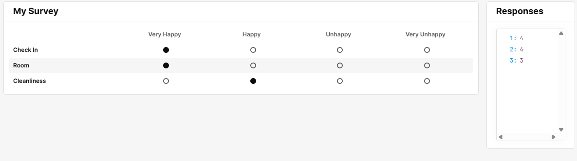
I've used a tab component in a listview for a similar survey because I also struggled with having variable options/questions with a radio group.
It's a bit of a hack, but I think it makes for quite a nice UX.
Here's a generic one you can play around with to see if it fits your needs.
forum.json (22.3 KB)
3 Likes
this is very nice, the alternating background shading is a nice touch too. Thank you!
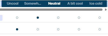
I had a thought to use a segmented control in a similar way, so that might help others too.
Some footnotes on using tabs v using segmented controls:
Neither offer the option to wrap text.
Tabs will make the width of the label the length of the word (dcartlidge's example is a perfect of this.) This could result in weird alignment issues with the fake radios below if your labels are not similar lengths.
A segmented control will enforce the 'segments' to be the same width. This will cut off the longer labels, but maintain the alignment. Both issues are fixed by widening the components as you see in the solution.
Using a repeatable with a text box and setting it to a fixed width to match the controls would help but might be fiddly.
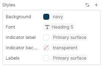
Styling:
Neither the tabs nor the segmented control can be set to read only, so you will need to adjust the styling so the header is consistent even if the user 'selects' a label.
Segmented controls don't offer indicator text styling.
Tabs do.
Segmented controls offer a 'replace' option for the icon position, tabs don't. I had to use a string with a space in it to get the effect I wanted as the label kept auto generating.
Both offer comparable functionality in terms of input (array) and output.
Thank you for coming to my tedtalk. This community has helped me so much, this is a small addition, but I hope it's helpful to someone with the same problem in the future xx
2 Likes