I wanted to comment on the new table with a + button etc. and words about deprecating the Legacy Table.
Users want something that looks good in spite of the underlying funtionality.
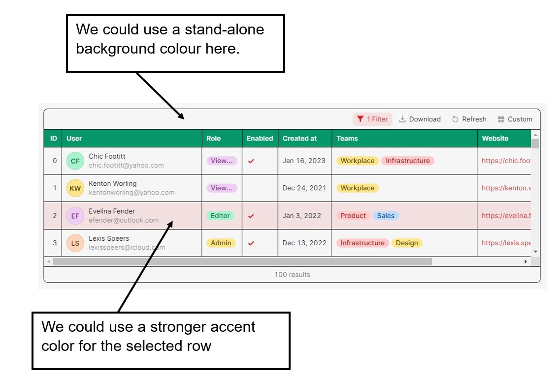
I have shown screen captures of the Legacy Table and the New Table and I have added some notations about how the appearance of the New Table might be improved.
I think we should attend to these improvements before consideration of deprecating the Lagacy Table.
Mike
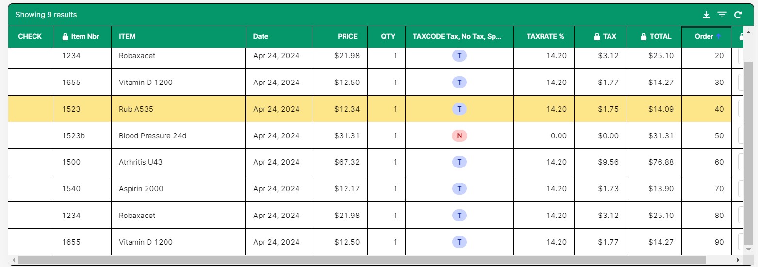
Legacy Table
New Table
1 Like
Paulo
May 10, 2024, 8:24pm
2
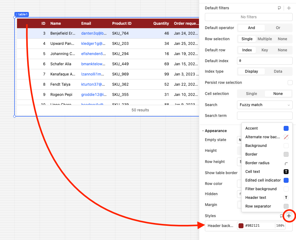
For the header background, click the "+" sign on Styles and we should find a "Header background" option we can edit:
For the background color of the selected row, here is how to achieve this using Custom CSS :
Adding on here! If you'd like to change the text color of only the selectedRow, you can use some custom CSS (docs and community forum guide ).
Here's the code I'm using:
#table2--0 li[aria-selected=true] div {
color: red;
}
You'll likely just need to change the table name in the CSS for it to work on your end. Let us know if you have any questions!
We could also customize it according to the values of each row:
Hello, self in new table is point to table itself. I try item is ok. but still with error tooltip.
pls help to fix this wrong tooltip, we can get item in the background option's scope.
[image]
Paulo:
You are explaining the header background color which I already acknowledged.
Above the header is a blank space. I am asking that the blank space be given the same color as the header space as it is with the legacy table.
Mike
Paulo
May 10, 2024, 11:24pm
4
Thanks for specifying! We could also go the Custom CSS route for this.
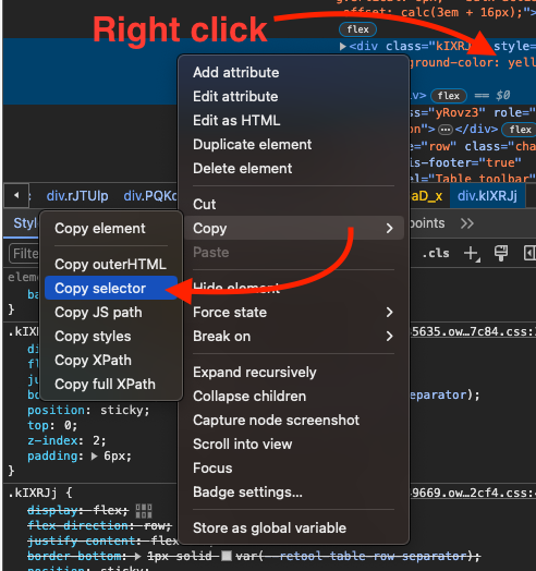
To find the correct selector:
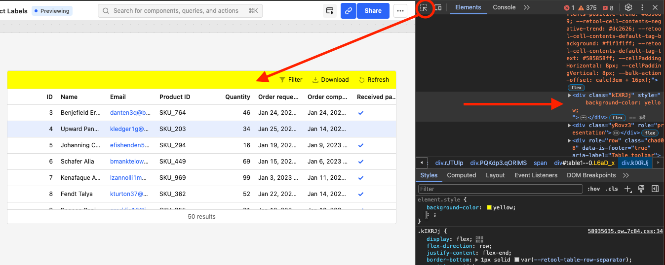
In Preview mode, go to the Chrome dev tools, use the select element option circled in this screenshot:
Note: Click the bar on your app and you'll see the HTML element selected on the right.
Then, right click the element and copy the selector:
You should get something similar to this:#table1--0 > div.kIXRJj
We can use that selector in Custom CSS to add any styling:
Paulo:
Could you not just make this the default header coloring like we had in the Legacy Grid?
Mike
Paulo
May 13, 2024, 4:28pm
6
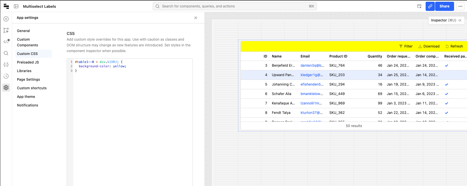
We created the feature request for it. We'll let you know when we get any updates on it. On the meantime, we could use Custom CSS.
I will look forward to the grade.
I have tried the CSS styling code and it doesn't seem to work.
Mike
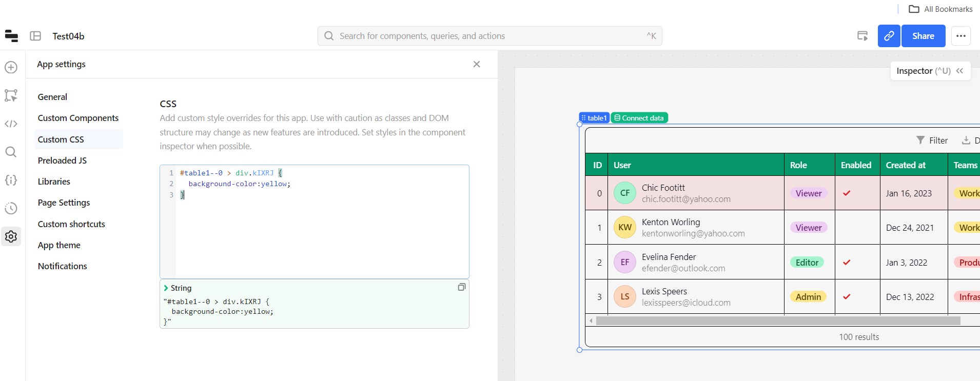
Big Picture
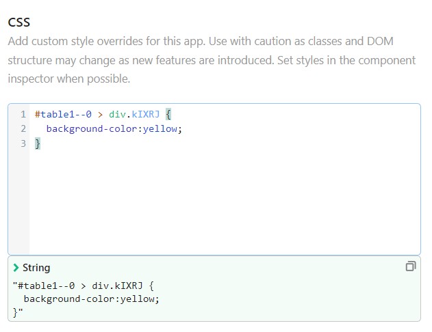
Close up of Code
Paulo
May 14, 2024, 4:00pm
8
Did you go through these steps to get the selector? The selector will most likely be different on your app.