Description:
We have encountered a major regression in the Retool Mobile HTML Component. The renderer appears to be applying aggressive CSS overrides (likely global display: block or width: 100% rules) that break standard web layout capabilities.
Specific issues observed:
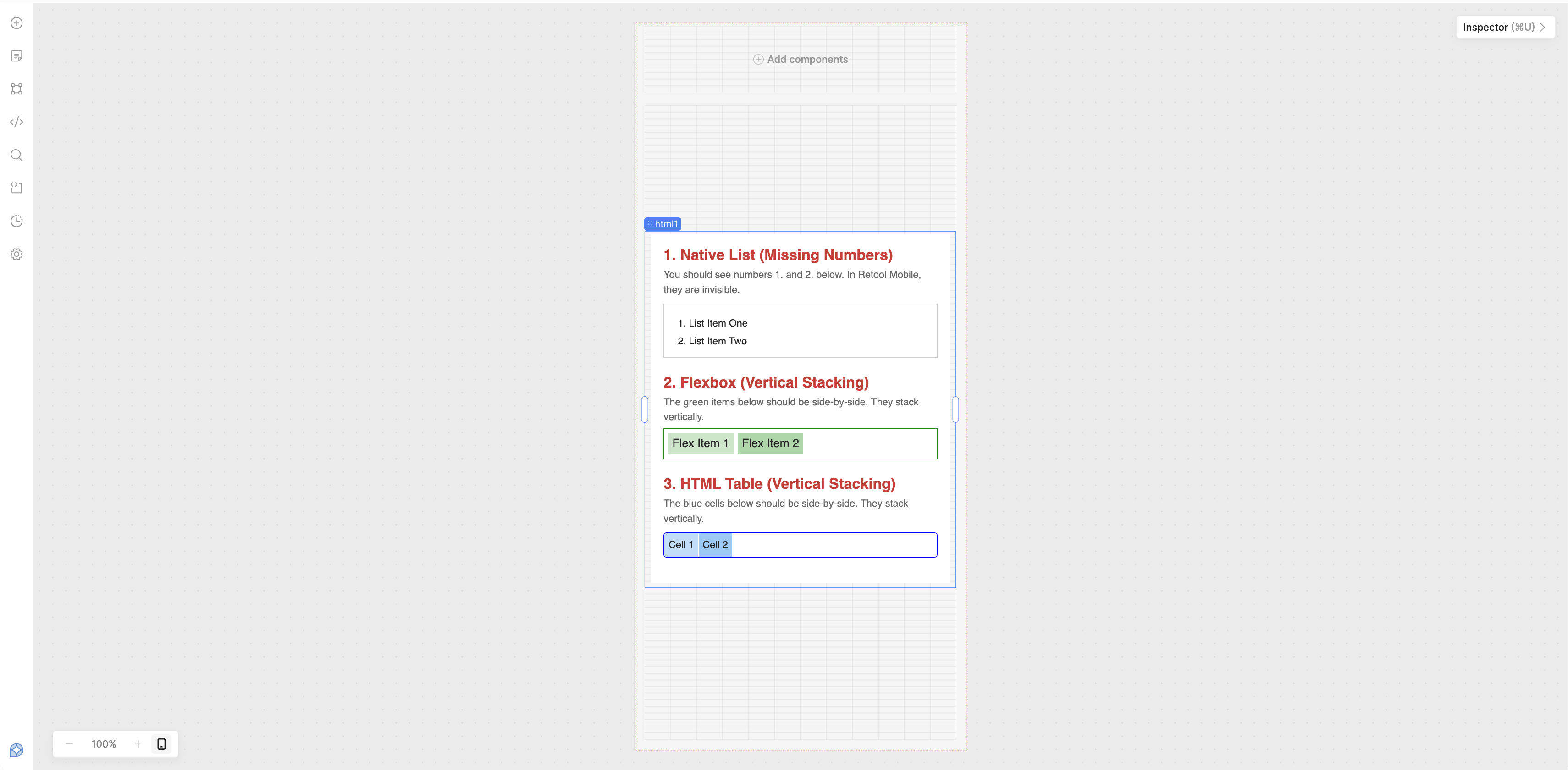
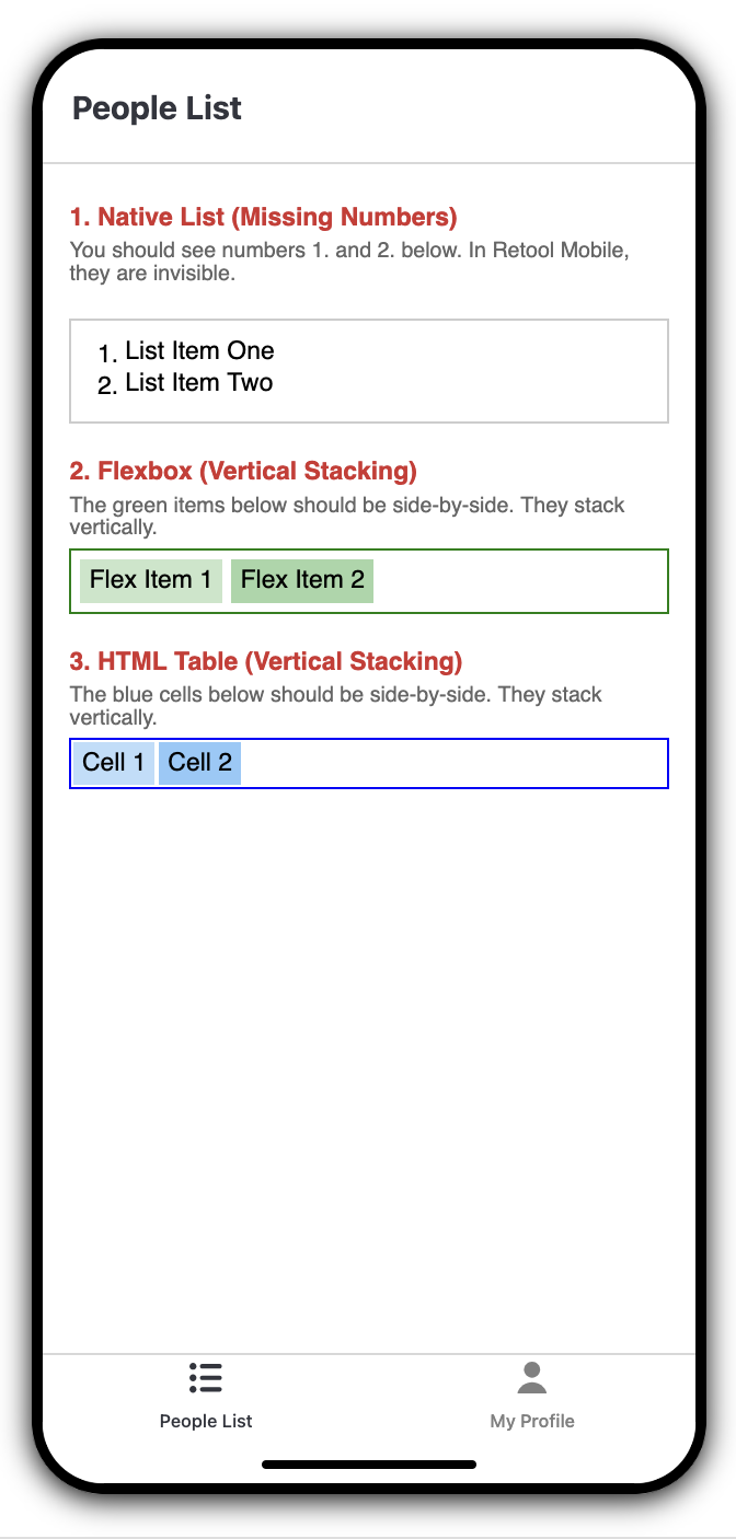
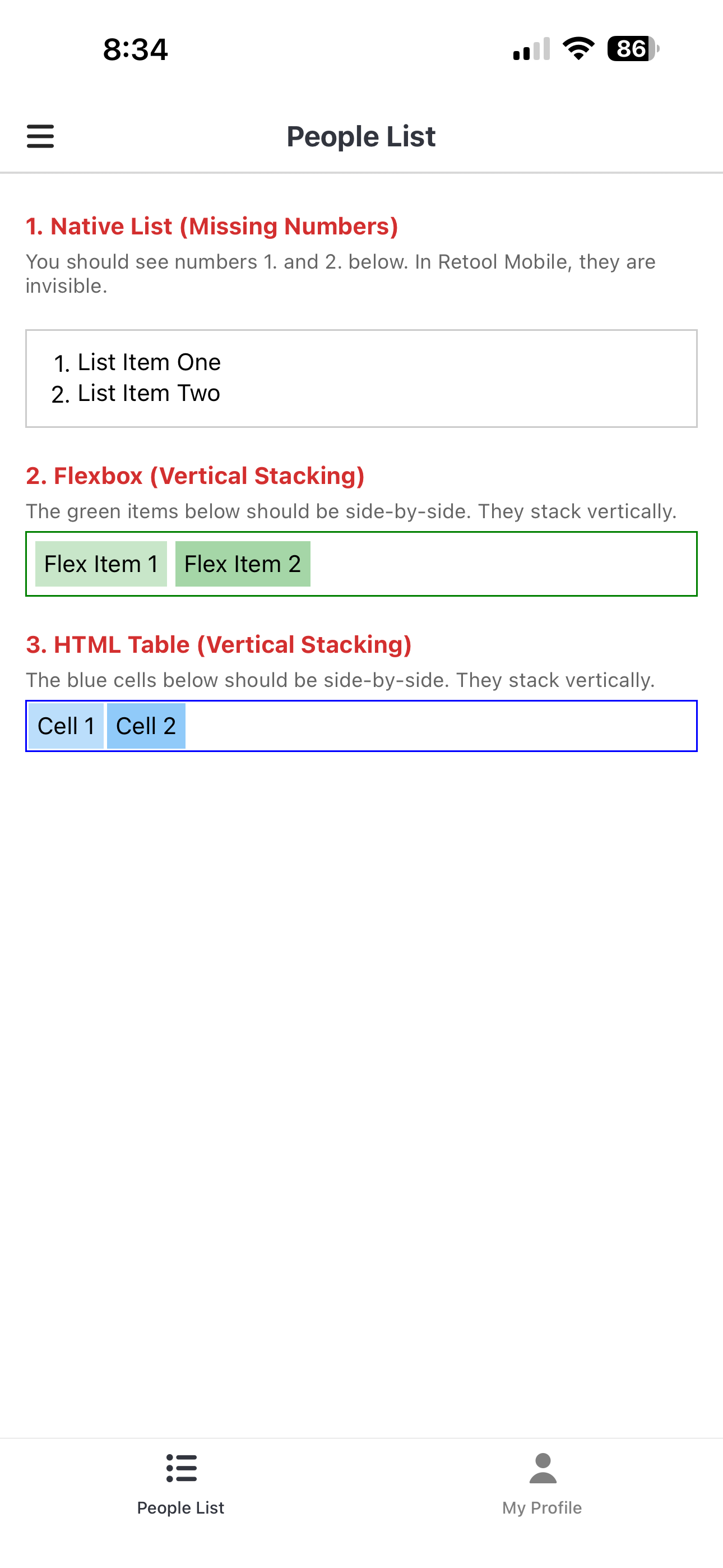
Native Lists (<ol>): List markers (numbers 1., 2., 3.) are completely invisible/hidden.
Flexbox Ignored:display: flex containers force children to stack vertically instead of horizontally.
Tables Broken:<td> cells stack vertically instead of sitting side-by-side.
Inline-Block Ignored: Elements styled with display: inline-block are forced to new lines.
This makes it impossible to render standard rich text or basic multi-column layouts.
Steps to Reproduce:
Open a Retool Mobile app.
Drag an HTML component onto the canvas.
Paste the "Reproduction HTML" provided below into the HTML value.
Expected Behavior:
"Native List" should show numbers (1, 2) next to the text.
"Flexbox Test" should show "Item 1" and "Item 2" side-by-side (Green row).
"Table Test" should show "Cell 1" and "Cell 2" side-by-side (Blue row).
Hey @neilbalthaser! Sorry to hear about the issue you're having! I copied and pasted the provided "Reproduction HTML" into the the value for an HTML component and wasn't able to reproduce what you're experiencing:
Is there potentially anything else that could be effecting your view? Are there any existing styling rules in the Custom CSS of app level settings or possibly within the HTML component itself in the section of the inspector where you would provide value for class styles that could be essentially 'outclassing' your component level inline styles?
thank you for getting back to me. it looks like you are using the html component for a Retool PWA. I am using the HTML component for a Retool Mobile app.
Just chiming in to confirm that it’s most likely an issue in your global configuration somewhere, here’s the same HTML in a Mobile App desktop preview:
Thank you for your input and for testing the HTML snippet. Your observations that the rendering appears correct in desktop previews and on your mobile device are quite telling.
This leads us to a specific line of inquiry: Has the "data-target click event handling" feature been enabled for your Retool Mobile instance?
My recent analysis suggests that the enablement of this feature, which allows for the capture of specific click events from within the HTML component, may be the root cause of the rendering regressions we are observing for lists, tables, and flexbox layouts.
The hypothesis is that enabling this feature requires a form of "instrumentation" or special handling of the HTML content by the Retool Mobile application. This process could involve:
CSS Overrides: Injecting styles or modifying the CSS cascade in a way that aggressively resets or overrides default element behaviors (e.g., list-style-type, display, padding, margin).
Content Wrapping: The introduction of a native wrapper around the HTML content to facilitate event interception, which may itself impose display properties like display: block that force elements into a vertical stack.
If your instance does not have this specific data-target click event handling enabled, it would explain why you are unable to reproduce the issue. It suggests that this enablement is a "global configuration" specific to our instance that is directly impacting the rendering pipeline.
I would appreciate confirmation on whether this feature is active in your testing environment? This will help us isolate whether the problem lies within this specific enablement or requires further investigation elsewhere.