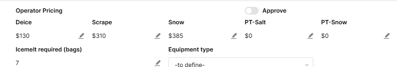
I have 6 components that were number inputs and I changed them to Editable Number components. This is the behavior I want but I think 6 little pencils to edit each one looks too busy.
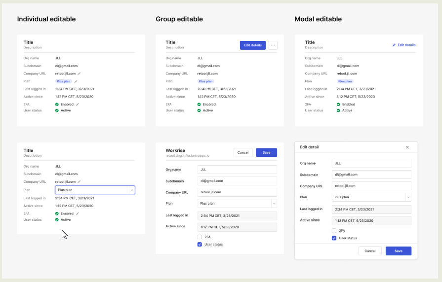
The documentation shows we can achieve this effect in the second example "Group Editable".
How could I have just 1 pencil and when I click on it, it has the same behaviour to edit all of these components?
Hey @Shawn_Optipath!
I don't think the design suggestion document you linked is actually showing Editable components in the group example. It looks like it might be using a view based container with static display fields on the main view which switches to a standard input component view for the data entry. I believe the modal example is also setup this way but it looks like instead of a button they used a icon/link to switch to the input view/modal.
I also looked through the Editable Number and Text component docs as well as the current state values of each in a sample application and there doesn't seem to be any method/property to switch these components into "edit" mode beyond selecting them. They also seem a bit strange in that they have a default action for Shift+Enter and Cancel as well as the built-in Icon event to switch from display to edit.
2 Likes
Hey @pyrrho!
You might be right. It could be a view based container. I set this up for a quick test and came up with this:
Will still need to play around with it but it does the trick.
I had a look as well and couldn't find an edit mode. That would have been the cleanest I think.
2 Likes