Hello @rww, welcome to the Retool Community!
I faced the same issue where toolbar options were not available by default when using 2D charts in the Plotly JSON Chart component. After checking the documentation and experimenting, I found that the toolbar is automatically included only for certain chart types like 3D charts (for example, scatter3d), whereas it’s not available for standard 2D charts.
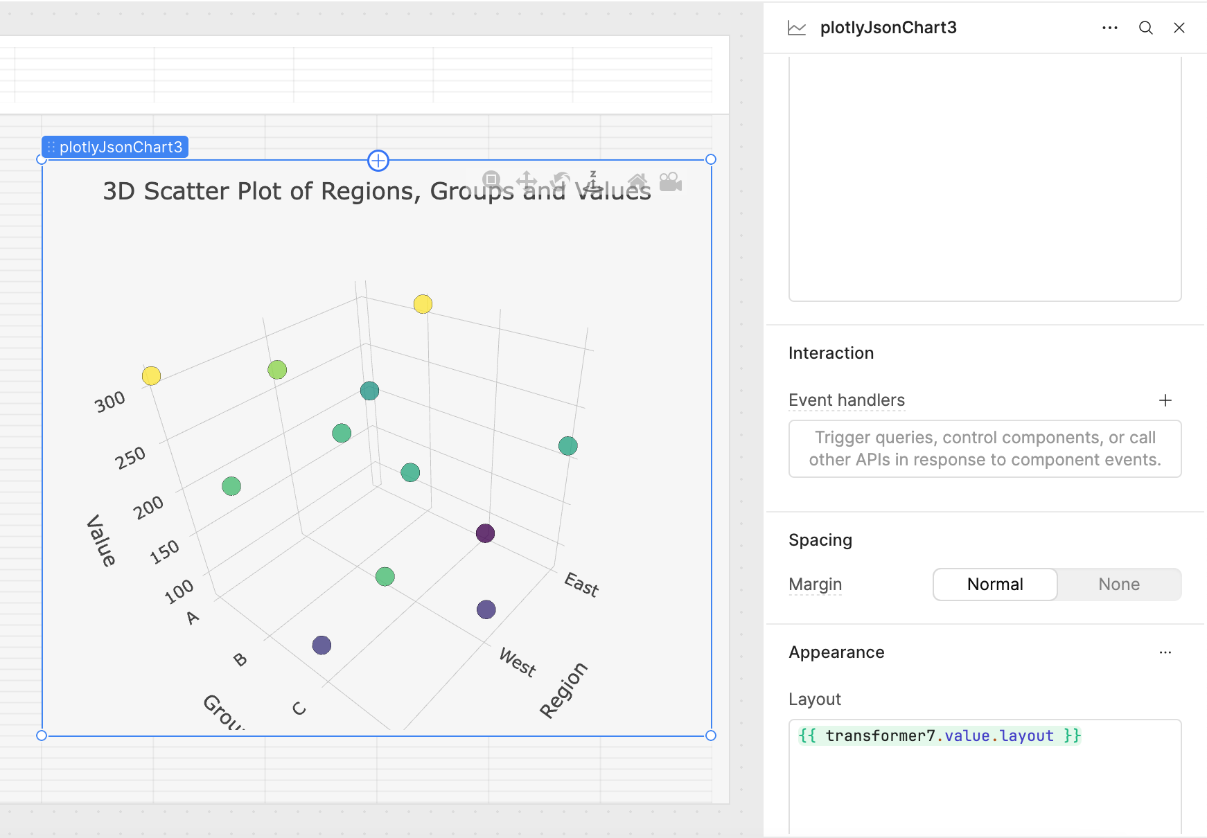
To address this, I modified my transformer to output a 3D chart structure instead of a 2D chart. This ensures that the toolbar is visible with all its default options. Below is the transformer code I used for demonstration purposes:
const raw = [
  { region: "East", group: "A", value: 200 },
  { region: "East", group: "B", value: 310 },
  { region: "East", group: "C", value: 77 },
  { region: "East", group: "D", value: 215 },
  { region: "West", group: "A", value: 270 },
  { region: "West", group: "B", value: 230 },
  { region: "West", group: "C", value: 220 },
  { region: "West", group: "D", value: 112 },
  { region: "South", group: "A", value: 310 },
  { region: "South", group: "B", value: 240 },
  { region: "South", group: "C", value: 117 },
  { region: "South", group: "D", value: 240 }
];

// For demo, map region and group to numeric coordinates
const regionMap = { "East": 10, "West": 20, "South": 30 };
const groupMap = { "A": 1, "B": 2, "C": 3, "D": 4 };

// Generate x, y, z arrays for 3D scatter plot
const x = [];
const y = [];
const z = [];
const text = [];

raw.forEach(item => {
  x.push(regionMap[item.region]);
  y.push(groupMap[item.group]);
  z.push(item.value);
  text.push(`${item.region} - ${item.group}: ${item.value}`);
});

return {
  data: [
    {
      x: x,
      y: y,
      z: z,
      mode: "markers",
      type: "scatter3d",
      text: text,
      marker: {
        size: 8,
        color: z,
        colorscale: "Viridis",
        opacity: 0.8,
        line: {
          width: 0.5,
          color: 'rgba(0,0,0,0.5)'
        }
      }
    }
  ],
  layout: {
    title: "3D Scatter Plot of Regions, Groups and Values",
    scene: {
      xaxis: { title: "Region", tickvals: [10, 20, 30], ticktext: ["East", "West", "South"] },
      yaxis: { title: "Group", tickvals: [1, 2, 3, 4], ticktext: ["A", "B", "C", "D"] },
      zaxis: { title: "Value" }
    },
    margin: { l: 0, r: 0, t: 50, b: 0 },
    paper_bgcolor: "#f6f6f6",
    plot_bgcolor: "#f6f6f6",
    autosize: true
  }
};
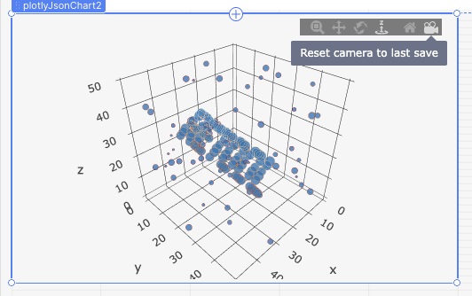
Here is a screenshot for reference:
Note: Certain options such as showToImage are not available in the toolbar for 2D charts. The toolbar itself is only included by default in 3D charts like scatter3d, which is why switching to a 3D structure makes the toolbar visible.
I hope this explanation helps others who are trying to configure Plotly charts in Retool. If you have further questions or need assistance, feel free to ask!