I'm trying to optimize an input form and trying to change the sequence the user can change between the input fields using the 'tab' key. I think the word would TabIndex which I couldnt find in the forum.
Is there a function to change the tab index? Maybe I'm missing the right word for it.
I'm moving this to the feature requests section since it doesn't look like this is currently possible to do within Retool. I'd like to point out though that changing the tab index of your components can cause issues with users who interact with your page using assistive technology (as is mentioned here). Is there a particular reason that you're looking to have your components be tabbed through in a different order than how they appear on the screen?
I've passed the information along to our dev team and will let you know here if/when it gets picked up.
In the meantime can you describe a bit more the case in which you would want a field to be skipped? This may be possible by disabling the components and having users manually enable them for editing
Hey all, I've gotten confirmation that we'll continue to follow accessibility best practices for tab order, which should always match visual order. Allowing for customization would disrupt that so we currently don't have plans to do so.
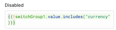
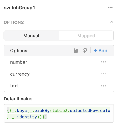
Definitely! When a component is disabled it is removed from the tab order, since you can conditionally disable components by passing dynamic values to that field using {{}} you can link this to a control where you set which fields are editable. Below is an example using a switch group component.
First set the disabled property to check whether the currency switch is set to true:
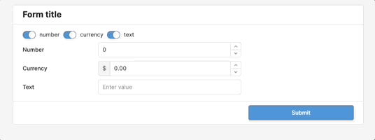
Then note that when it's off the component is disabled and leaves the tab order:
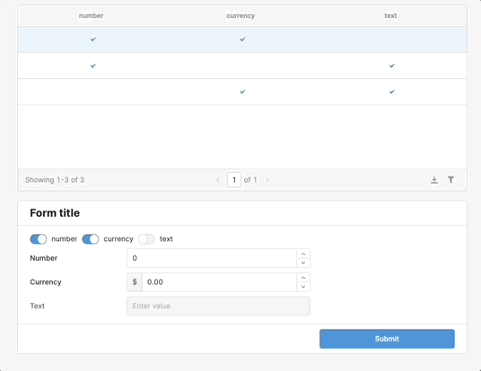
Note that the default values of the control can be dynamically set as well! Here they're linked to a table but there are certainly other ways you can set it up. If you'd like to share more about you're use case maybe there's a way that'll work better for you!
Here the code {{ _.keys(_.pickBy(table2.selectedRow.data, _.identity) }} returns an array of the table columns which are marked as true for the selected row, e.g. ["number", "text"].
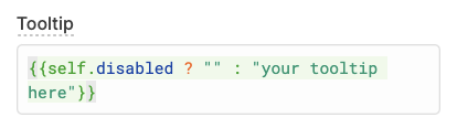
@Kabirdas thank you I will check this out! Meanwhile, I found a related bug for you to share with your developers. I have a text input field with a checkbox field next to it which I want to skip when I tab. The checkbox field has a Tool Tip on it. When I press tab to exit the text input field, the cursor is now on the checkbox field's Tool Tip(!) even though the checkbox itself is skipped!
If you'd like for the tooltip to be skipped as well can you try conditionally hiding it based on whether the component is disabled or not? You can pass a ternary to the tooltip field in {{}}, as long as it evaluates to the empty string "" the tooltip should be skipped:
Given that retool apps are for internal use, mostly for data entry and administration, and often for power users in their field, I feel like the supposed web accessibility reasoning is misguided.
A byte or int tab order field on components would be easy to implement and would only override the default tab behaviour if so desired by the developer. I think it's the developer's responsibility to worry about accessibility guidelines, yours is to provide sensible defaults.
Your workaround of disabling components doesn't work in all situations, for example a group of buttons placed to the right of a some edit boxes of different sizes.
Apologies if I have not kept up with the discussion but I am new to Retool.
I agree on tab order. When I developed apps in MS Access I spent a lot of time editing tab order - partly because the default was really bad and partly to optimize workflow.
It should be fairly easy to implement using TabIndex="1"
Thanks for chiming in again here. You know your teams better than we do and it sounds like for all of you tab order has been particularly helpful. That being said, there are a number of different feature requests to tackle with limited engineering resources, so the team is focusing on enabling those design patterns which are more accessible.
We're still keeping an eye on feedback though! I surfaced this with them and they're curious to hear more specifics about both of your use cases.
For me it is simply optimizing the order of data entry in forms without needing to go to the mouse.
For example if there are two columns of fields, it usually makes more sense to go vertically down one then the next as they tend to be related that way. But the default it left to right. Often the buttons will not be needed in the tab order you don't need to hit tab multiple times to get past some buttons before the next input field. The next component after the last input field should be the Add or Submit button, no matter where it is positioned on the app.
With anything other than the simplest form, the default is always non-optimum. If I lay out the form out to optimize the tab order, it does not typically work as well visually.
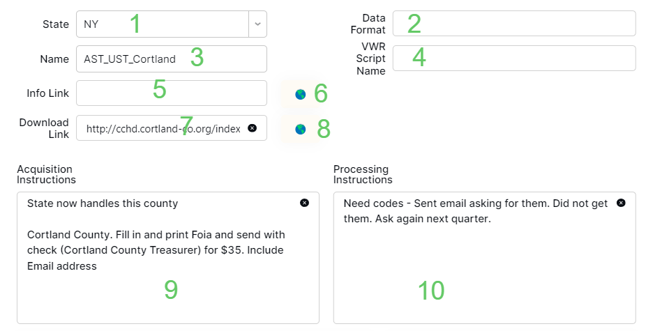
For the first use case is it helpful at all to use containers to separate the columns? I'm also curious what components you're using for 6 and 8 along with the functionality they have.
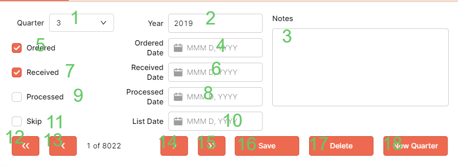
For the second use case, it looks like 5 through 10 follow the default tab order, though I'm not quite sure where 3 lies. Is this a form being submitted? Would it help to have the "Save" functionality happen on form submission so that it could be triggered by pressing the "Enter" key? I wonder if then you might also be able to add a success handler that focuses 5. Or if, in general, custom keyboard shortcuts might help with navigating the parts of the form that don't fit into the tab order.
Let me know if any of that sounds doable or if it would cause additional issues!
6 and 8 are icons that open the URLs in a browser. Not useful in the data entry. Not a big deal here, just an example of improvements setting tab order would provide.
On the second one, 3 is a text area and 5-10 are backwards, going from right to left which suprised me a bit.
Yes, using containers would help. But over using containers can clutter up the UI as easily as they can improve it. Considered layout does mitigate the issue.
I wouldn't put this issue in my top 10, but setting tab order would be a solid quality of life improvement for some situations.
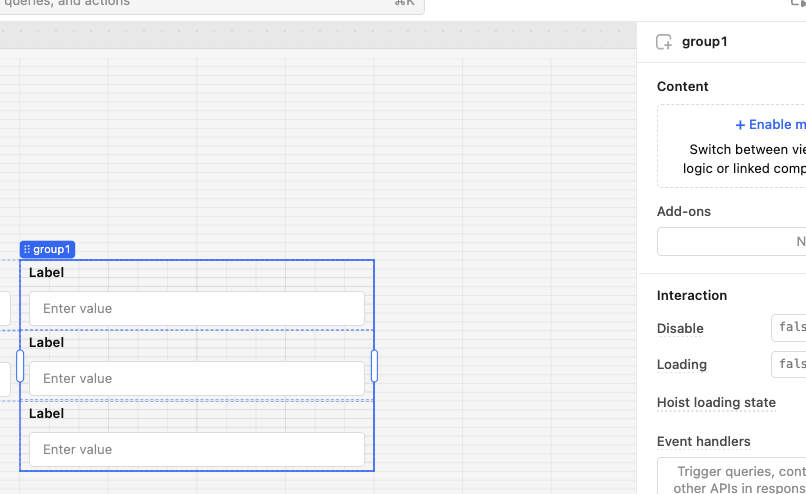
Apparently the only real use of the group is to allow easy showing and hiding of multiple controls. But at a quick check it did seem to provide tab ordering without the heavyweight container.
Hope this turns out to be helpful. I don't know if we will ever see true tab ordering.
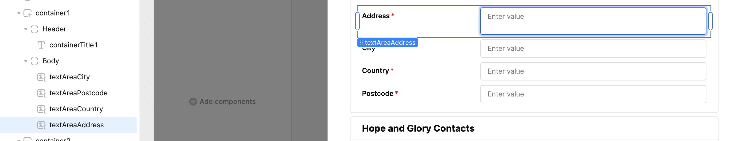
I came across this as I'm struggling to get my tabs in the correct visual order! I've created a form within a modal (auto created from a table) but the tab order is all over the place! On the component tree the order of the components is also out of order. Anyone got any ideas? I wanted to override the tab order to put it correct but it looks like it can't be done...