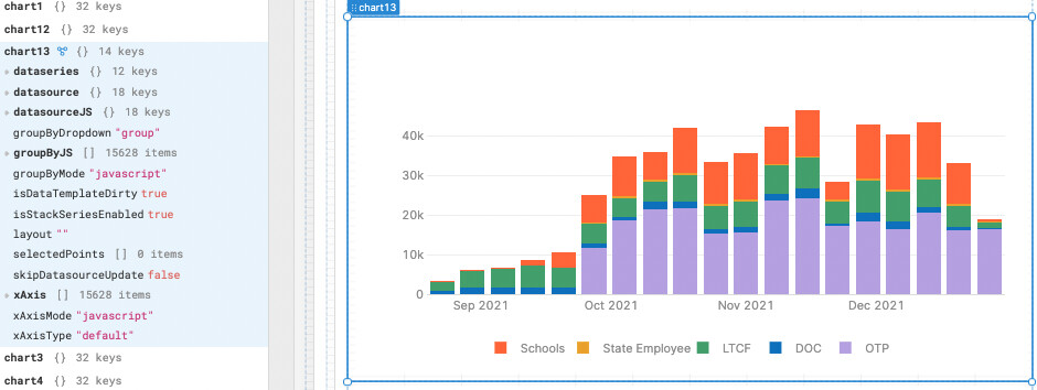
I'm trying to utilize the Plotly feature where when you click on a category in the legend to display, it updates the chart to only display that data. I'm unable to find what that attribute actually is on the left panel. I did notice that if you select a single point, it updates the selectedPoints attribute, but that doesn't happen when you toggle via the legend.
When I reached out to support on this topic last week, I was told that Retool doesn't expose all properties of the Plotly chart in the left panel, so if the attribute I'm looking for isn't exposed, I might want to look into custom components. Unfortunately I don't have the time right now to learn React and create a custom component--my company does mass COVID testing for thousands of schools nationally and obviously there is a LOT going on with the pandemic currently.
I also think that this seems to be a pretty standard and powerful Plotly feature, so it would be wise for Retool to implement it beyond just telling me to create a custom component. You can take a look at the screen shots below if my description wasn't good enough. Thanks!
Hey @bryan — thanks for writing into our community forum. I think I found the Plotly feature that you are looking for. I've built a lot of charts with Plotly in Retool and almost always learn something new — their library is huge.
Here are the steps to adding the feature you're looking for:
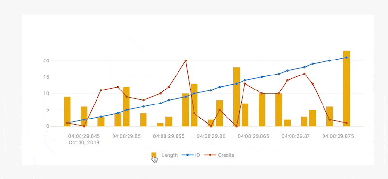
In the Layout section of your chart's sidebar, select the Plotly JSON option. This exposes the underlying JSON config of the Layout object for your chart (instead of the Retool UI abstraction).
Now test your chart by clicking on the desired items in the legend. You should see the other series disappear and only the series you clicked on will remain.
Here's a GIF of this working with the attribute added:
This behavior is documented in Plotly's Single Page Reference, in the Layout section. I highly recommend searching through this reference with cmd + f in your browser when you need to find other attributes like this in the future.
Hey @alex thanks for the response. I don’t think this is going to be the solution I’m looking for. The default behavior already allows for isolation of individual groups by legend clicks, but what I’m looking for is the actual attribute revealed in the left bar that shows which group in the legend IS actually isolated. I would like to be able to trigger some other dynamic behaviors based on what is currently showing on the chart.
Aha, I see. Sorry about the confusion. It doesn't appear that we expose the selectedSeries in the data model yet, only the selectedPoints. Will make sure we track this as a feature request for you internally.
I'm not aware of any upcoming work on the Plotly component, but we triage new requests regularly. I'm not on our eng or product team so I'm not a decision-maker for this, but I will let you know as soon as I hear more.