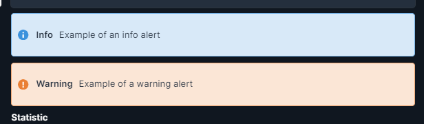
Hey all, just noticing that the alert component looks out of place on dark themes, the lightness of background is being hardcoded into the color, and there are no styling options to override it.
Requesting for one of the following:
- Primary & Background color configurable as part of the theme.
- Primary & Background color configurable as part of the component's styling options.
Or at the least, leave it hardcoded, but using transparency instead of whitening.
For example, current info alert background: #d8e9f8ff
Ideal background: #3c92dc36 (derived from the component's primary color #3c92dcff)
Would look the same on light themes, and also translate nicely to a dark theme.

I could add this to global custom css, but it's an additional unnecessary step to update all the deployed instances when the class names changes, which it has for other elements in the past.
The scrollbar is another element that needs to be part of the theme for the same reason. Or hardcode it to follow the existing surface colors (?).
Thanks 