It would be great to have a container type (or options on the existing containers) to have something whose only purpose is to give a new internal grid for fine alignment of items.
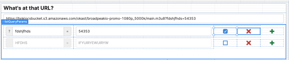
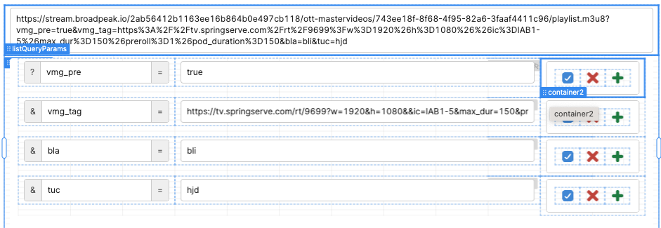
In that listview, the icons on the right hand side are all very wide because they are in the same grid as the inputs. I would like it if it was possible to have all 3 in a container of their own (with a much smaller grid), the container itself taking 2 slots horizontally in the listview grid (instead of 3 icons each taking one).
I have tried to use a standard container, but it has internal padding and a minimum height that is way taller than the inputs and therefore causes the list view rows to be unnecessarily high.
+1 for having more configurable layout/grid/styling options.
I particularly struggle with the icon component inside the standard grid and using a container and/or listview just adds a lot of whitespace that I can't control without hacky CSS