Hey Retool team!
I noticed that flexed containers can be quite useful -- but they definitely are my last option I ever consider when building an app that I know will need a mobile version. This is even more of a pain if the desire for mobile functionality is a factor that doesn't come to light until after you've already started developing an app for a client...where you'd then have to completely hide your stack container.
Some containers foster a lot of other components, and simply hiding is not conventional for a speedy, reliable application. My suggestion -- why not just allow Layout options in a containers inspector to be conditionally set? That way, we could flip style conditions depending on viewport size.
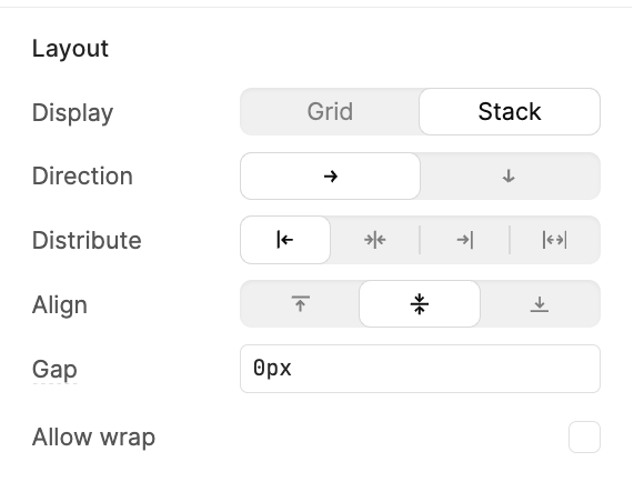
We could create logic where, for example, we want to set the container flex properties when {{ viewport.width > 900}} to be:
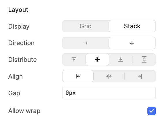
...else:
...then just give us this so we can set a condition and create conditions like:
Layout
Direction {{ viewport.width > 900 ? 'row' : 'column' }}
Distribute {{ viewport.width > 900 ? 'flex-start' : 'center' }}
Align {{ viewport.width > 900 ? 'start' : 'center' }}
Allow wrap {{ viewport.width > 900 ? 'center' : 'flex-start' }}