Hello,
I have a Number input field. I want a user to be able to decrease or increase the number by clicking the '+' or '-'.
Does anyone know how to achieve this?
Hello,
I have a Number input field. I want a user to be able to decrease or increase the number by clicking the '+' or '-'.
Does anyone know how to achieve this?
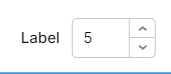
The closest you are going to get is to use the Number Inout component's built in scrollers:
I really like the idea of clickable prefix and suffix icons though! Many use case I can see beyond yours.
Thanks,
I am building a tool that is mostly used on an ipad, unfortunately the built in scrollers for some (with fat fingers) are a little difficult to use. 
Would be great indeed if they can make them clickable for multiple purposes!
maybe you could use a slider component on mobile and the number field with steppers on desktop?
Thanks for the suggestion 
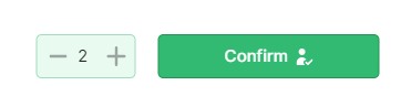
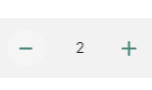
With steppers is not the best for this tool. In the end I worked around it by
creating a container with 2 small buttons '+' en '-' and in between a text or numberfield which displays the number. Still need to add some css.
I'll add some javascript to the buttons to update the displayed number when clicking on '+' or '-".
Hey folks! There's an experimental feature flag that we can turn on for you as of version 3.4.0 that allows for 0-padding containers. Just wanted to mention it since it may help with creating composite widgets like the one you're describing here:

If it's something you'd be interested in testing, let us know!
Yes this would be very convenient!
I manipulated padding with css in many cases, as the padding often was too large for what I needed it to be..