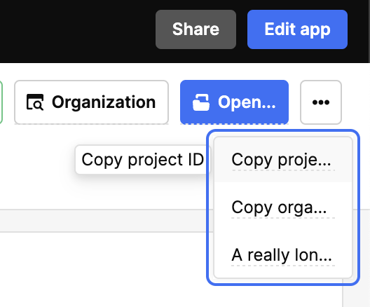
The overflow menu of the new button group control seems to have very little usable space. I'm only able to see about 1.5 words for each menu item contained within, making it pretty unusable. Currently the control is placed on the right side of my screen, but allowed to take up to 1/2 of the app's width. Alignment of the buttons does not affect the outcome.
Unable to inspect the HTML element when the menu is open (using the element inspector in the browser causes the menu to disappear) so I can't even work around this by overriding the styles.
Chrome Version 120.0.6099.234 at normal screen resolution
Mac OS 14.2.1
Similar results on Safari
I just realized there is an overflow menu in tables, which I got excited about, but then realized it suffers from the same unreasonably-narrow display problem.
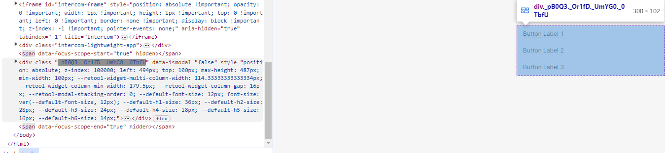
The class selector (_pB0Q3) worked for me, but I don't know how long that obfuscated/random-looking class will work, so I'm using this as an alternative. Better or worse?
body > div[data-ismodal="false"] div[role="listbox"] {
  min-width: 200px;
}
o.O I didn't know you could do that, im def bookmarking this that seems like a way more flexible solution than the hardcoded random name (they do change and you won't know when until it's too late)
They seem to have added a fix for this. Under the appearance settings, advanced settings popup, there's a min width (and max length) setting for the overflow menu.